The Def Leppard logo is a concentration of energy that the musicians strive to convey through music. In this way, they harmoniously combined the auditory and visual spectrum, presenting the world with a unique symbol that corresponds to the concept of modern rockers.
Def Leppard: Brand overview
| Founded: | 1976 – present |
| Headquarters: | Sheffield, England |
| Website: | defleppard.com |
Meaning and History
The legendary group began with three Tapton School students from Sheffield who came together in the musical collective Atomic Mass. As the band developed, it was joined by new members, including 18-year-old Joe Elliott. The rockers rehearsed at Portland Works, and their debut performance took place in the local school’s dining room. Later, the young musicians chose another name. Elliott suggested it. During an art lesson, he created posters for imaginary groups. One such option was Deaf Leopard.
Then, each album received an individual design, but the common logo, consisting of the rock band’s name, was always present on the cover. To ensure it did not look like a foreign inscription, designers always adapted it to the original style established in the musical compositions.
What is Def Leppard?
Def Leppard is a British-origin rock band that appeared in 1976 in Sheffield. Their fame came in the 80s/90s of the 20th century when many records went platinum, and two albums received diamond certification. The lineup of the group was not constant and often changed. However, two people were almost always present in the team since its inception: Joe Elliott and Rick Savage. In 2019, the group was inducted into the Rock and Roll Hall of Fame.
1977 – 1978
After forming Atomic Mass in 1976, the group began rehearsals in its initial lineup. Under this name, it only existed for a year from the moment of the first performances and then changed its name to one more suitable for the rocker style. The young musicians did not have their logos at that time.
1978 – 1980
After achieving their first success, the guys changed the band’s name. Joe Elliott suggested the name, as he often made posters for fictional bands in his school art classes. One of the options was Deaf Leopard. Later, on Tony Kenning’s recommendation, they changed the spelling to Def Leppard to make it more rock-style and distinct from the punk bands of that time.
1979
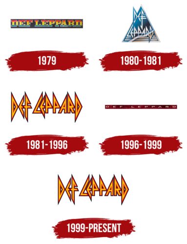
This logo appeared only once – on the Wasted single cover. The logotype featured the full name of the band in a hand-drawn, custom-designed font. The letters were massive, ornate, and had large serifs connected to the main elements by an overall contour line. The color palette was particularly bright: red, yellow, and blue blended harmoniously in a gradient and appeared vivid against the black background.
1980 – 1981
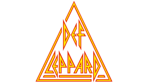
The emblem of that period featured a highly stylized name that was barely recognizable in the sharp details, barely resembling letters. The glyphs looked like ancient Latin symbols – even smooth, geometric shapes without serifs. They looked like triangles arranged vertically, intersecting three decorative stripes of equal width. The logo’s author was Alan Schmidt.
A tall pyramid united the unconventional inscription. At the top was the word “Def,” and at the bottom – “Leppard.” The isosceles triangle was outlined by a light frame and colored in a gradient blue hue. Silver elements contrasted nicely on it. This logo was used on the covers of On Through The Night (1980) and Pyromania (1983), while it was secondary on the High ‘n’ Dry (1981) album cover.
1981 – 1996, 1991 – today
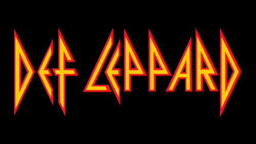
The Def Leppard emblem was simplified. Designers removed the background pyramid but kept the pointed letters in the form of vertical triangles. They simplified the “F” by removing the hooked curve of the leg and the second crossbar. The logo first appeared in this format on the High ‘n’ Dry (1981) cover. Later, it changed its color scheme and background several times until the band returned to the original yellow-red design with dark blue edging in 1999. It has been used ever since, adorning the Euphoria album. The emblem’s creator was Hipgnosis (Storm Thorgerson).
1996 – 1999
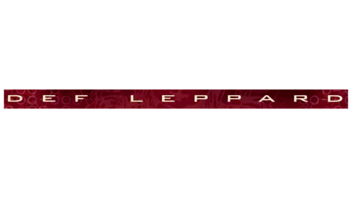
This version of the British rock band’s logo existed for a short period – until 1999. It accompanied the Slang compilation and was never seen elsewhere. The emblem featured a narrow horizontal stripe, vaguely resembling an elongated rectangle. Inside, on a burgundy background, was the name of the band. The letters were flattened, grotesque, white, and widely spaced.
Font and Colors
The original typeface chosen for the Def Leppard logo is Pyrite. It’s a display font with angular glyphs that perfectly conveys the rock and heavy metal style. Its creator is Ray Larabie. Blocky and chiseled characters are also present.
The musicians’ palette is predominantly bright and daring. It’s a combination of red and yellow, forming a fiery spectrum. The cold metal is conveyed through a combination of restrained shades – silver-chrome and icy blue. One of the emblems also features burgundy and white, which also reflects the unrestrained surge of emotions.
Def Leppard color codes
| Tangerine Yellow | Hex color: | #ffcb00 |
|---|---|---|
| RGB: | 255 203 0 | |
| CMYK: | 0 20 100 0 | |
| Pantone: | PMS 7549 C |
| Pigment Red | Hex color: | #f11421 |
|---|---|---|
| RGB: | 2414 20 33 | |
| CMYK: | 0 92 86 5 | |
| Pantone: | PMS Bright Red C |
| Black | Hex color: | #000000 |
|---|---|---|
| RGB: | 0 0 0 | |
| CMYK: | 0 0 0 100 | |
| Pantone: | PMS Process Black C |
