


![]() Delaware Blue Hens Logo PNG
Delaware Blue Hens Logo PNG
Designers created the Delaware Blue Hens logo, which reflects the team’s name. They depicted a lively, combative blue hen because these birds are renowned for their love of fights. However, the cartoonish style suggests one should not take conflicts seriously, as sports competitions are just games.
The University of Delaware’s athletic history began in 1889 with its first football team. The “Blue Hens” name came from a fighting chicken breed tied to state identity and Revolutionary War legends.
A modern era started in 1940 under Bill Murray, who led the program to a national title in 1946. Dave Nelson followed, developing the Wing-T system and winning another title in 1963. His successor continued the same approach, and all three coaches later entered the College Football Hall of Fame.
Harold “Tubby” Raymond took over in 1966 and stayed for 36 years. He refined the Wing-T system and led the team to national titles in 1971, 1972, and 1979, as well as 14 Lambert Cups and 16 playoff appearances. His record reached 300 wins, and players like Rich Gannon later became NFL MVPs.
Under K.C. Keeler, the program won the 2003 national championship by defeating the Colgate Raiders and reached the finals again in 2007 and 2010. Quarterback Joe Flacco set a passing record in 2007 before winning a Super Bowl with the Baltimore Ravens.
Since 2001, the program has competed in the Colonial Athletic Association, building consistent results. Women’s basketball rose under Tina Martin, with undefeated conference seasons in 2012 and 2013, led by Elena Delle Donne, who later became a WNBA MVP.
In 2023, the University of Delaware announced a move to FBS, joining Conference USA in 2025. In its first season, the team won the 68 Ventures Bowl against Louisiana.
Meaning and History
![]()
The first emblem, adopted in 1939, resembled an advertising sign. It looked like a blue canvas in a decorative frame. Inside was a white hen with four little chicks. The inscription “The Blue Hens” was in the upper corner, decorated with flourishes and swirls. In 1955, the team acquired an abstract logo. Designers emphasized the “D” to denote the university’s home state. Two colors were chosen for the design: blue (main) and yellow (thin outline).
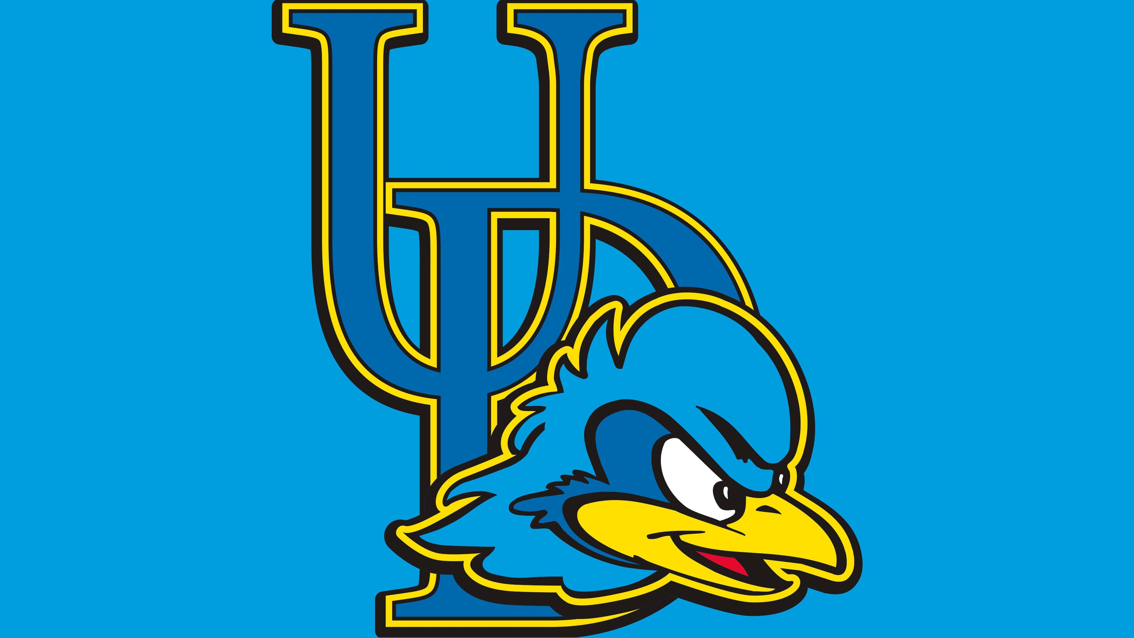
In 1967, the era of the fighting rooster began. At first, it was drawn in full height, but then it was decided to depict only the head. This allowed the addition of other elements to the emblem: the capital letter “D” (1987-1988), a yellow ring with the inscription “University of Delaware Fightin’ Blue Hens” (1999-2008), and the monogram “UD” (since 2009).
What is Delaware Blue Hens?
Delaware Blue Hens (or Delaware Fightin’ Blue Hens) participates in the intercollegiate program, consisting of 21 teams formed by students of the University of Delaware. The sports faculty is based in Newark, is part of the Colonial Athletic Association, and competes in NCAA Division I (FCS). The athletes have won 22 CAA championships (since 2001).
1939 – 1955
![]()
1955 – 1967
![]()
1967 – 1987
![]()
1987 – 1999
![]()
1996 – 2009
![]()
2009 – 2018
![]()
2018 – today
![]()
Delaware Blue Hens Basketball
The men’s basketball team participated in several tournaments but won only once, in the 2014 CAA tournament. The women were luckier: they won the CAA conference twice, with scores of 18-0. Also, the Fightin’ Blue Hens’ female athletes became NCAA champions in 2012 and participated in the Women’s National Invitation Tournament seven times.