The service emblem is very friendly and fun. We are focused on today’s young generation. “Hi, everything will be ok,” the Deliveroo logo says. We are fast as kangaroos. We will put the products in a bag and deliver them to your address.
Deliveroo: Brand overview
| Founded: | 2013 |
| Founder: | Will Shu |
| Headquarters: | London, England, UK |
| Website: | corporate.deliveroo.co.uk |
Meaning and History
Few people know, but Deliveroo was once a startup “for their own.” Greg Orlowski and Will Shu created it to bring food to former colleagues. Moreover, the only office of the company was located directly in Shu’s apartment in London. But the idea of friends turned out to be so in demand that they turned a small project into a large-scale international business.
When the delivery service reached a new level, it had to change the couriers’ logo and shape. The visual identity had to match the global brand status because Deliveroo had already grown out of a simple startup.
What is Deliveroo?
Deliveroo is a British company specializing in food delivery. It partners with grocery stores, cafes, and restaurants in the UK and several other countries, such as Italy, Belgium, France, UAE, Qatar, and Hong Kong. Users can access Deliveroo services through a mobile app or website. The service has been operating since 2013 and has its headquarters in London.
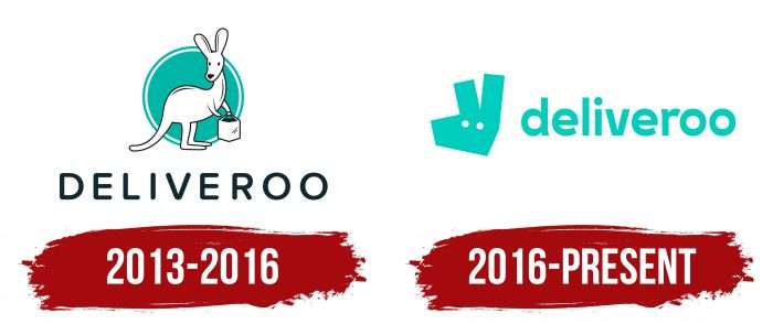
2013 – 2016
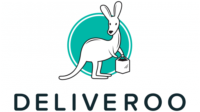
The original logo was drawn by friends Will Shu, who possessed artistic talent and computer graphics skills. They depicted a funny kangaroo with a bag in its front paws against a turquoise circle’s background. The fast-footed animal symbolized the same agile food peddler.
At the bottom was the inscription “DELIVEROO.” The authors of the logo used capitalized black letters with rounded ends. The large spacing between the characters made the name of the service visible and readable.
2016 – today
When the company needed a new style, its owners turned to the branding agency DesignStudio. To immerse themselves in the Deliveroo atmosphere, the designers got on their bicycles and started delivering food from restaurants. The experiment allowed them to understand in which direction to move.
After a large-scale study, the specialists decided not to give up the kangaroo because both customers and Deliveroo employees loved it. Instead, they changed the drawing style and developed new typography.
DesignStudio faced a daunting challenge: to create a logo that could be used in twelve countries. So the designers did a semiotic analysis to find out how the new symbol would be perceived in different cultures. Minimalism was supposed to smooth out the “sharp corners” because the fewer the details, the more likely customers will not have conflicting associations.
Deliveroo: Interesting Facts
Deliveroo, a UK-based online food delivery company started in 2013 by Will Shu, has changed how people get restaurant meals.
- Origins and Growth: Will Shu launched Deliveroo in London because he missed New York’s food delivery options. It’s now in over 200 cities globally.
- Rider-Centric Approach: Deliveroo’s riders, known for their teal and black uniforms, highlight the company’s flexible work model, embodying the gig economy.
- Unique Business Strategy: Deliveroo uses a hyper-local model, using technology to improve delivery speed and efficiency, setting it apart from traditional services.
- Delivery-Only Kitchens: In 2017, Deliveroo introduced “Deliveroo Editions,” kitchens designed solely for delivery, helping restaurants reach more customers without a physical storefront.
- Significant Investments: Attracting funds from venture capitalists and big names like Amazon, Deliveroo has seen its value soar, underlining its significant market impact.
- Technology at Its Core: Deliveroo’s success is fueled by advanced algorithms and logistics software, optimizing everything from food prep time to delivery routes.
- Boosting Restaurants: Deliveroo offers restaurants a new online revenue channel, changing how they operate in today’s digital-first world.
- Environmental Efforts: The company is working to reduce its environmental impact by reducing its use of plastic and offering sustainable packaging options.
- Facing Controversies: Deliveroo has navigated challenges typical of the gig economy, including debates over rider employment status and rights.
- Pandemic Adaptations: During COVID-19, Deliveroo introduced contactless delivery and helped deliver meals to those in need, showing flexibility and community support.
Deliveroo is a food delivery pioneer that blends technology, innovation, and a new way of thinking about restaurant dining while also addressing the challenges of the gig economy.
Font and Colors
The Deliveroo brand is a whole concept based on the image of a kangaroo. Even its name speaks about it: “DELIVEry” + “kangaROO.” By the way, the character on the logo is also called Roo. In the new design, it looks abstract because the artists made it angular. The idea was to match the polygonal graphic’s shape to the courier outfit and the delivery website. This is how the three-dimensional cartoon logo became simple and flat but did not lose its original meaning.
Creative director James Hurst has revealed the secret of typography. He admitted that both the logo and the jackets and the Deliveroo website use a modified version of the Stratos font. The designers chose this geometric sans-serif because it most closely matches the angular Roo. The word is written in bold turquoise lowercase characters. The kangaroo’s head is also turquoise in a Robin Egg Blue (# 00CDBC).
Deliveroo color codes
| Robin Egg Blue | Hex color: | #00cdbc |
|---|---|---|
| RGB: | 0 205 188 | |
| CMYK: | 100 0 8 20 | |
| Pantone: | PMS 3275 C |
