


![]() Dell Logo PNG
Dell Logo PNG
The Dell logo is a graphic representation of the slogan “turn the world upside down” and the name of the company’s founder. Following modern minimalism, the two-word Dell logo conveys the brand’s core idea and communicates dynamism, drawing attention to the name. The skewed letter “E,” created by designers from “Siegel + Gale,” conveys the completeness of the company’s slogan axiom.
Dell began in 1984 in a University of Texas dorm, where 19-year-old Michael Dell assembled and resold computers. He left medical school and founded PC’s Limited with $1,000. The direct sales model bypassed retail chains used by IBM and Compaq, offering custom builds, lower prices, and faster component turnover. First-year revenue reached $6 million.
In 1985, Dell introduced the Turbo PC, based on the Intel 8088, for $795. Orders came through phone sales and ads in tech magazines. In 1987, the company became Dell Computer Corporation and opened a UK office. The 1988 IPO raised $30 million and valued the company at $85 million.
In 1990, Dell opened a plant in Ireland to serve Europe. Supply chains were tightly managed, with minimal inventory and rapid assembly cycles. In 1994, the Latitude line marked entry into laptops.
In 1996, Dell.com launched with an online configurator. By 1998, daily online sales reached $12 million. In 2001, Dell became the top global PC seller, overtaking Compaq. In 1992, Michael Dell entered the Fortune 500 as its youngest founder.
By 2006, issues had emerged, including a recall of 4.1 million laptop batteries and declining service quality, dubbed “Dell Hell”. Hewlett-Packard regained market leadership. Michael Dell returned as CEO in 2007 with the Dell 2.0 strategy.
In 2013, Dell and Silver Lake took the company private for $24.9 billion. In 2016, Dell acquired EMC for $67 billion, gaining control of VMware and forming Dell Technologies. In 2021, VMware was spun off as a separate public company.
Meaning and History
![]()
A distinctive feature of Dell’s corporate style is the inverted letter “E.” It has been used in logos since 1989 as a graphic representation of the phrase “turn the world upside down.”
What is Dell?
Dell is an American high-tech company that supplies computers, peripherals, televisions, and networking equipment to the global market. It is part of Dell Technologies and serves as its brand. As of 2021, this manufacturer ranks second globally in PC shipments to users. The company’s headquarters is located in Round Rock, Texas.
1984 – 1987
![]()
The corporation’s debut emblem reflects its first name, PC’s Limited. To the left of the inscription, a microchip element is drawn, formed by many thin black stripes.
1987 – 1989
![]()
In 1987, the company was renamed Dell. The rebranding was reflected in the logo: designers depicted large letters “D,” “E,” “L,” and “L” with small, sharp serifs and drew two dark blue lines, one at the top and the other at the bottom.
1989 – 2016
![]()
In 1989, the first version of the emblem, featuring the skewed letter “E,” appeared: the blue word “DELL” on a white background. After 2009, this version continued to be used on the boot screens of Windows 7 computers.
2010 – 2016
![]()
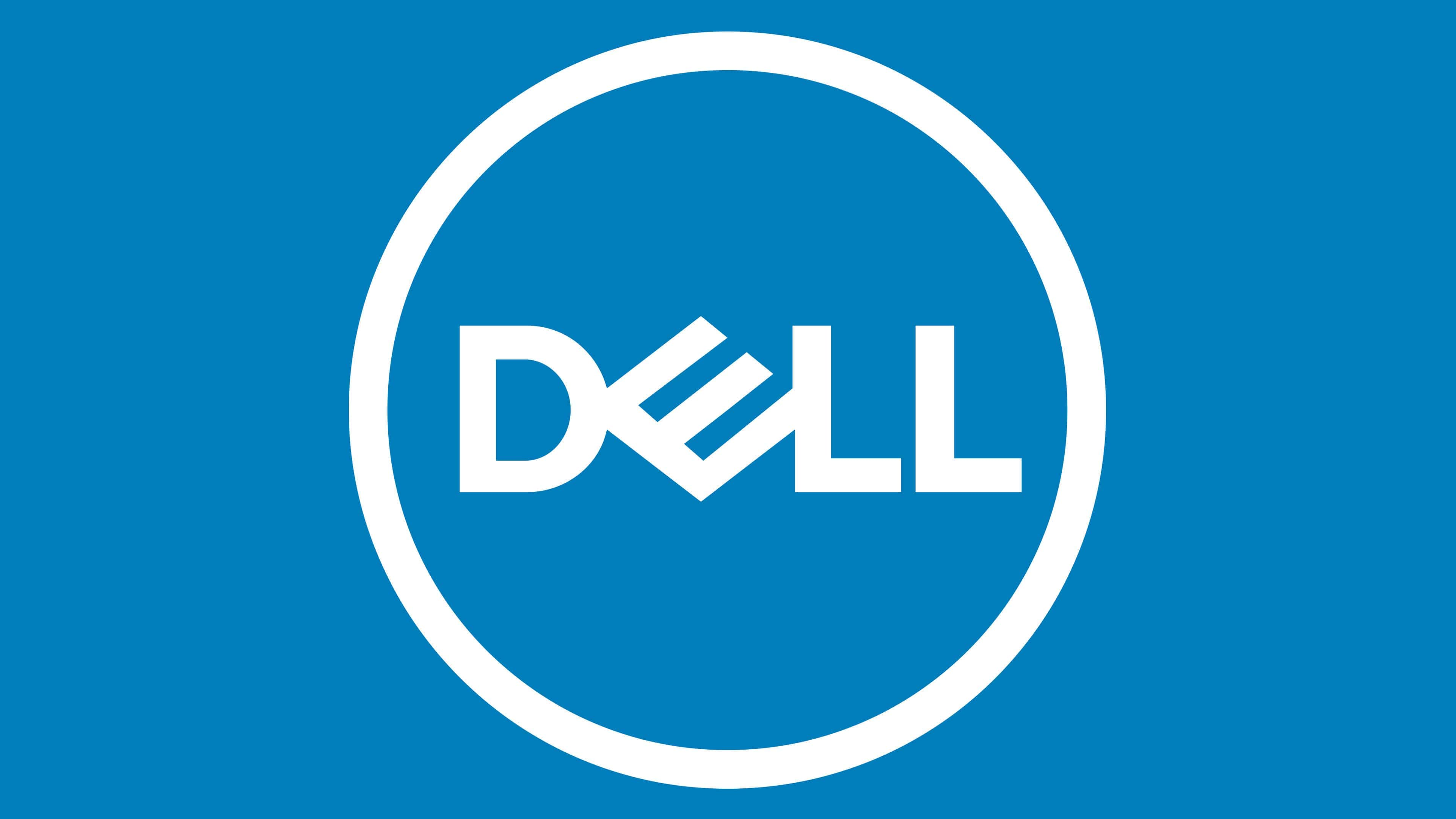
From 2010, the brand name gradually changed. Designers placed the inscription in a dark blue ring, keeping the previous font with the inverted letter “E.”
2016 – today
![]()
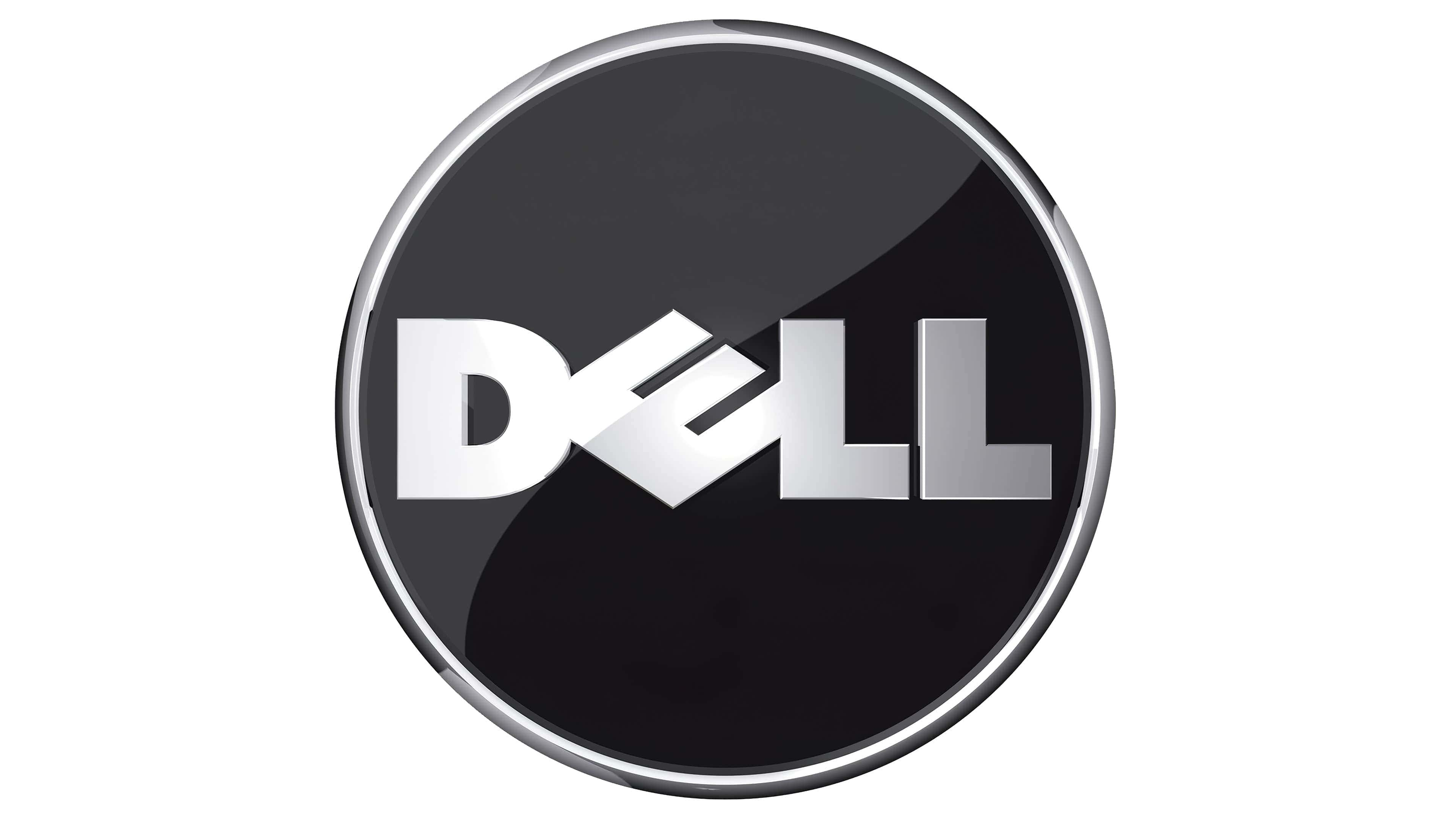
After merging with EMC Corporation, the company updated its logo again. The letters became thinner, but the proportions remained unchanged.
Font and Colors
Dell’s branding is characterized by minimalism. Designers managed to express the brand’s ideological spirit with just one word, highlight its name, and convey dynamism. The letter “E” is tilted to the left and rests on the edge, resembling a diamond.
The logo uses a sans-serif font. The inscription and the circle contour are colored in dark blue.