


 Dental Logo PNG
The Dental logo is complex, demonstrating the complexity of the problems the dental company solves. It concentrates elements directly related to health care and adds to the sign’s solidity. These are ancient, universal symbols of medicine.
Meaning and History
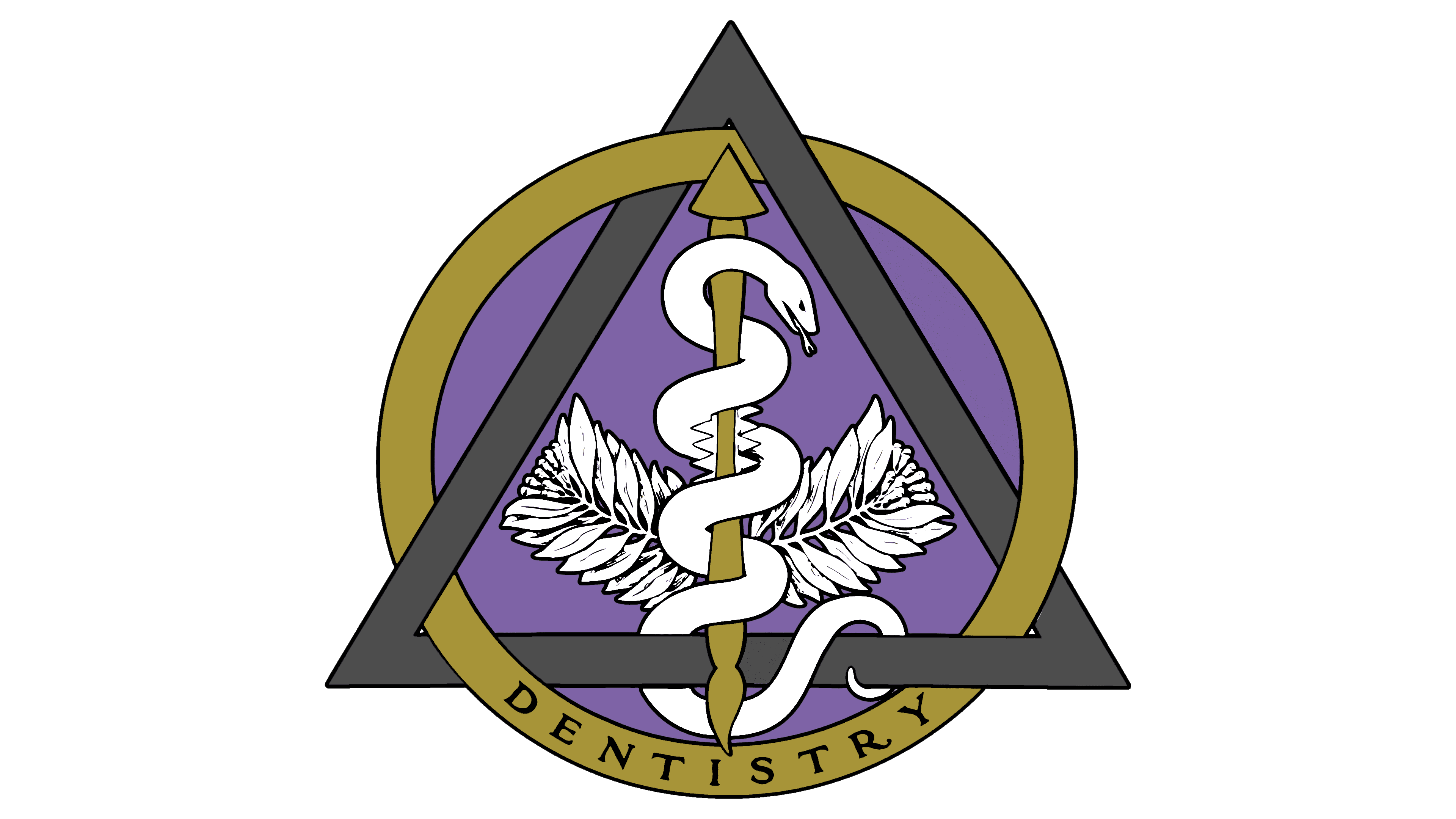
The current version of the Dental logo appeared in 1965. It was introduced at the American Dental Association convention. Since then, the logo has undergone only minimal changes that did not alter its essence. The logo itself is an emblem with many elements. At its center is the so-called Rod of Asclepius, the symbol of medicine. Visually, it resembles a spear. A snake is wrapped around it. This creature was not chosen by chance; the ancient Greeks used it in various healing rituals.
Snakes are also mentioned in the Old Testament. There, they are depicted as symbols of health and prosperity. As a result, it is not surprising that dentists use a snake in their emblem.
What is Dental?
It is one of medicine’s most important branches. Millions of medical institutions worldwide provide dental services. Almost everyone has visited a dentist at least once. The Dental logo, in various color variations, appears in almost any hospital, especially in specialized departments involved in dental treatment.
Behind the main image are also 20 berries and 32 leaves. Interestingly, these elements also symbolize dentistry: the number of milk and permanent teeth in a person’s mouth.
The Dental logo has two frames, one triangular and one round. At the same time, the triangle is the Greek letter Delta and a symbol of dentistry. The round frame also references the first letter of “odont,” meaning “tooth.” The two frames meet, creating a sense of three-dimensionality and magic.
Generally, the logo is displayed in various colors depending on the surface. At the bottom, “Dentistry” is also written. The word is written in classic bold sans-serif capitals within a circular frame.
Font and Colors

The dentistry logo mainly emphasizes the image and symbols. However, there is also an additional inscription, “Dentistry.” It is made in a classic sans-serif typeface. As a result, it looks official and confirms the logo’s medical nature.
The dental emblem has no specific color palette. Different institutions use different color gamuts, depending on the surface on which it is depicted. As a result, the logo can appear in various shades, which helps explain its relevance across countries. Dentistry supports healthy teeth and the well-being of millions. Almost every person has seen this emblem and can clearly say it relates to medicine.