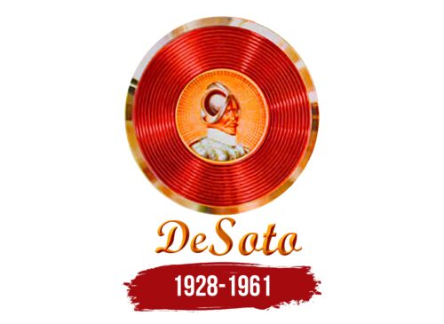
The DeSoto logo is like a platinum record by a famous author, preserving an enduring legacy. The emblem emphasizes the brand’s original compact design and thoughtful philosophy. The model is made to shine and be remembered.
DeSoto: Brand overview
In 1928, Chrysler Corporation launched the DeSoto brand to offer a more compact and affordable lineup of vehicles. Named after explorer Hernando de Soto, the brand occurred between Plymouth and Chrysler in the corporate brand structure.
DeSoto became known in the 1930s and 40s for its popular and innovative models, such as the Airflow, Custom, and Deluxe. The key to the brand’s efficiency and success was the integration of its manufacturing facilities with other Chrysler brands. This allowed DeSoto to share parts and manufacturing processes with sister brands, creating economies of scale.
DeSoto’s zenith came in the late 1950s when annual sales exceeded 200,000 units. Models such as the Fireflite and Firedome became iconic embodiments of the brand’s design ethic and capabilities. However, this success was short-lived.
By 1960, the brand began to suffer from internal competition within the Chrysler Corporation, especially with Chrysler and Dodge. The competition proved unfeasible, leading to the discontinuation of DeSoto in 1961 after 32 years in service.
More than 2 million DeSoto vehicles were sold in North America, making the brand a prominent member of the mid-size segment of the automotive industry. Although the DeSoto brand has long since ceased to exist, it continues to linger in the annals of automotive history. It serves as a reminder of Chrysler Corporation’s once-diverse portfolio of automotive brands.
Meaning and History
What is DeSoto?
It is an American automobile brand founded by the Chrysler Corporation. The brand produced mid-priced cars, offering a range of stylish and reliable vehicles that filled the gap between Plymouth’s cheaper lineup and Chrysler’s more luxurious models. Known for their distinctive design and advanced features, the cars were popular with consumers looking to balance affordability and sophistication. Despite its success, the company faced declining sales and increased competition, leading to the discontinuation of the brand.
1928 – 1961
The DeSoto logo features a detailed portrait of Hernando de Soto, the famous conquistador. This portrait accurately depicts his facial features and expressions. He is shown wearing period-appropriate clothing, including a metal helmet and a surcoat, adding historical authenticity.
The logo’s background is a rich gold circle, symbolizing prestige. Surrounding this gold circle is a wide red band, creating a bold contrast. The entire emblem is framed by a gold-colored border, giving it a shiny, polished appearance.
Below the emblem, the brand name “DeSoto” is prominently displayed, ensuring brand recognition. The text is styled to complement the overall design, contributing to a cohesive look.
The portrait, set within a golden circle and red band, evokes the image of a protagonist from a historical graphic novel. The gold border adds sophistication and luxury, making the logo stand out. The placement of the brand name at the bottom provides a clear identifier, anchoring the design and adding to its overall impact.
This thoughtful combination of historical imagery, rich colors, and sophisticated detailing creates a visually appealing logo and is deeply connected to the rich history of Hernando de Soto. The DeSoto logo conveys tradition, luxury, and historical significance, making it a memorable emblem in the automotive industry.


