The Deutsche Bahn logo shows how important customer cargo is to the company. Its safety and speed of delivery are guaranteed. The emblem reflects reliable packaging, compact placement, and maintaining the desired temperature.
Deutsche Bahn: Brand overview
| Founded: | 1 January 1994 |
| Founder: | Federal Republic of Germany |
| Headquarters: | Bahntower, Berlin, Germany |
| Website: | deutschebahn.com |
Meaning and History
The Deutsche Bahn brand has long ceased to be associated only with the railway industry. It is engaged in freight and passenger transport of all types and serves about 12 million people every day. It’s DB Regio division operates bus fleets, provides car sharing and bicycle rental services. So the company has already gone beyond the train operator and raised to a new level of mobility.
All Deutsche Bahn vehicles are adorned with the logo: on the side of the rail, on the back of cars, and the trunk of bicycles. The well-known symbol called “Biscuit” was inherited from the Federal Republic of Germany railway and changed several times. The current version appeared relatively recently, but DB’s corporate designers, together with hired specialists, tried to preserve the corporate identity’s traditional elements.
What is Deutsche Bahn?
Deutsche Bahn is one of the largest European transportation companies, launched in 1994. It is a state-owned enterprise in Germany and manages most of the German railway infrastructure. It has several divisions that provide various services, ranging from passenger transportation (by bus and train) to cargo transportation.
1920 – 1949
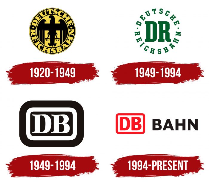
The symbol of Germany is the eagle, which was used at that time on all the country’s official symbols. Deutsche Reichsbahn used this symbol in its logo, in a slightly different interpretation, placing its inscription in a circle.
1949 – 1994
Until 1994, the railway network in eastern Germany was called the Deutsche Reichsbahn and used a simple emblem with green lettering. In the center were two large letters “DR” with rectangular serifs. They were placed in a DEUTSCHE ring (top) and REICHSBAHN (bottom), separated by two dots. This sign appeared even before World War II, but at that time, the main one was a yellow and black seal with an eagle.
1949 – 1994
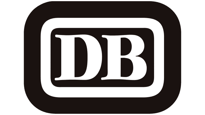
In 1949, the state company Deutsche Bundesbahn was formed, which controlled rail transport in Germany’s Federal Republic. Its logo, which received the unofficial nickname “Biscuit,” became the basis for Deutsche Bahn’s similar symbol. The original version looked like three concentric rectangles with rounded sides. The geometric shapes on the inside and outside were black. A white frame separated them. In the middle was the abbreviation “DB,” which stood for Deutsche Bundesbahn.
The famous “Biscuit” was developed by the German woodcarver, graphic artist, and painter Eduard Ege in 1955. Until that time, passenger transport was decorated with a similar sign with the letters “DB”: it was applied to the back and front bumper of buses.
1994 – today
In 1994, Deutsche Bahn was incorporated. It appeared due to the connection of two parts of Germany and, accordingly, two railway networks. The new organization inherited the logo from Deutsche Bundesbahn – albeit in a modernized form.
The transport organization contacted Weidemann studio to give the classic emblem a modern look and paid 200,000 Deutsche Marks for the work. The public criticized this decision: the amount seemed very large to people, especially when the media accidentally “increased” it to 1.2 million. The company gained more than it lost because the number of colored spots on the logo decreased. This has saved hundreds of thousands of Deutsche Marks through lower costs for screen printing ink and label embroidery thread.
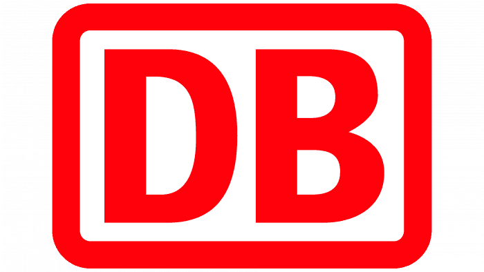
Graphic designer Kurt Weidemann was responsible for the visual design. He made the lettering “DB” red and placed it inside a white rectangle with a similar red border. The corners of the geometric shape remained rounded, and the serifs on the letters disappeared.
Until the mid-2000s, the brand was not holistic: almost every Deutsche Bahn subsidiary had its logo, and there were no common design standards. Erik Spiekermann undertook to correct the situation. He redesigned the icon and added a black ‘BAHN’ lettering to the icon, which he co-designed with Christian Schwartz. Spiekermann received a prestigious government award for the work done, covering the creation of corporate culture.
Deutsche Bahn: Interesting Facts
Deutsche Bahn AG (DB), established in 1994, is a major force in transportation within Germany and internationally, known for its comprehensive rail network.
- Foundation: Formed from the merger of West and East Germany’s state rail systems after reunification, Deutsche Bahn is government-owned but operates as a private entity.
- Extensive Network: With over 33,000 kilometers of track, it’s one of the world’s largest rail networks, which is crucial for Germany’s transportation.
- Global Presence: Deutsche Bahn works in over 130 countries, offering logistics through DB Schenker and local transport via DB Arriva.
- High-Speed Trains: Its Intercity-Express (ICE) trains reach speeds up to 300 km/h, connecting major cities quickly and comfortably.
- Technological Advances: Deutsche Bahn leads in rail technology, focusing on automation, digitalization, and sustainable transport solutions.
- Sustainability Goals: Aiming for climate neutrality by 2050, DB emphasizes renewable energy and eco-friendly mobility.
- Speed Record: In 1988, a DB ICE train set a world record by reaching 406.9 km/h on a test run.
- Cultural Impact: The DB logo and its trains are iconic in Germany, symbolizing reliability and innovation, and have appeared in films and media.
- Railway Museum: The Deutsche Bahn Museum in Nuremberg is Germany’s oldest railway museum. It displays a vast collection of artifacts from the history of rail.
- Enhancing Accessibility: Deutsche Bahn is committed to making its services more accessible, ensuring transportation is available to everyone, including those with disabilities.
Deutsche Bahn is pivotal in Germany’s mobility and logistics and in advancing sustainable and innovative transportation worldwide.
Font and Colors
The red graphic sign with the abbreviation “DB” provides brand recognition. This is an old element of visual identity: it appeared a long time ago, back in the days when the Deutsche Bundesbahn trains traveled on the railways. Several upgrades have given the rounded rectangle a modern look, but the distinctive shape and associated nickname “Biscuit” have not gone away.
Typographers Erik Spiekermann and Christian Schwartz have created a font family for DB called DB Type. The typeface used in the logo is designed based on Garamond. Moreover, the designers turned the serif into a grotesque and strengthened it, made it proportional, and adapted it for all the needs of the transport company. The result of their joint work was awarded the Gold German Federal Design Award in 2007.
The deep shade of Red (Pigment) (# EC1B2D) is the basis of the Deutsche Bahn brand identity. This color is used for the brand’s emblem, high-speed trains, buses, bicycles, cars, signs, and even the official DB website. For maximum contrast, red is paired with white and black.
Deutsche Bahn color codes
| Pigment Red | Hex color: | #ec1b2d |
|---|---|---|
| RGB: | 236 27 45 | |
| CMYK: | 0 89 81 7 | |
| Pantone: | PMS 1788 C |
