The Deutsche Telekom logo is both imposing and simple. Its style echoes the idea of the telecommunications service – that it occupies a leading position, owns an extensive network, and covers a huge territory. The emblem’s monolithic nature shows the company’s high importance in connecting people through communication.
Deutsche Telekom: Brand overview
| Founded: | 2 January 1995 |
| Headquarters: | Bonn, Germany |
| Website: | telekom.com |
Meaning and History
The brand’s visual recognition is high, which is not surprising given that millions of customers use Deutsche Telekom’s services throughout Germany. For all the time, five variants of the logo were presented. Each new redesign made the company logo more modern and confident. However, the main message remained unchanged.
What is Deutsche Telekom?
It is one of the largest telecommunications companies in the world. Also, the company provides its customers with services related to mobile communications and as an Internet service provider.
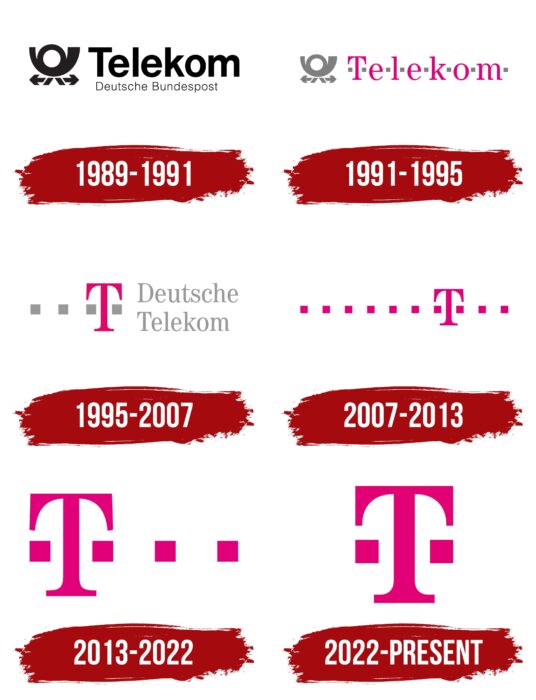
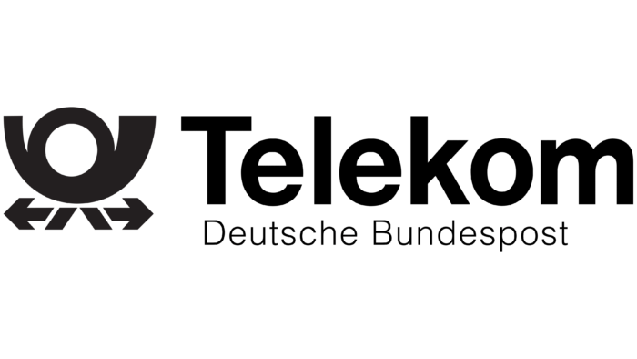
1989 – 1991
The original version of the logo was presented almost immediately after the creation of the holding. It was based on a verbal inscription and an emblem located on the left. The brand name was written in two lines. On the top was the word “Telekom.” It was done in a classic sans-serif font in a simple grotesque. All letters, except for the initial, were presented in lower case. The lettering “Deutsche Bundespost” used the same typeface but in a much smaller size. Moreover, the lines in the letters were extremely thin, and therefore not all clients immediately noticed the additional inscription.
The emblem was made in the form of a stylized horn, at the bottom of which were depicted two legs and arrows in different directions. Also, the image could evoke associations with a snail.
If we talk about the color palette, all the elements are shown in black on a white background.
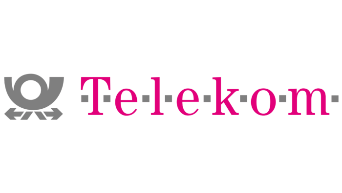
1991 – 1995
The changes that took place in the first redesign of the logo, by and large, concerned the word lettering. The emblem was also located on the left, but its color was changed to light gray. The brand name now consisted only of the word “Telekom.” All letters have been repainted pink. If we talk about the font, serifs appeared in the letters, which added elegance. Gray horizontal lines also appeared on both sides of each letter. Many people associate this innovation with communication.
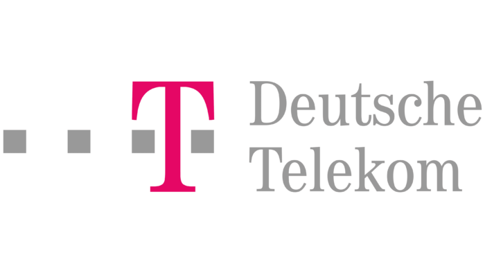
1995 – 2007
A rather controversial redesign that made the logo more incomprehensible to the target audience. The emblem was completely removed, and instead, there was one large letter “T” in pink. Also, she was surrounded by gray horizontal lines, three on the left and one on the right. To the right of the emblem appeared the inscription “Deutsche Telekom.” The font of the writing is identical to the previous version.
2007 – 2013
The new redesign greatly simplified the logo. There was only one letter, “T,” and ten pink horizontal lines. Moreover, seven are depicted on the left and three on the right. Despite the minimal number of elements, the Deutsche Telekom logo became cumbersome, and not every client understood the associations between lines and communication.
2013 – 2022
There was a certain simplification of the previous version. It’s about reducing the number of lines. Now there are only four. There are three such features to the left of the letter “T” and the right one. At the same time, the font of the letter itself remained unchanged.
2022 – today
The simplification of the logo continued in 2022. Now, there are only two horizontal purple lines left: to the left and the right of the big “T.” Consequently, the Deutsche Telekom logo began to look more natural and harmonious, thanks to the balance of the sides. All elements are bright pink, which only adds to the attractiveness of the image.
Font and Colors
If in the first versions of the logo, the main emphasis was placed on the emblem, then on the mysterious horizontal lines in subsequent versions. Consequently, little attention was paid to the inscriptions themselves. Globally speaking, this is a classic bold font with serifs (in the first version, without them). The inscription looks modern, but it does not play a special role.
If a black and white color palette was chosen in the first version of the logo, then after the first redesign, Deutsche Telekom preferred gray, white, and pink. An unusual contrast causes increased interest in the company’s activities. Bright pink and gloomy gray are unusual solutions for the telecommunications market.
Deutsche Telekom color codes
| Red Purple | Hex color: | #e10174 |
|---|---|---|
| RGB: | 225 1 116 | |
| CMYK: | 0 100 48 12 | |
| Pantone: | PMS 213 C |

