Business-like rigor is the main criterion to which the DeWalt logo is subjected. The power tool company’s logo shows its power, reliability, and practicality. With the large design elements, the designers harmoniously stressed the great significance of the company’s products.
DeWalt: Brand overview
| Founded: | 1924 |
| Headquarters: | Towson, Maryland, U.S. |
| Website: | dewalt.com |
Meaning and History
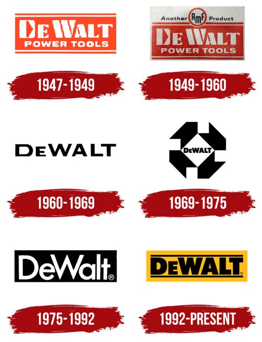
Visual recognition of the brand is at a high level. After all, DeWalt has been operating on the market for more than 100 years, and during this time, its name has been associated with power tools. If we talk about logos, then six options were presented. Moreover, some redesigns significantly changed the style.
What is DeWalt?
It is one of the largest brands in the production of power tools. The company’s factories are located in the USA and Brazil, Canada, Mexico, the Czech Republic, China, etc.
1947 – 1949
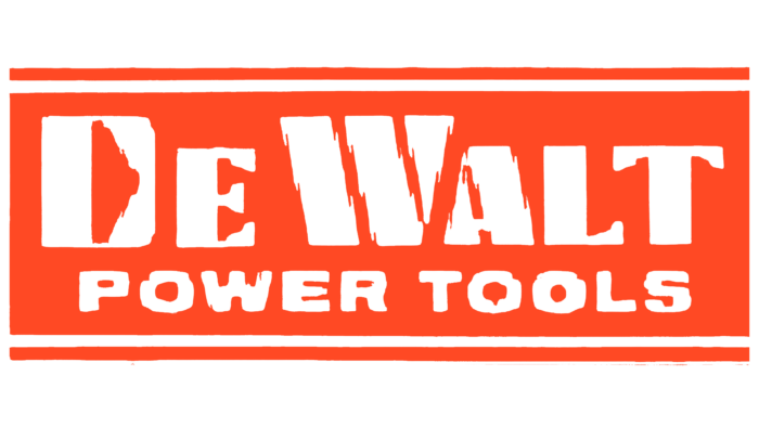
Even though the company was established in 1922, the first full-fledged logo was formed only in 1947. The basis of the first version of the logo was an orange rectangle inside of which there was a word inscription in two lines. On the first was written the second name of the founder of the company, namely “DeWalt.” It used a bold serif typeface. It cannot be said that the font was ordinary because each letter in the brand name had unique features. For example, in the letter “D,” the empty space was shown as a triangle turned to the right. Also, the letter “W” was depicted as three diagonal lines pressed against each other.
Below there is also an additional inscription, namely “Power Tools.” It used a classic bold sans-serif font. The letters were made much simpler.
1949 – 1960
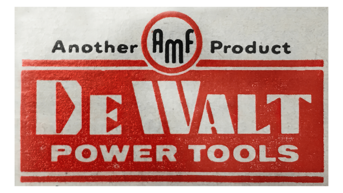
After the first redesign, the basis of the logo remained unchanged. However, an additional inscription was added on top, namely “Another product AMF.” The decision was in 1949 that DeWalt was bought by American Machine & Foundry Co. Inc. Speaking of this inscription, it was a classic sans-serif typeface with nice and elegant lines in the letters. At the same time, the abbreviation “AMF” was inside a white circle with an orange outline. For this inscription, the effect of “jumping letters” was used, which were not on the same level.
1960 – 1969
At this stage, there was a significant simplification of the logo. All that’s left is black lettering on a white background. The company name “DeWalt” was in classic bold sans-serif. All letters, except for “e,” were capitalized, and therefore this character stands out from the rest.
1969 – 1975
The inscription itself remained unchanged, including when it comes to the chosen font and style of writing letters. At the same time, four diagonal arrows appeared around it, which gave something very similar to a circle. Thus, the new DeWalt logo has become more voluminous and attractive.
1975 – 1992
The new redesign brought changes to the color palette. Additional arrow elements have been removed. Although it remained unchanged, the inscription itself was now white on a black background.
1992 – today
The latest redesign of the company’s logo has made it more striking. It was now the brand name in black letters on an orange background. The font is the same, but the lines in the letters are much thicker, which directly indicates that the company continues to develop and occupy a special place in the market. Two thin horizontal lines are shown above and below the verbal inscription.
Font and Colors
All variants of the company’s logo used a nearly identical bold sans-serif typeface. Only the size of the letters and the thickness of the lines changed. Thus, the company’s recognition turned out to be at a high level, thanks to the stability of the project.
The DeWalt brand has chosen a classic black and white color palette in most cases. However, the white background has been changed to orange in the latest version. An interesting contrast with black only added brightness and attractiveness to the logo.
DeWalt color codes
| Fluorescent Orange | Hex color: | #febd18 |
|---|---|---|
| RGB: | 254 189 24 | |
| CMYK: | 0 26 91 0 | |
| Pantone: | PMS 7549 C |
| Black | Hex color: | #000000 |
|---|---|---|
| RGB: | 0 0 0 | |
| CMYK: | 0 0 0 100 | |
| Pantone: | PMS Process Black C |
