The DISH Network logo is a prototype of a satellite dish. The emblem is arranged according to the associative principle. Indicates association, communication, signal transmission, and broadcasting over long distances via satellites.
DISH Network: Brand overview
| Founded: | 1996 |
| Founder: | Jim DeFranco, Charlie Ergen, Cantey Ergen |
| Headquarters: | Meridian, Colorado, U.S. |
| Website: | dish.com |
Meaning and History
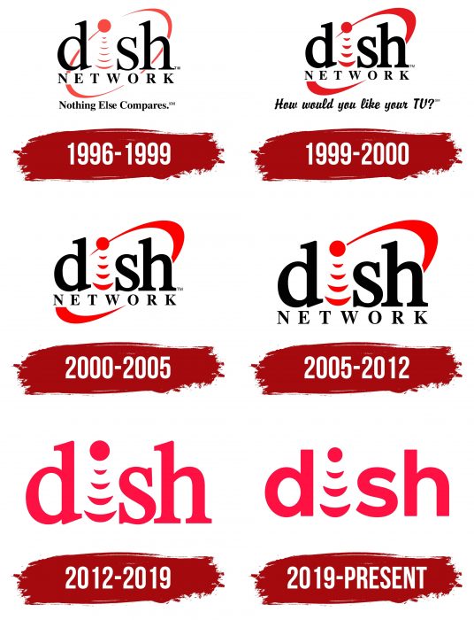
The name of the company is derived from the phrase DIgital Sky Highway. Even though DISH is an abbreviation, it is written in lowercase letters on the logo. It has always been this way: back in 1996, when EchoStar had a satellite broadcasting service, designers developed the first-word mark with lowercase lettering. Perhaps they needed an “i” with a dot at the top to stylize it as a communications satellite transmitting a signal to Earth. The basic concept did not change until 2012. Then the company decided to experiment by updating the color scheme and removing some of the elements. And in 2019, she went even further, choosing a new sans-serif font that has nothing to do with the usual serif.
What is DISH Network?
DISH Network is an American corporation providing satellite television and mobile communication services. Its history dates back to 1980 when the television equipment distributor Original EchoStar was created. The consumer brand DISH Network was introduced in 1996. In 2007, a restructuring took place, and the name started being used not for a separate service but for the entire company.
1996 – 1999
The logo representing the satellite television service of the EchoStar Corporation had “dish” in lower case. The second letter consisted of six arched lines, arranged from bottom to top in descending order, and a large red circle symbolized the satellite. Behind the word was a ring – the orbit of the spacecraft’s rotation.
The second part of the brand name (“NETWORK”) was written in capital letters on the next line. Even below was the motto “Nothing Else Compares,” with a dot at the end. For it, the designers used the same black serif font as for the rest of the text. And all the graphic elements, including the satellite with its signals and orbital arc, were dark red.
1999 – 2000
With a slight redesign of the logo, the word “dish” has become more compact. Perhaps this effect was created because the red ring in the background was narrowed. The circle’s diameter, which marked the dot above the stylized letter “I,” also decreased, and the number of arched lines below it was reduced to four. The old motto was replaced by the phrase “How would you like your TV?” The designers made it handwritten, choosing a font with a slight slant and interconnected letters.
2000 – 2005
Moving into the new millennium, the telecommunications company has simplified the emblem again. She got rid of the motto to emphasize her name, the design of which has remained practically unchanged.
2005 – 2012
Another “cosmetic” update of the DISH Network logo took place in 2005. On August 16, a version of the badge was presented without the lower half of the red ring and a shortened line of the upper arc, which ceased to go beyond the circle. The changes came as part of a rebranding under the inspiring slogan “Better TV for All.”
A little later, a variant appeared without the word “NETWORK.” And in 2010, an emblem with shiny purple-pink arcs came into use. The glossy effect was created by using a gradient and white spots.
2012 – 2019
In 2012, the company redesigned its logo to celebrate the launch of a new product called Hopper. The improved identity system was presented at one of the promotional events. After the redesign, it became less technological: the upper half of the orbital arc disappeared, and the word “NETWORK” disappeared. The remaining inscription with the stylized communications satellite has been completely repainted red. The old bold serif type has survived.
2019 – today
The first significant change to the font happened in 2019. The developers removed the serifs and rounded the in-letter space “d,” resulting in the corporation name taking on a completely new look. The number of arcuate lines that replace the bottom “i” has been reduced to three.
There is also a variant with the slogan “Tuned In To You.” This phrase is at the bottom. It is written together with “dish” in white letters and placed inside a red circle.
DISH Network: Interesting Facts
DISH Network Corporation, known as DISH, is a major American TV provider. It was started in 1980 by Charlie Ergen, Candy Ergen, and Jim DeFranco. Originally named EchoStar, the company launched its first satellite in 1995 and later changed its name to DISH Network Corporation in 2008.
- Start and Name Change: It began as EchoStar and became DISH Network after separating its tech business into EchoStar Corporation in 2008.
- Customer Attraction: DISH used unique methods to get customers, like giving away free satellite TV dishes, which helped grow its customer base quickly.
- HD and DVR: It was one of the first to offer HD TV and DVR services, launching an early DVR with HD in 2003.
- Sling TV: In 2015, DISH started Sling TV, a service for people who don’t want traditional cable, which offers streaming of major cable channels.
- Legal Issues: Despite legal issues, mainly related to copyright and disputes with content providers, DISH has settled many of these problems.
- Spectrum and Wireless Plans: DISH has bought a lot of wireless spectrum and plans to enter the wireless market, especially in creating a new 5G network.
- Accessibility: The company focuses on making its services easy for everyone, including people with disabilities. Features like voice-controlled remotes make this possible.
- Environment: DISH is working on reducing its environmental impact by using energy-efficient devices and installing solar panels at its headquarters.
DISH has grown from a small satellite TV service to a significant telecommunications provider by innovating and adapting to new technology and customer needs.
Font and Colors
The DISH Network logo represents the satellite broadcast service and related products of the telecommunications company. The main graphic symbol looks like a circle with three arcs at the bottom. This is the classic symbol for the satellite and its signals, used since 1996 instead of the “i” in the word “dish.” In the process of evolution of the emblem, only three arcs disappeared (at the very beginning, there were six of them), and the ring denotes the satellite’s orbit.
In past versions of the logo, the lettering was very similar to Times Bold, but in 2019 DISH Network changed its tradition and ditched it in favor of a bold geometric sans serif, which is reminiscent of Mostardesign’s Interval Sans Pro SemiBold. It also duplicates the Sling logo typeface. In this case, the main color of the wordmark is red, although earlier, it was used only for graphic elements.
DISH Network color codes
| Crimson | Hex color: | #ec1944 |
|---|---|---|
| RGB: | 236 25 68 | |
| CMYK: | 0 89 71 7 | |
| Pantone: | PMS 1788 C |
