Little spectators who know the world are depicted on a visual sign. They are full of energy and are interested in every insect and blade of grass. The Disney Junior logo shows that the channel is trying to satisfy kids’ curiosity in a playful way.
Disney Junior: Brand overview
| Founded: | February 14, 2011 |
| Founder: | Walt Disney Television |
| Headquarters: | Burbank, California, U.S. |
| Website: | disneynow.com |
Meaning and History
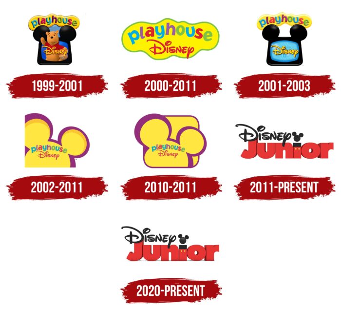
In 1997, the Disney Channel Preschool Block was launched – a series of television programs aimed at teaching children from 2 to 7 years old. In 1999, the owners rebranded and renamed the morning cartoon block Playhouse, Disney. In this form, it existed until 2011, when it was replaced by Disney Junior, which later became a separate TV channel. All this time, concepts have changed and logos because each brand has its own identity.
1999 – 2001
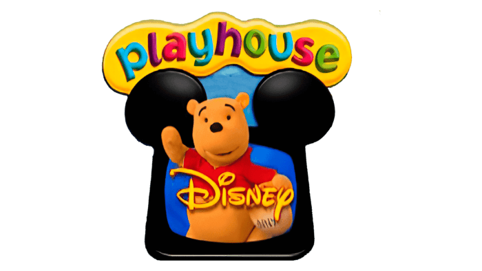
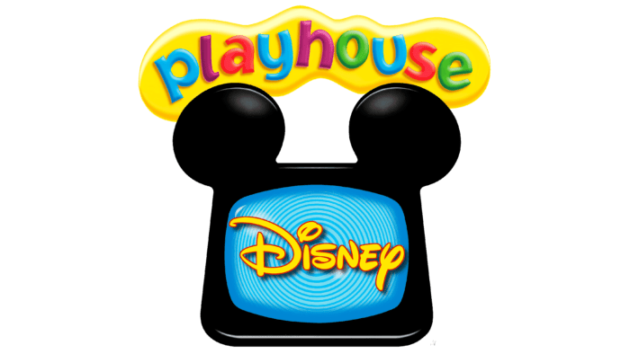
When the Disney Channel Preschool Block became Playhouse Disney, it was immediately reflected in its logo. Designers combined the main visual symbols of the brand: Winnie-the-Pooh and Mickey Mouse ears. A waving bear with a pot of honey under his arm was depicted inside the TV. He did not fit on the screen entirely, so his head looked out. And across it was written the yellow word “Disney,” for which a corporate font was used.
The black case of the TV had a non-standard shape: on top, it was decorated with two circles that represented the ears of Mickey Mouse. Above was the inscription “playhouse,” placed inside an oblong yellow cloud. Each letter was painted in a different color: “p,” “y” and “u” in blue, “l” and “h” in purple, “a” and “s” in crimson, “o” and “e” – in light green. The sans-serif typeface chosen was called Jacoby Black. A colorful logo with a TV and a cartoon character best expressed the concept of the brand. This was the merit of Beehive, which developed animated graphics.
2000 – 2011
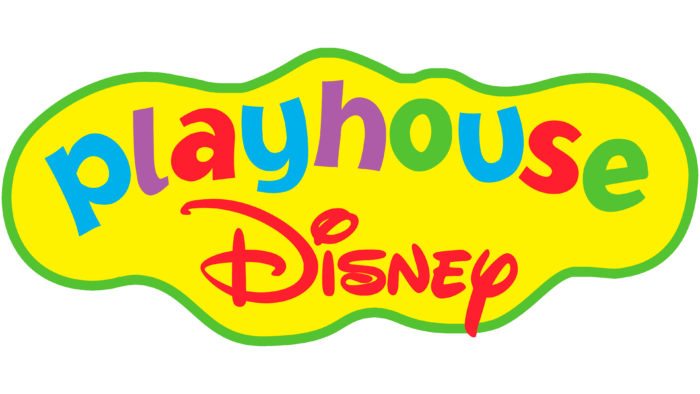
In the early 2000s, Beehive specialists have created new graphic signs for Playhouse Disney. They simplified the old logo by removing the Winnie-the-Pooh TV. The remaining words “playhouse” and “Disney” were combined inside a shapeless yellow cloud outlined in green. The fonts have not changed: the name of the gear unit, as before, used the Jacoby Black grotesque, and the word “Disney” consisted of individual glyphs. Instead, the designers experimented with the color scheme and repainted the second line in a bright red shade. The rest of the colors became saturated while the shadows around the letters disappeared.
2001 – 2003
In 2001, the programming block was renamed Playhouse Disney Channel. The new brand owners again turned to Beehive for help with a logo redesign. The developers decided to bring back the iconic icon that appeared in 1999. But they removed the image of Winnie-the-Pooh, replacing it with a blue screen with concentric circles and the already familiar yellow “Disney” inscription. The gradient created a sense of depth. The black body of the TV with Mickey Mouse’s ears also seemed three-dimensional because of the white highlights.
The shapeless yellow cloud with the word “playhouse” remained in its place. The designers made it a little lighter and kept the Jacoby Black font. But there were still changes: under the TV, a black inscription “CHANNEL” appeared at the very bottom. Bold font with rounded corners was used for it – the grotesque Helvetica Rounded.
2002 – 2011
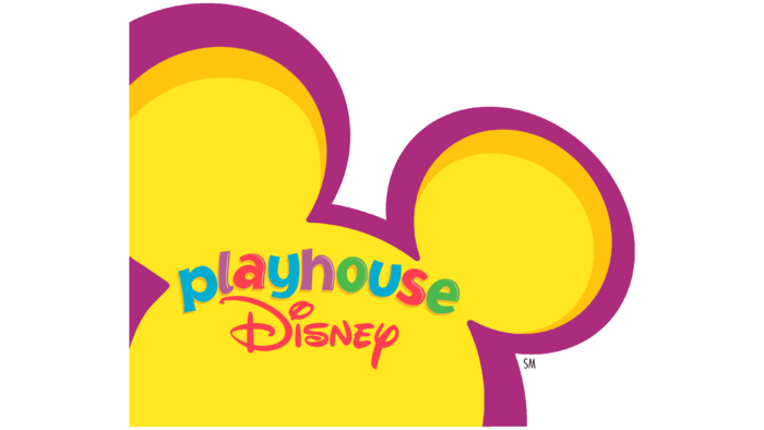
Three design agencies worked on the updated Playhouse Disney logo: Primal Screen, CASquare, and Beehive. Specialists jointly created a revolutionary concept in which there was no place for either a TV or an abstract cloud. The improved visual sign featured a yellow Mickey Mouse head peeking out from the lower-left corner. The upper edges of the ears were outlined in orange semi-arches, and the entire silhouette was in a purple frame.
Inside the large circle were two inscriptions: “playhouse” and “Disney.” The first word remained multi-colored, but the letters acquired light highlights and wide shadows with a gradient. Because of this, the Jacoby Black font seemed three-dimensional.
2010 – 2011
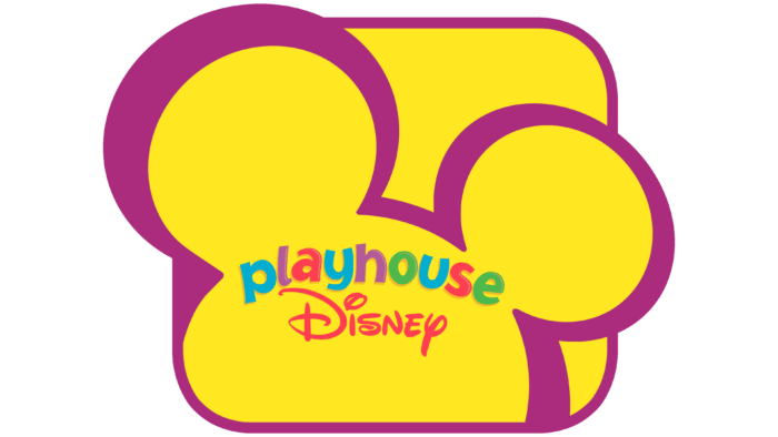
After another redesign, the logo has expanded. The left ear of Mickey Mouse, which previously did not fit “in the frame,” was depicted in the full uncut version. This was achieved by adding a base in a yellow rectangle with rounded corners. The new geometric figure balanced the proportions and reminded of the classic Playhouse Disney logo, where there was a large TV screen.
2011 – today
Disney Junior debuted in 2011. It succeeded Playhouse Disney, taking over its airtime and inheriting several older series. The relaunched block received a new graphic created by We Are Royale. It has nothing left of the previous design.
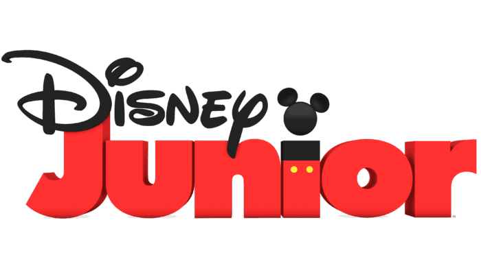
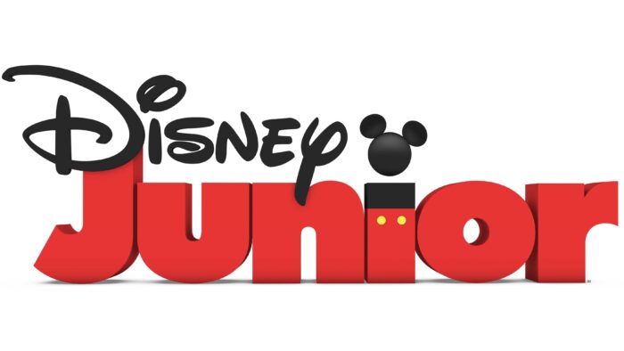
The black word “Disney” is at the top. It traditionally looks like the emblem of the company of the same name. The second line is occupied by the red inscription “Junior.” Futura Extra Bold marked the end of the Jacoby Black era. The letters are very massive and closely spaced so that there are no intervals between them. Irregular contours create a 3D effect. But the most notable element is the “i,” stylized as Mickey Mouse. The dot is replaced by the black silhouette of the character’s head, and the horizontal bar represents the character’s body. It is divided into two color blocks: a black top and a red bottom with yellow “buttons.”
2020 – today
In 2020, We Are Royale updated the logo with a gradient applied to Mickey Mouse’s head. In addition, a pronounced transition of shades appeared at the word “Junior,” for which the designers had to lighten the side edges slightly. The three-dimensionality of the letters is emphasized by gray shadows located at the bottom in an inclined plane. Because of them, it seems that the inscription does not hang in space but stands on a flat white surface.
Disney Junior: Interesting Facts
Disney Junior is a popular channel known for its engaging content aimed at preschoolers.
- Early Days: It started as a programming block on the Disney Channel in February 2011 and became its channel in March 2012, showing Disney’s focus on preschool programming.
- From Playhouse Disney: Disney Junior replaced Playhouse Disney, updating the brand while keeping Disney’s storytelling charm and aiming to reach more viewers.
- Original Shows: “Jake and the Never Land Pirates” was one of its first original series, mixing adventure with learning, and became very popular, setting the stage for more original content.
- Key Shows: “Mickey Mouse Clubhouse,” a carryover from Playhouse Disney, became a hit on Disney Junior for its interactive and problem-solving focus.
- Worldwide Presence: The channel is watched in over 160 countries and territories in multiple languages, showcasing Disney’s global influence in children’s TV.
- Programming Philosophy: Disney Junior aims to spark learning and discovery by using classic and new Disney characters under the motto “Where the magic begins.”
- Family Content: In 2012, it launched “Disney Junior Night Light,” a short show for parents and kids to watch together, underscoring its dedication to family viewing.
- Healthy Living Campaign: With support from Michelle Obama, Disney Junior promoted healthy lifestyles for kids through its “Magic of Healthy Living” campaign.
- Themed Weeks: The channel features themed weeks like “Pirate and Princess Week,” offering interactive and immersive content for its young viewers.
- Digital Expansion: Disney Junior has embraced the digital era with apps and online content, including games and educational activities, to meet modern media consumption habits.
Disney Junior combines entertainment with learning, offering shows and activities that support children’s development in a fun, engaging way.
Font and Colors
The transformation of the Disney Junior program block into the TV channel of the same name did not affect its identity in any way. The 2011 text logo has been retained as it looks stylish and modern. And the Mickey Mouse “i” perfectly fits the Disney concept. This character is the brand’s face and represents it at all levels. The game design of the emblem is designed for children under the age of 8 years. 3D graphics are used for the same purpose because today’s younger generation prefers 3D cartoons.
The word “Disney” is designed in a corporate style using individual glyphs. And for Junior, a modified version of the Futura Extra Bold font was taken. The designers have added additional facets to the letters to make them more voluminous.
The red and black palette matches the colors of Mickey Mouse. Perhaps it was chosen because the letter “i” is stylized as a classic cartoon character. She even has yellow blotches in the form of dots-buttons. Gray is the only color that stands out from the concept. It is used for shadows at the bottom of a word.
Disney Junior color codes
| Cinnabar | Hex color: | #e73533 |
|---|---|---|
| RGB: | 231 53 51 | |
| CMYK: | 0 77 78 9 | |
| Pantone: | PMS Bright Red C |
| Dark Charcoal | Hex color: | #282828 |
|---|---|---|
| RGB: | 40 40 40 | |
| CMYK: | 0 0 0 84 | |
| Pantone: | PMS Neutral Black C |
| Corn | Hex color: | #feeb4f |
|---|---|---|
| RGB: | 254 235 79 | |
| CMYK: | 0 7 69 0 | |
| Pantone: | PMS 107 C |
