The Disney Princess logo is stylish and expensive. The emblem represents the most famous crowned beauties of the entire fairy-tale world; therefore, it is filled with gold. The sign embodies the nobility and good manners of young princesses.
Disney Princess: Brand overview
| Founded: | 2000 – present |
| Founder: | Andy Mooney |
| Headquarters: | United States |
| Website: | princess.disney.com |
Disney Princess – 17 characters from Disney’s screen adaptations of fairy tales, which have been gathered into a community and sell products and toys in their style. The main participants are Cinderella, Rapunzel, Snow White, Sleeping Beauty Aurora, Raya, Belle, Jasmine from Aladdin, Elsa, Anna, Elena, The Little Mermaid Ariel, Pocahontas, Mirabel, Merida from Brave, Tiana, Mulan, Asha, and Moana. The franchise increased Disney Consumer Products’ sales from $300 million to $3 billion over five years.
Meaning and History
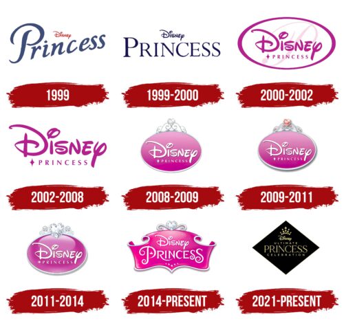
The idea of Disney Princess was unexpected; hence the franchise logo evolved and was improved over time as new heroines and products were added. The emblems predominantly feature pink hues, resonating with the tender age of the buyers. Almost every image includes precious stones and metals to underline the royal status of the heroines.
What is Disney Princess?
A franchise was invented by Andy Mooney to increase Disney Consumer Products’ sales. Under this brand sells toys, bedding, towels for girls, children’s cosmetics sets, coloring books, books, and clothing. The products are sold in the USA, Europe, and Asia.
1999
The first test logo of the series was simple – the original Disney inscription in red, which was more associated with femininity and beauty, and the prominent word Princess tilted to one side.
The upward slope of the word indicated that the franchise had just emerged and was planning to grow and expand. The dot in the letter “i” was replaced with a crown, fitting for a princess’s attire.
1999 – 2000
The idea received the first responses, increasing DCP’s revenue, so the issue was approached more seriously, forming the first list of princesses, which included six heroines.
The team’s logo was dyed dark blue with an even inscription. The word Disney still remained on top, and a delicate font with serifs was chosen for Princess. Interestingly, all the letters of the inscription are capitalized, but the first letter, P, is still highlighted with an even larger size. The technique suggests that these are renowned crowned individuals with noble pedigrees, and their names simply cannot be written in lowercase.
Placing the characters on the same level without a rise and serifs suggested a classical style. Princesses should stand out with their upbringing and set an example with their manners, clothes, and speech. Using an old standard font resonated with rules, etiquette, and decent behavior. Delicate lines pointed to the elegance and slimness of the beauties.
2000 – 2002
In 2000, the sequels of the cartoons about Cinderella, Mulan, and Ariel were released, as well as a musical about Belle, which prompted the sale of Princess merchandise licenses to Fisher-Price (figures), Hasbro (games), and Mattel (dolls). With the expansion, a promotional image of the franchise and a new identity is formed.
For the emblem, a delicate style suitable for young women and girls is finally chosen – a raspberry oval with a large branded Disney inscription. The brand name is highlighted to draw attention to the famous name and show who the main owner of the franchise is.
Below the symbol of the star is a small-sized inscription Princess in capital letters. This approach shows that princesses are just part of a big project, but all of them are of noble origin and deserve all kinds of praise for their qualities and beauty, like real stars.
In the background, in the form of light-flowing ribbons, there’s a translucent cursive letter R. The image creates a sense of airiness, light crinoline and satin ribbons from the princesses’ outfits.
The oval shape, which contains all the inscriptions, symbolizes perfection, completeness, and the absence of flaws.
2002 – 2008
2008 – 2009
In 2008, the Disney Fairy Tale line of wedding dresses based on Disney princesses was released. It included dresses, jewelry, outfits for girls with flowers, and bridesmaids. For this event, the franchise logo was transformed.
The emblem is made in the form of an oval pink with a gradient medallion on which a familiar white logo with an inscription is placed. The medallion is taken into a silver frame and adorned at the top with a heart shining with rhinestones.
The logo resembles a brooch ornament or the top of a comb for a wedding hairstyle. The heart hints at the animated weddings that princesses usually expect. It hints at the new collection of wedding dresses. The gradient of the background, with a lighter top, seems to enhance the shine of the silver jewelry.
2009 – 2011
Tiana from The Princess and the Frog is included in the favorites of girls. The logo is slightly updated. The heart and the ends of the silver curls turn red. This approach accentuates vivid feelings and emotions. It increases the feeling of joy and energy.
2011 – 2014
In 2011, Rapunzel from the cartoon Rapunzel: A Tangled Tale, released at the end of 2010, was added to the lineup of beauties. Also, a collection of princess dolls at a young age was released. In connection with the replenishment, the logo was changed.
The emblem has become three-dimensional. The oval base has become convex and smooth, like a precious stone. The top decoration of two large diamonds and a heart seems like a fancy diadem.
The return of silver shades gives the emblem tenderness and innocence, which resonates with the baby princesses.
2014 – today
The ranks of princesses were replenished with the 16-year-old Merida from the tale Brave, which was in a rental in 2012-2013, and Anna from Frozen. The updated franchise logo takes on a new form in the shape of a spread-out carved parchment. Its image resembles a crown topped with a silver heart. The word Princess has been increased in size and written in a flamboyant script, in a palace style. Its first and last letters are of the same large size, which creates a sense of harmony and completeness.
2021 – today
In 2021, a limited collection of the Ultimate Princess Celebration of 15 dolls was released. Both the outfits and the packaging design of the collection are more adult. For the occasion, a new logo appears, completely different from the usual children’s image.
Below is a black diamond, inside which the collection’s name is written in gold letters with an emphasis on the word “Princess.” In the upper corner is an image of a crown composed of individual rhombuses. The emblem signifies the collection’s premium quality. It hints at evening balls, evening gowns, and dolls that have grown into beautiful young women.
Font and Colors
The main colors of the logos: raspberry, gold, white, and silver. Each of them harmonizes perfectly with the realm of girls.
- Pink – dreams, sweetness, pleasant character, elegance.
- White – young age, pure heart, good stories where the heroes win.
- Silver and Gold – precious metals indicative of royal personages, honor, and wealth.
The logo employs a unique Disney inscription, handcrafted specifically for the company. The Princess font resembles Lawrence Regular.
Disney Princess color codes
| Pastel Yellow | Hex color: | #fdf895 |
|---|---|---|
| RGB: | 253 248 149 | |
| CMYK: | 0 2 41 1 | |
| Pantone: | PMS 602 C |
| Dark Tan | Hex color: | #9e893d |
|---|---|---|
| RGB: | 158 137 61 | |
| CMYK: | 0 13 61 38 | |
| Pantone: | PMS 7754 C |
| Black | Hex color: | #010001 |
|---|---|---|
| RGB: | 1 0 1 | |
| CMYK: | 0 100 0 100 | |
| Pantone: | PMS Black 6 C |
