


![]() Disneyland Logo PNG
Disneyland Logo PNG
The Disneyland logo is inspired by legend and evokes the park’s fabulous content. The elements of the emblem demonstrate the versatility of the entertainment on offer. Carousels, slides, and caves take adults and children to a fairy-tale world.
Disneyland began with Walt Disney watching his daughters ride a carousel at Griffith Park in Los Angeles in the late 1940s. He wanted a cleaner, more engaging place where children and adults could enjoy the same visit. On August 31, 1948, he described the first version, “Mickey Mouse Park,” as an eight-acre site near the Burbank studio.
The idea soon outgrew Burbank. In 1952, Disney created WED Enterprises and gathered artists, animators, and engineers to develop the park. After Burbank rejected the project, the Stanford Research Institute pointed to Anaheim, near the future Santa Ana Freeway. In 1953, Disney bought 160 acres of orange and walnut groves.
Financing came through television. ABC invested in exchange for a weekly Disney show and a stake in the park. The Disneyland TV program promoted the project before opening day. Construction began on July 16, 1954, and cost $17 million.
The press opening on July 17, 1955, became known as “Black Sunday.” Around 28,000 people arrived instead of the expected 11,000, many with fake tickets. Food and drinks ran out, fresh asphalt trapped women’s heels, and Fantasyland closed after a gas leak. Still, ABC’s broadcast reached about 90 million viewers. Disneyland opened to the public on July 18, drew 1 million visitors in ten weeks, and reached 5 million a year by 1956. Later came Walt Disney World in 1971, Tokyo Disneyland in 1983, Disneyland Paris in 1992, Hong Kong Disneyland in 2005, Shanghai Disney Resort in 2016, and Disney California Adventure, alongside the original Anaheim park, in 2001.
Meaning and History
![]()
Disney Parks, a special division of The Walt Disney Company, is responsible for developing all Disneyland. This business segment originated in 1971, when Walt Disney World opened. While there are many Disney resorts with hotels and rides, the main one is the original Disneyland in Anaheim. Walt Disney needed him to entertain tourists visiting the film studio. The owner of the huge corporation made sure fans could meet their favorite cartoon characters and have fun.
The very first Disneyland continually expanded. New themed “lands” were added as it grew, locations dedicated to different movies and cartoon series. At the same time, the park’s logo remained virtually unchanged, which ensured its recognizability.
1955 – today
![]()
Walt Disney originally wanted to call its entertainment complex Mickey Mouse Park, but then changed its mind and chose Disneyland. The name was first used in 1954 for a television series that aired on ABC. The television program helped raise funds to build the park, as the ABC network agreed to fund it in exchange for the show’s airtime.
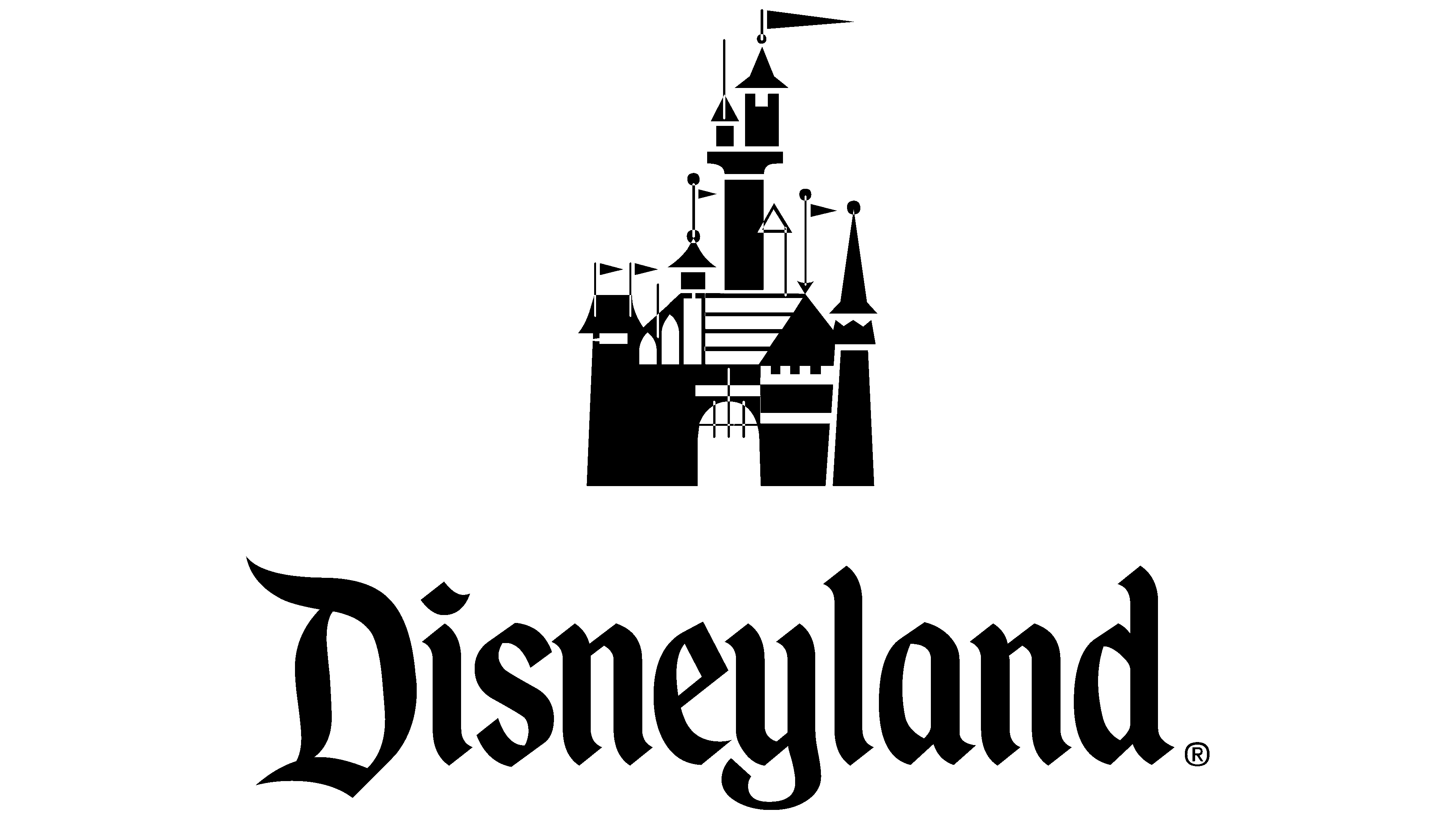
The first logo features the word “Disneyland,” written in an unusual font. The lettering style is reminiscent of Gothic lettering from the Middle Ages. The black color emphasizes this similarity, making the text expressive.
2000 – today
![]()
The entertainment complex’s official name was changed to Disneyland Park to distinguish it from the Disneyland Resort of the same name. This was reflected in the logo. The word “Park” was added to the inscription in the lower right corner. It is reduced in size and consists of sans-serif letters. The design of the central part has been retained, but it is now light blue rather than black.
The Disneyland emblem shows a typical Disney princess castle. The building, with its fortress wall, numerous towers, and five triangular flags, is rendered in a cartoon style. Despite the high defenses, the castle does not look impregnable because the lattice gate is raised. The entrance welcomes all who want to get inside and offers guests many fun activities. The two-dimensional design and the monotonous black-and-white color scheme do not spoil the fairytale character of the moment. Even in such a minimalistic way, the graphic character shows the atmosphere of the Disney universe.
Font and Colors
The creators of the Disneyland logo chose individual glyphs for the inscription. Later, they created a font with a similar shape, called “Mouse by Robert Nava”. The wordmark was based on the so-called rotunda, an Italian variant of the Gothic script transitioning to Antiqua. Many of the edges of the letters are cut at a 45-degree angle because goose pens with a diagonally cut writing edge were used at the inception of the Gothic script. The characters are tightly spaced because parchment was expensive and had to be saved. Of course, such spacing between letters is not due to lack of space but to historical traditions in the modern world.
The high contrast of strokes and the illusion of slanting to the left side make the logo dynamic. It feels like a fabulous addition to Disneyland World. As for the word “Park,” the designers chose an unusual sans-serif font, a geometric grotesque with rectangular protrusions along the edges.
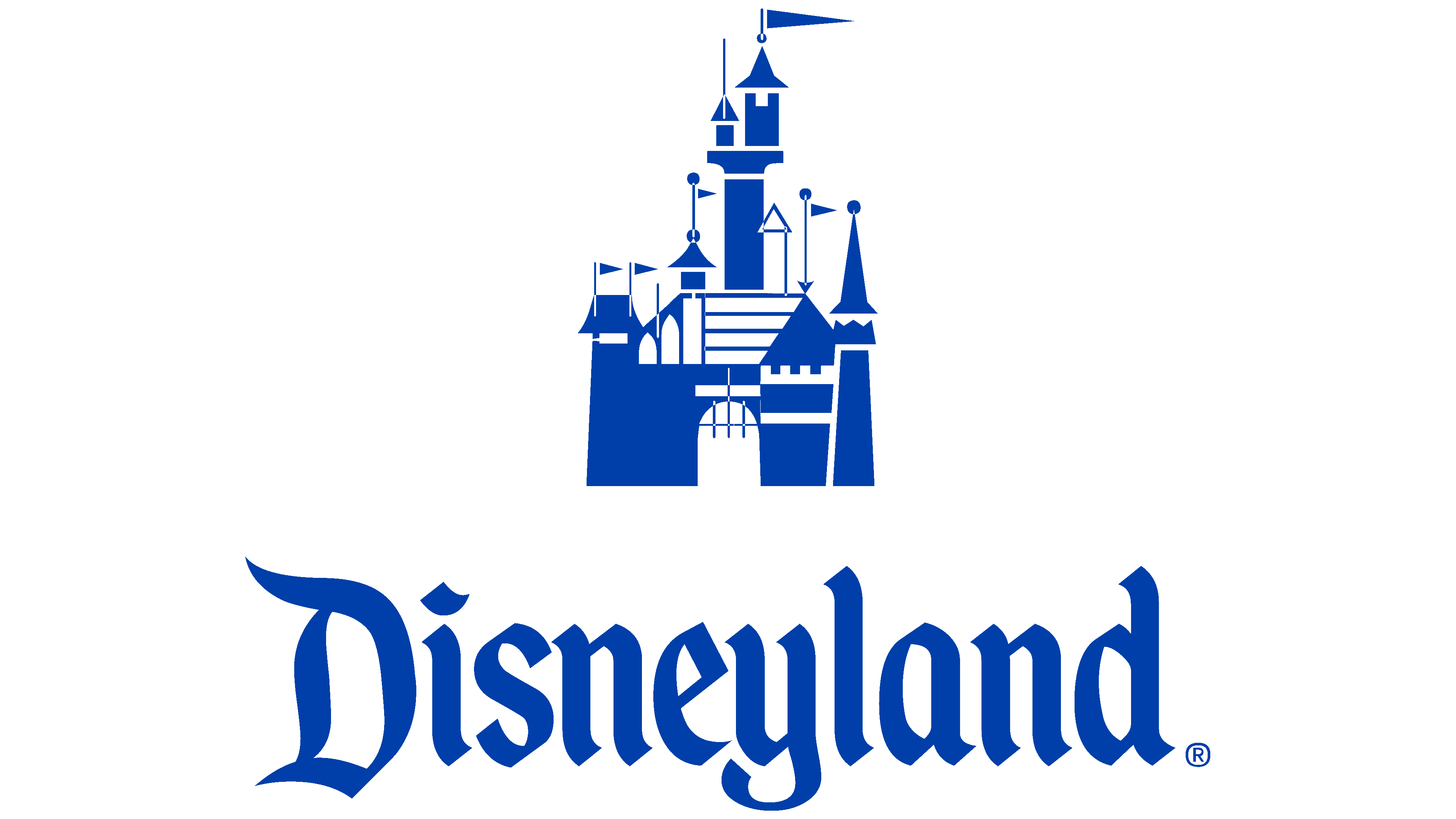
The theme park icon uses two color schemes. The classic option is black and white, as seen in the first logo and emblem, featuring the castle image. A later version combines white with a bright blue called Cyan-Blue Azure (#3081C3). The latter is associated with the sky, constancy, eternity, and honesty; in heraldry, it denotes loyalty and good glory.