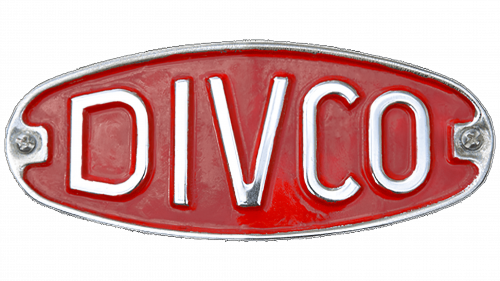
The Divco logo is elegant and vibrant. The emblem showcases the strength and beautiful design of the vehicles. The dynamic letters of the name indicate adaptability for performing necessary functions.
Divco: Brand overview
Detroit Industrial Vehicle Company began in the heart of Detroit, Michigan, in 1926. Sixteen years later, in 1942, it optimized its name and became Divco. The company carved out a niche by specializing in producing multi-stop delivery trucks, which immediately became recognizable due to its unique cab-over-engine layout. This design was optimized for frequent stops, making these trucks ideal for delivering milk and dairy products.
In the early years, in the late 1920s, the Divco design was influenced by the Ford Model T chassis, which evolved into the Model A by 1929. The next decade saw the introduction of larger truck models, such as the Model U and Model S, based on Dodge and Chevrolet chassis.
The aftermath of World War II characterized the 1940s. Divco, like many other industrial companies of the time, deviated from the standard production line and contributed to the war effort by producing auto parts and military necessities. However, the post-war years, specifically the 1950s, were prosperous for Divco. The company launched the Model 320, which quickly became the flagship product, and over 75,000 units were produced over the following decade.
In the 1960s, Divco began producing a wider range of commercial vehicles, including the Divco Delivery Van. By the 1970s, despite a change in ownership when the management team acquired part of the company in 1975, Divco remained true to its roots, producing modern versions of its classic delivery trucks.
However, the 1980s were less favorable to Divco. Stiff competition and dwindling demand took their toll. By 1986, the last iconic Divco truck rolled off the line, and a year later, in 1987, the company’s assets were liquidated, marking the end of an era.
Meaning and History
What is Divco?
It is an American manufacturer known for its multi-stop delivery trucks, often called milk trucks. These trucks delivered milk and other products to homes. The company became an important part of American culture, especially in the mid-twentieth century, due to the widespread use of its trucks by dairies and other delivery services.
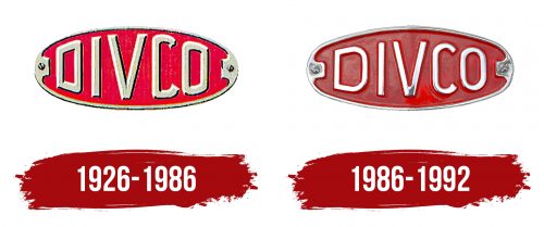
1926 – 1986
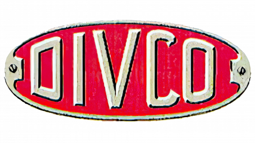
The logo of Divco, or Detroit Industrial Vehicle Company, features forward-facing, faceted letters that immediately draw attention. The brand name in this style highlights the power and reliability of the company’s vehicles. The first letter, “D,” mirrors the last “O,” which sometimes creates reading confusion but adds uniqueness to the logo.
The large size of the letters represents the scale of the trucks produced by Divco. These vehicles are known for their reliability and durability, which is reflected in the confident and massive design of the logo. The bright red background adds dynamism and energy, emphasizing the enduring strength and power of Divco machines.
The brand’s emblem symbolizes the American spirit, striving for success. Every detail of the logo encodes the company’s soul, reflecting its commitment to quality and innovation in the production of industrial vehicles.
1986 – 1992
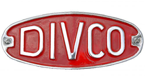
The Divco car badge, a vintage relic, captures the charm of retro automotive design. The brand name “Divco” is displayed in silver letters with a metallic sheen, creating an elegant look. The letters taper, growing larger toward the center and narrowing at the edges, fitting perfectly within the oval frame.
The base is rich burgundy, providing a sophisticated backdrop highlighting the light-colored letters. This color choice enhances the badge’s visual appeal, making it eye-catching. A thin, shiny frame encases the design, adding a sleek, polished finish.
The retro elements evoke nostalgia, reminding viewers of an era focused on craftsmanship and detail. The burgundy background contrasts with the silver letters, adding warmth and richness. The letters’ metallic sheen suggests luxury and quality.
The oval shape and the glossy frame give the badge a solid, robust appearance, reflecting Divco’s sturdy and reliable reputation. This emblem blends classic aesthetics with enduring appeal, making it a timeless piece of automotive history.


