The DKW logo demonstrates a leader who can balance and survive even in the most difficult circumstances. The emblem has a lot of sharpness, purposefulness, and speed. The sign seems to be flying, rushing to victory.
DKW: Brand overview
| Founded: | 1916 – 1966 |
| Founder: | Jorgen Skaft Rasmussen |
| Headquarters: | Berlin, Germany |
DKW is a German company founded by Danish engineer J. S. Rasmussen and was at the forefront of motorcycles. Having started its production in 1920, by 1928, it became the world’s largest manufacturer of two-wheeled motor vehicles.
Having reached the peak, DKW opened a new direction – cars. Its front-wheel drive cars with two-stroke engines were in demand in the middle of the 20th century.
The company has preserved the authenticity of the models, having survived two wars. Abolished in 1966.
Meaning and History
The DKW logo is the epitome of mutual support and teamwork. The evolution of the emblem shows the different activities of the company. Working alone and in partnership with other automakers. The history of DKW and the country is closely intertwined in the symbols. The sign is full of strength, life, and striving forward. The elements read harmony and balance.
What is DKW?
German concern for producing cars and motorcycles existed from 1913 to 1966. The headquarters was in Chemnitz, and the production facilities were in Zschopau. The most famous models of motorcycles are E 206, Luxus 200, and RT 125, and machines under the brand F.
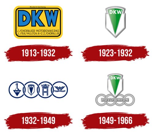
1913 – 1932
In 2013, the founder of the brand broke up with partner Ernst. As a result, the company’s name, work direction, and logo have changed.
The emblem is made in the form of a yellow rectangular plate with rounded corners. A short distance from the edge is a black contour line.
Inscriptions are placed inside the background—central – DKW in large blue letters with a black outline. The abbreviation stands for Dampf Kraft Wagen.
Initially, the brand was patented for a car with a steam engine, the development of which the founder was engaged before World War I by order of the German authorities. After the war, interest in such a machine faded. However, three letters perfectly fit the new direction of work – the gasoline engine.
The toy-sized example purchased was called Des Knaben Wunsch. Rasmussen modified and connected it to a bicycle, calling the model Das-Kleine-Wunder. The design became a bestseller with a circulation of 10,000 copies.
Below the name is a more detailed description: where is located and what does the company “L. Schopauer Motorwerke J. S. Rasmussen A-G. Z. Schopau S.A.” Jørgen Skafte Rasmussen bought the first factory in the German city of Chopau, where production has been carried out since 1906, together with partner Karl Ernst. The abbreviation SA refers to Saxony.
The letter S is unusual in words. Unlike other straight letters, the figure looks like a light wave inclined to the right. The element is reminiscent of the curves in the road that DKW bikes used to race.
Outside the black border around the yellow edge is a small inscription: “Made in Germany.” From this, it can be assumed that the logo plate was attached to the company’s motors.
1923 – 1932
In 1922, Jørgen was actively engaged in producing motorcycles, for which they developed another trademark. The image can be described as “a triangle inside the shield.” The tips of both figures converge at the bottom to one point.
The composition resembles a frame fork when viewed from the front. The symbol is elegant, like the first models, more like bicycles. The triangle is also similar to the teardrop shape of gas tanks, especially in the first models.
At the top of the logo is the abbreviation DKW in thin white letters. During this period, another comic decoding of the acronym Die (a prefix in front of any name of a tree), Kleber Wasser, appeared since the motorcycle’s design was not made of metal but of glued wood.
1932 – 1949
DKW becomes the largest motorcycle manufacturer. More than 65 thousand products rolled off its conveyors. Therefore, the company decided to expand and acquire the Audi plant. And during the depression, she teamed up with her and two other auto manufacturers to form Auto Union AG for mutual support.
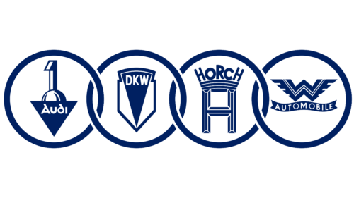
The union logo is four intertwined rings, today known as the Audi sign. Inside each circle is inscribed a small emblem of the members of the union: DKW, Audi, Horch, and Wanderer.
The partial interweaving of symbols showed the preservation of independence with the release of its products and the production of hybrid models—for example, the Audi Front with a Wanderer engine manufactured by Horch and DKW front-wheel drive.
1949 – 1966
After the Second World War, part of the participants ended up in the GDR, where the authorities used their capacities for their purposes to produce cars F8, F9, Trabant, and others. Horch and Wanderer ceased to exist. Wanting to regain independence, the remnants of DKW and Audi are registered in Germany as Auto Union GmbH.
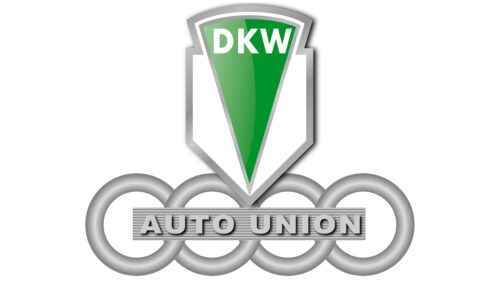
The new logo retains the elements of the two remaining union members: a triangular DKW design from 1923-1932, which sits on top of 4 interlaced Audi rings, in the center of which is written Auto Union.
An enterprise in West Germany produced DKW cars (F89, F91, F92 Monza, Junior), so the brand sign was given the leading top position. DKW also organized the assembly of motorcycles, which explains the logo from the time of their first models.
The production of DKW cars was led by Audi, which did not use its brand at that time. Therefore, her sign is located at the base, like a base. Four rings are like the four wheels of a car.
In 1965, Volkswagen bought Auto Union GmbH and resurrected Audi, and DKW was discontinued in 1966.
Font and Colors
The main colors of the emblem are gray and green.
- Green stands for growth and development, striving to make life easier for people through rapid movement.
- Gray is the color of painstaking work, incessant work on new models, and restoration of production despite constantly hindering external circumstances.
Phiz Shadow’s lettering font is voluminous, clear, and simple. Shows thoughtfulness and build quality.
DKW color codes
| Forest Green | Hex color: | #00922c |
|---|---|---|
| RGB: | 0 146 44 | |
| CMYK: | 100 0 70 43 | |
| Pantone: | PMS 354 C |
| Fern | Hex color: | #7bb97c |
|---|---|---|
| RGB: | 123 185 124 | |
| CMYK: | 34 0 32 27 | |
| Pantone: | PMS 346 C |
| Smoky Black | Hex color: | #0e0e0e |
|---|---|---|
| RGB: | 14 14 14 | |
| CMYK: | 0 0 0 95 | |
| Pantone: | PMS Black C |
| Dark Gray | Hex color: | #afafaf |
|---|---|---|
| RGB: | 175 175 175 | |
| CMYK: | 0 0 0 31 | |
| Pantone: | PMS Cool Gray 5 C |
