


![]() DeLorean (DMC) Logo PNG
DeLorean (DMC) Logo PNG
The DMC logo is fantastic and extraordinary. The emblem personifies the point that, like a magnet, it attracts the past and the future, forming a vortex of time that creates an unreal portal. From here, the hero starts, setting off on a journey.
John Z. DeLorean spent nearly 17 years at General Motors, where he became the company’s youngest vice president and helped create the Pontiac GTO and Pontiac Firebird. In 1973, he left GM after years of tension with corporate leadership and began planning his own sports car. DeLorean Motor Company was founded in 1975. The concept was a stainless-steel coupe with gullwing doors and a price aimed at a wider market.
DMC hired Giorgetto Giugiaro and Italdesign for the exterior in March 1975, while Colin Chapman’s Lotus team reworked the chassis and engineering. For production, DeLorean chose Northern Ireland after the British government offered major support to create jobs near Belfast. Construction of the Dunmurry factory began in October 1978.
The first production DMC-12 left the line on January 21, 1981. The name came from the original $12,000 target price, but the final price rose to about $25,000. The car used a 130-horsepower PRV V6 from Peugeot, Renault, and Volvo. Road & Track recorded 0 to 60 mph in 10.5 seconds, slower than the Porsche 911 and Chevrolet Corvette.
Sales missed targets. DMC needed 10,000 to 12,000 cars a year to break even, but sold around 6,000. In February 1982, the company entered receivership. In October, DeLorean was arrested in an FBI cocaine sting, and DMC filed for bankruptcy on October 26. He was acquitted in 1984, but the company was gone after about 9,200 cars. In 1985, Back to the Future turned the DMC-12 into a film icon.
Meaning and History
![]()
The original company logo consisted of only three letters: “DMC.” It was purchased along with parts when Stephen Wynne decided to revive the iconic brand. The new DeLorean brand has nothing to do with the old one, except for their shared name and visual identity elements.
What is DMC?
This company is best known for creating the legendary DMC-12 sports car with a stainless steel body and upward-opening doors. It represents a unique period in automotive history. Operating from a purpose-built factory in Northern Ireland, the company produced a car distinguished by unique design elements, including an unpainted stainless steel body and angular styling by Giorgetto Giugiaro. Design features included a fiberglass underbody covered with stainless steel panels and a rear-mounted PRV V6 engine, which became defining characteristics of the DMC-12.
1975 – 1982
![]()
Phil Gibbon, an artist from the English city of Brighton, designed the first brand name. He used the stylized abbreviation “DMC” to make it symmetrical. The letter “D” looked like a mirrored “C” because it lacked a vertical stroke on the right side. The “M,” in turn, was shaped like an inverted “E.”
The inspiration for the logo was the cars’ look. Particular attention was drawn to the gull-wing doors that opened upward. They were supposed to be imitated by the “D” and “C” on the sides. To show the technical progress, Phil Gibbon made the design three-dimensional. To do this, he complemented the image with a silvery gradient and thin gray outlines.
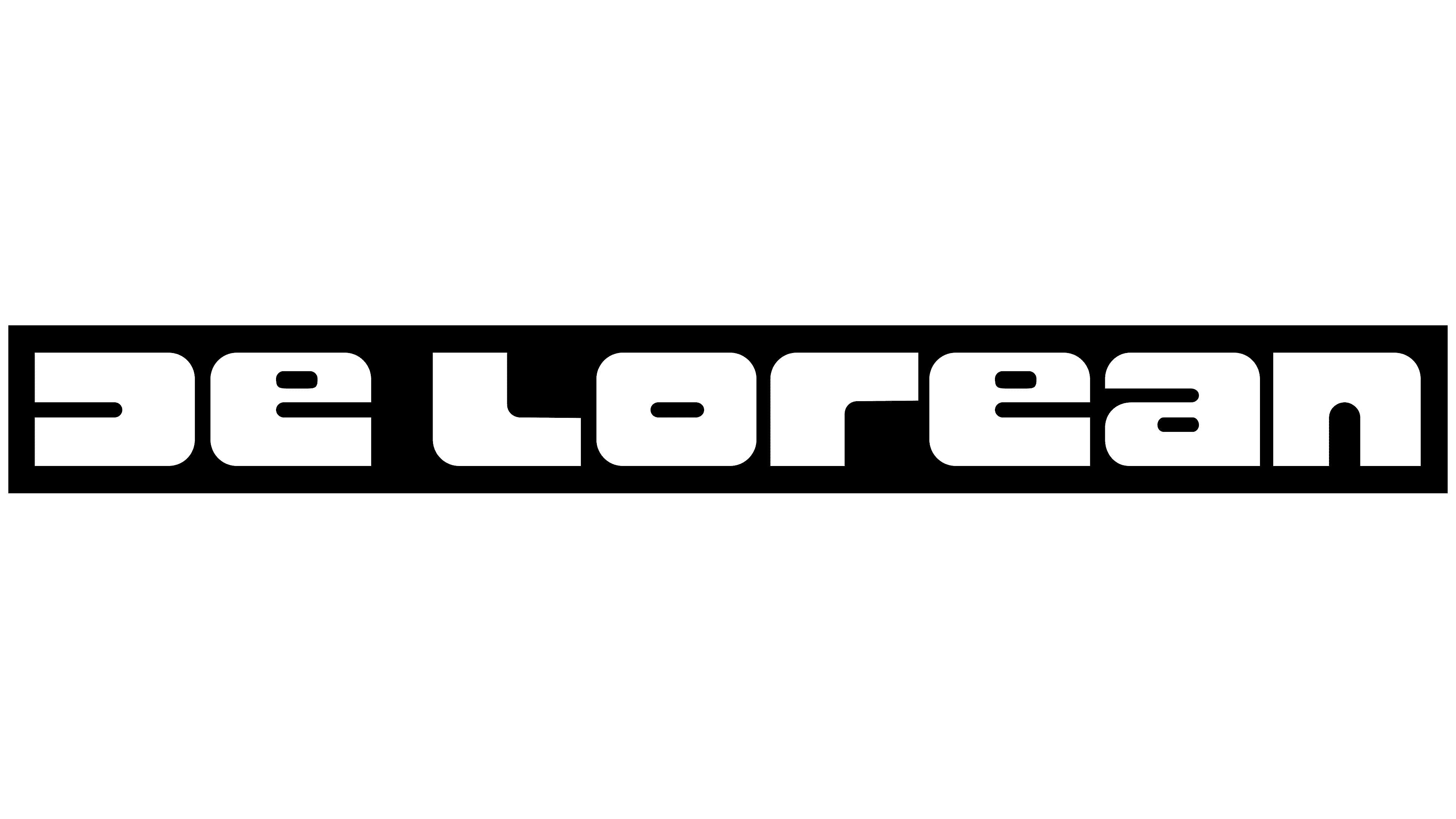
There was also an alternative version of the symbol with the inscription “DELOREAN.” It used the same unusual font as the main logo. The company name was white and inside a black rectangle. Such graphic designations were typical of the 1970s style.
1995 – 2008
![]()
In 1995, Stephen Wynne revived a long-forgotten automotive brand. He used the DMC logo to associate the new company with the old one, even though they are two unrelated organizations. The reworked abbreviation has become completely black and lost its volume. An additional inscription, “DELOREAN MOTOR COMPANY,” appeared at the bottom. It used a thin capital sans-serif typeface.
2008 – 2022
![]()
The classic silver palette made a comeback in 2008 with a three-dimensional effect. The letter “M” is slightly lighter than the others. In the modern version, the black outlines are complemented by the same dark shadows. White spaces are wider than usual, making the abbreviation easier to read and more elegant. Below, as before, is the manufacturer’s full name. The font has remained largely unchanged, but the lettering is white and has a thin black outline.
The 2D print version contains the black word “DMC.” Two lines of white and black surround each letter. The outer frame is interrupted at the corners, creating a visual sense of volume.
The current DeLorean Company (DMC), which is historically unrelated to its predecessor, uses the Zapf Humorist (also known as Bitstream Optima) font for its logo. And based on the abbreviation icon, the Rustproof Body typeface was developed.
Black, white, silver, and gray in several shades are the bases of the color scheme. They are combined so that the emblem appears metallic and three-dimensional.
2022 – today
![]()
It’s time for elegance. The company decided to convey it through thin letters. To do this, she chose a narrow font, which allowed her to treat the glyphs not as typographic signs but as graphics. Creative searches resulted in “D” and “C” with a shortened bottom stroke, as well as “M” with a bird flying in the middle. This is an allusion to the sliding doors.
Both sides’ symbols repeat their shapes, and the central element suggests that the car model is characterized by incredible speed and smoothness; it seems to be flying. The bird’s silhouette results from the lengthening of the upper “M” lines, which are usually pointed. No gray gradient or chrome reflections are left from the previous options; the DMC logo is just black.
Font and Colors
When John DeLorean decided to create his dream car, he did not think long about choosing a badge for the radiator grille and used the company’s abbreviated name, DMC. This abbreviation has remained the main distinctive symbol of DeLorean Motor Company. Because the letter “D” is missing a stroke, the inscription is a perfect palindrome, reading the same from left to right and from right to left. The designers made the emblem three-dimensional to emphasize visual harmony, adding contrasting lines (silver and white) along the edges. The fact that “D,” “M,” and “C” are oriented differently speaks to the brand’s global orientation and its desire to enter foreign markets outside the United States.
![]()
In the current emblem, the custom typeface aligns with the brand concept rather than relying on existing typography. Therefore, it has no analogs. The letters are capitalized and wide, with thin lines and a sans-serif style. Black remained the predominant color in the logo palette.