In such a pickup truck, no off-road is scary. This is a direct message conveyed by the Dodge Ram logo in the form of a big horned ram in this series of cars. Strong horns testify to the reliability of cars, a stubborn look – about high cross-country ability, a powerful forehead – about a solid body. The harmony of identity and technical characteristics dominates the symbol.
Dodge Ram: Brand overview
| Founded: | 1981 |
| Founder: | Stellantis North America |
| Headquarters: | United States |
The Dodge Ram is a full-size pickup truck manufactured by Chrysler Group LLC. Now it is produced under the brand name Ram Trucks, and previously it was issued under the brand name Dodge. In the U.S. and Canada, the car is better known as Ram. This name was given to it in 1981. The car is a company’s proprietary design, which began developing four-wheelers in 1914, long before the Chrysler Corporation. At that time, the company was called Dodge Brothers in honor of its founding brothers. At present, the pickup is ranked as a light-duty truck and was three times awarded the title of the truck of the year by the Motor Trend. It is produced in Mexico by Saltillo Truck Assembly (located in Saltillo, Coahuila) and in the United States by Warren Truck Assembly (in Michigan). In 2021 the brand became part of the Stellantis.
This car exists in four modifications, which from generation to generation became more perfect. The first model dates back to 1981-1993. It came out on the Chrysler AD platform. The second Dodge Ram was produced from 1994 to 2002 and was based on the Chrysler BR / BE. The third generation was produced from 2002 to 2008. The platform was variable – Chrysler DR / DH / D1 / DC / DM. Production of the fourth version started in 2009 and is still going on. Designers of the updated pickup were Ryan Nagode and Scott Krugger.
Meaning and History
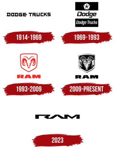
Despite the frequent changes in style and stuffing of light trucks, its logo has not changed dramatically. What changed most was the identity mark of the company itself, as it expanded and transformed. This can be traced by years of the appearance of updated emblems. The brand had many of them, starting from the foundation of automobile enterprise by brothers John F. Dodge and Horace E. Dodge.
What is Dodge Ram?
Dodge Ram is the old name for Ram pickup, which was used until 2010. It is a series of pickups, first introduced in 1980 and sold under the Ram Trucks brand. The vehicles are known for their high power, making them in demand in construction, agriculture, and cargo transportation. They can have various cabin and body options.
1914 – 1969
The logo is wordy. It bears nothing but the inscription “Dodge Trucks.” It is on a single line and in a stylized square font. The inter-letter space is narrow, and the inter-word space is wide. Each character is unique. The “D” has flat serifs protruding to the left. “O” and “G” are identical – they look like squares and have no serifs. “E” has an elongated horizontal stripe in the center, so the letter resembles a pitchfork pointing to the right. The “U” and “C” are the same. They look as if they repeat each other but look in different directions, taking the shape of wide staples. The lettering is black and on a white background, thanks to which it immediately attracts the eye.
1969 – 1993
After the redesign, the logo was divided into three parts. The upper rectangle shows a pentagon with a narrow star in the middle. Each of its rays rests in a separate corner. At the bottom, the company’s full name, “Dodge Trucks,” is typed on the same black background. The letters are stenciled, bold, stretched upward, and have no serifs. Between the black rectangles is a white one. It contains the brand name is an abbreviated version – simply “Dodge.” These symbols are wider than the previous ones and have a square shape, and the inscription consists of a combination of upper and lower case letters.
1993 – 2009
In the process of working on the second and third generations of Ram Trucks pickups, the automobile company changed both the logo and name, becoming the Dodge Ram. However, that was the name of the trucks, which were produced in 1981. Those were the upgraded Ram and Power Ram, which came to replace the Dodge D-Series. The brand got its original name after the decor on the hood. The cool-horn ram’s head print first appeared on Dodge cars in the 1930s. The animal is located directly and looks menacingly from the side, pointing forward with wide horns. And the image of the ram is double: one red (external), the other white (internal), projecting from the negative space. At the bottom, the word “Ram” is written in columnar letters.
2009 – today
While retaining the lettering style, the designers completely redesigned the graphic part. They kept the shield and the image of the ram but changed their design. Now a three-dimensional head of chrome with a gradient from light gray to lead is looking from the hood of the Ram Trucks. The professional combination of shadows and highlights creates a 3D effect. At the same time, they are not scattered chaotically but arranged in a structured (even mirror-like) way. The head and horns fill the entire inner space of the metalized shield with a volumetric frame.
2023
The logo introduced in 2023 contains the black word “RAM.” Due to the indistinct squashed font, the inscription resembles horns, but these associations are not obvious. All three letters are connected to each other. At the same time, each of them has a small triangular notch in the upper right corner. This makes the brand name dynamic, especially considering that the traditional horizontal strokes are missing from the “R” and “A.”
Font and Colors
The evolution of the Ram Trucks logo went hand in hand with the company’s development and its vehicles. The logo received another update in the most important stages to adorn the branded vehicles with improved features. It is worth noting that the symbol went from simple to complex, which is not characteristic of all brands, as, in recent years, there has been a tendency to simplify.
For the modern emblem of the pickup truck manufacturer, the Optiflare font was chosen with squat, wide letters without serifs. The lines of the characters are smooth, bold, and flat. The signature palette consists of a classic combination of black and white. The 1993 version also features red.
Dodge Ram color codes
| Black | Hex color: | #000000 |
|---|---|---|
| RGB: | 0 0 0 | |
| CMYK: | 0 0 0 100 | |
| Pantone: | PMS Process Black C |
