


![]()
The global pizza chain Domino’s has unveiled a refreshed brand developed by the agency Work In Progress. Founded in 1960 and operating more than 21,500 locations, the company decided to update its visual identity while retaining its recognizable identity.
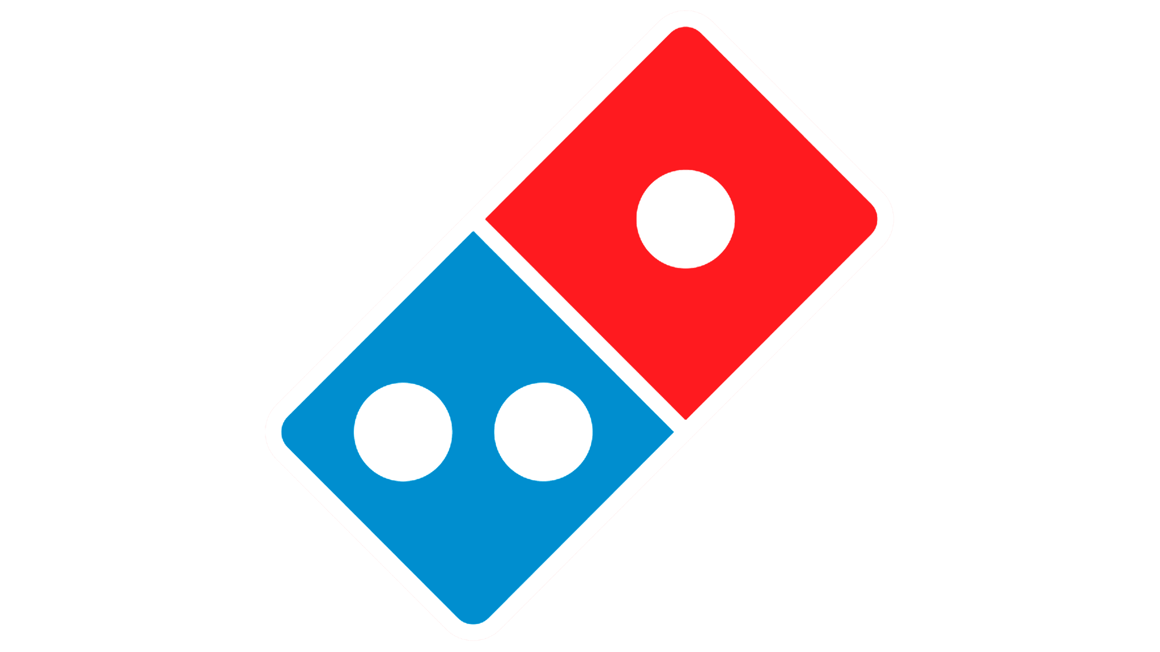
The main goal is to convey the warmth and flavor of freshly baked pizza. The traditional blue and red have become brighter and richer, and the logo has kept its familiar domino shape while looking cleaner and more modern. The dots are larger, the lines are neater. The typeface is bolder and more expressive, the rounded forms are gone, and the letters “m” and “n” now resemble pizza slices.
![]()
One of the key creative ideas is the signature Cravemark. In the word “Domino’s,” an extra “m” appears, forming “Dommmino’s.” The concept reflects the sound of pleasure when a person says “mmm.” The idea continues in a new jingle by musician Shaboozey, where three “m” tones form a recognizable melody that ends with the sound of falling domino tiles.
The packaging has become simpler and more expressive. The boxes now rely on clean brand colors and a concise logo, while the premium lines, Handmade Pan and Parmesan Stuffed Crust, feature a black-and-gold version.
The updated typography is based on a variable font with different weights, helping the brand maintain a consistent tone in advertising, signage, and menus.
Domino’s will gradually roll out the new style across all customer touchpoints, from advertising and the app to uniforms and restaurant design. The rebranding reflects the idea that Domino’s remains the pizza loved by millions, now presented through a more expressive and lively visual language.
![]()