


![]() DoorDash Logo PNG
DoorDash Logo PNG
The DoorDash logo indicates the delivery speed. Orders are executed almost lightning fast. The service managers are always friendly, and, as the emblem shows, the company’s entire work style is built on easy, pleasant communication with the client.
DoorDash began in 2012 in Palo Alto when Tony Xu, Stanley Tang, Andy Fang, and Evan Moore interviewed local businesses. A macaron shop owner explained she could not organize delivery. Research showed that about 85 percent of restaurants outside New York had no delivery at all.
In January 2013, they launched PaloAltoDelivery.com with PDF menus and a phone number, handling orders and logistics themselves. Later that year, the team joined Y Combinator and raised $120,000. The service was renamed DoorDash and incorporated in June 2013. In 2014, Sequoia Capital led a $17.3 million round, enabling expansion to Los Angeles, Boston, and other cities.
Competition intensified with the launch of Uber Eats in 2014 and Grubhub, which has been active since 2004. DoorDash focused on suburban markets rather than dense urban centers. The approach increased coverage, and by 2019, the company had surpassed Grubhub in the US market share.
In 2017, DoorDash introduced DashPass, a subscription model influenced by Amazon Prime, aimed at increasing order frequency. In 2019, the company faced criticism for tipping practices in which tips were used to offset base pay. In August 2019, the policy changed, and couriers began receiving 100 percent of tips on top of guaranteed pay.
Also in 2019, DoorDash acquired Caviar from Square for $410 million to target higher-end restaurants. However, its focus later returned to the mass market. In December 2020, the company went public on the New York Stock Exchange under DASH, raising about $3.37 billion at a valuation above $60 billion.
In 2022, DoorDash acquired Wolt for about €7 billion, expanding into more than 20 countries across Europe and the Middle East. In 2025, it announced plans to acquire Deliveroo for $3.9 billion, continuing its international expansion.
Meaning and History
![]()
DoorDash is a privately held company established in 2013 in San Francisco. As it developed, it changed three emblems that show progress, experience, and professionalism. The new identity allows her to establish strong ties with representatives of different socio-demographic groups.
What is DoorDash?
DoorDash is a company that manages online food ordering and home delivery. Launched in 2013, it quickly surpassed competitors and rose to second place, only to be overtaken by Grubhub. Its coverage areas include the United States, Japan, New Zealand, Germany, Canada, and Australia. The headquarters is located in San Francisco, California. The founders are Tony Xu, Evan Moore, Andy Fang, and Stanley Tang.
2013 – 2014
![]()
When the delivery service first entered the profile market, it had a simple text logo. It contained a two-color “doordash” lettering in sans-serif lowercase letters. The first part of the name was black, and the second was dark red.
2014 – 2018
![]()
In 2014, experts developed a new brand strategy, which involved a radical redesign of the logo. The word “DOORDASH” has become more prominent thanks to the uppercase translation. The phrase “delightful delivery” appeared in small letters below. This is the company’s motto, its goal, and the main principle of work.
Designers supplemented the text with a graphic element consisting of straight and semicircular lines. They not only represent the two Ds in the name but also the Japanese Shinkansen, a high-speed train. The pattern of red lines symbolizes movement. The text is also red, so all the elements are interconnected.
2018 – today
![]()
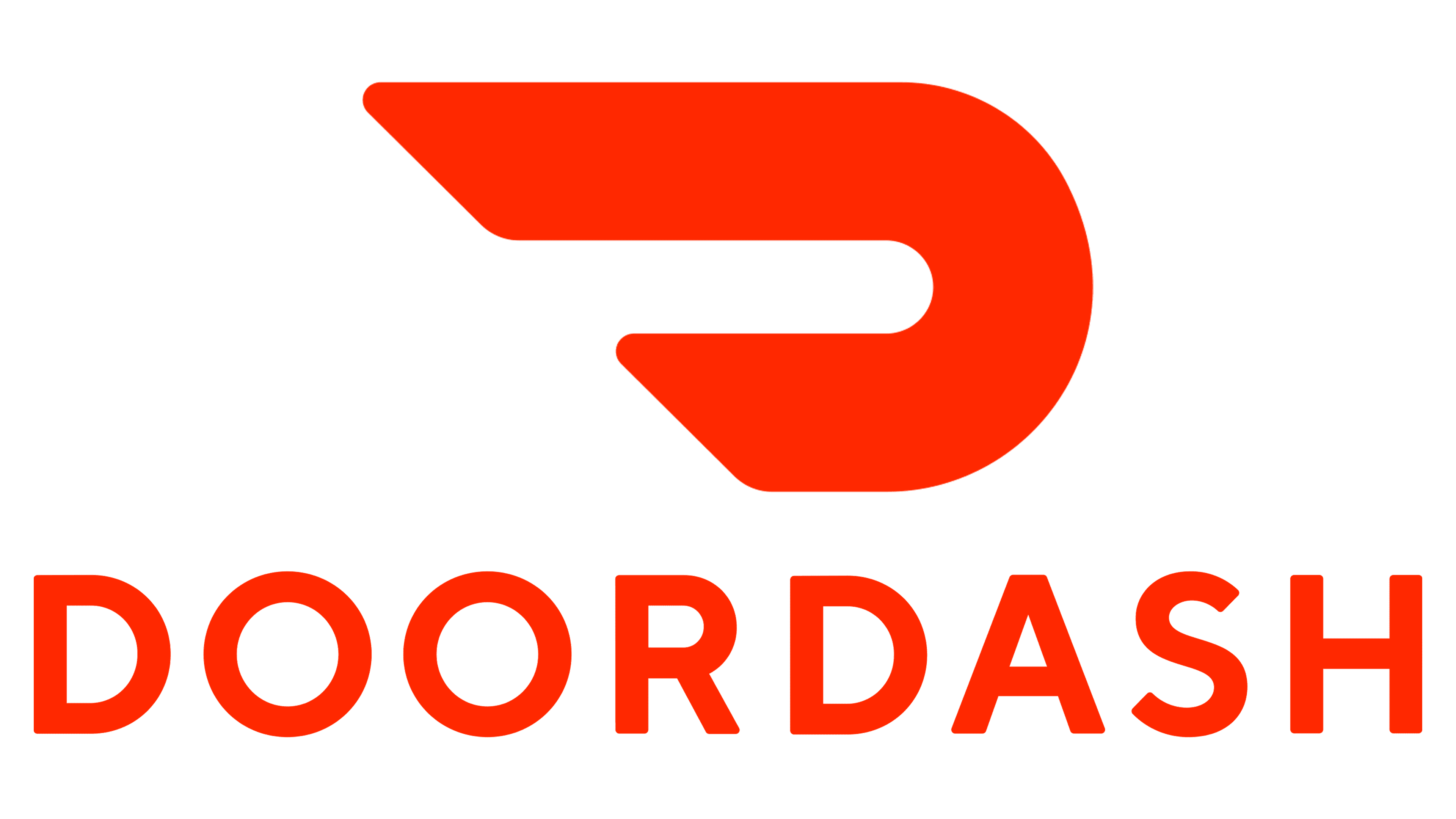
The character branding agency has developed a new style for DoorDash, featuring an improved logo and a revised color scheme. Simultaneously, the delivery service remained true to its ideals: its visual identity included a place for the high-speed Shinkansen express train. It is represented by a single curving stripe that creates negative space for the “dash,” symbolizing evolution. The company name is located to the left of the graphic symbol.
Font and Colors
Recently, DoorDash has been using an abstract Shinkansen image as a symbol. Associative parallels are drawn here because the Japanese passenger train and the delivery service share many similarities: they are futuristic, pragmatic, and ultra-fast. They also connect people and have clear logistics in place. The emblem communicates the brand’s mission across all interactions with restaurants and consumers.
Character designers have kept the original sans-serif font. They only reduced the spacing a bit to keep the company name compact. The branding agency focused on the color palette, which now includes white for the background and Electric Orange (# FF3008) for the logo components.