Although the Downy logo is delicate, at the same time, it is businesslike because it refers to the world of smells and requires exquisite design. The emblem’s soft style suggests its association with soothing laundry conditioners. In this way, it conveys to customers the idea of freshness, silkiness, and lightness.
Downy: Brand overview
| Founded: | 1960 |
| Founder: | Procter & Gamble |
| Headquarters: | United States, Philippines |
| Website: | downy.com |
Meaning and History
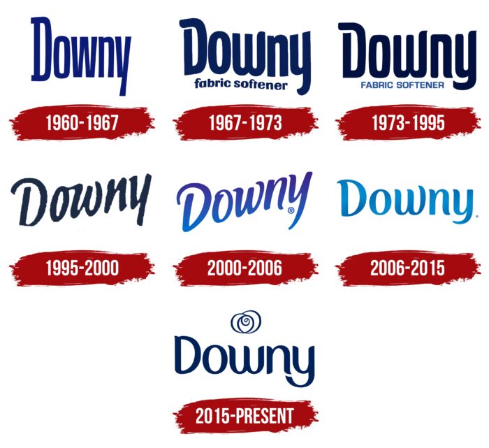
Visual recognition of the brand is at a high level when it comes to the US, Canadian, and UK markets. At the same time, in most countries of the world, the company is known under the brand name “Lenor.” The target audience was presented with six variants of the logo all the time. The key feature is the conciseness and minimalism of the image. Therefore, the Downy logo can be easily placed on any surface.
What is Downy?
This is one of the largest companies in the world when it comes to the production of fabric softeners. More than 50 years of experience in the market and millions of satisfied customers from all US states and far beyond the borders of the country once again confirm this.
1960 – 1967
The first version was introduced in 1960, immediately after the company’s founding. It was blue wording on a white background. The brand name used a classic bold sans-serif font with elongated letters. This is most noticeable when looking at the “y.” All letters, except for the initial, are in lower case.
1967 – 1973
The first logo redesign resulted in a significant improvement to the logo. Now you can see rounded corners in all the letters. In addition, you can notice that all the characters are not on the same horizontal line; hence the effect of “jumping” letters is created. Many characters have a unique writing style, such as the letter “w.” The right vertical line is much longer than the two left ones, and the rounding in it is more distinct. Also, you can see the space between the lines in the letter “D,” which makes the company logo more mysterious.
In addition, an additional inscription in blue, “fabric softener,” appeared under the brand name. It is in lowercase, bold sans-serif, but much smaller.
1973 – 1995
The style for the main inscription remained identical to the previous version, but the lines in the letters D, w, and y became much longer.
At the same time, the additional inscription received significant changes. The blue color has been changed to light blue, and all letters in the phrase are in the upper case. The font itself has become simpler and more concise. As a result, the two elements of the logo have become independent of each other.
1995 – 2000
Minimal changes if we talk about the word “Downy” itself. The ends in the letters have become more “sharp.” Also, there was a small italic, which visually resembled a handwritten style. Between “o” and “w” appeared an indivisible line.
2000 – 2006
This redesign made the logo of the American company more colorful and friendly. The dark blue color has changed to a gradient with a predominance of bright shades. Serifs appeared in the letters, but the style resembled previous versions. At the same time, the inscription rose diagonally to the right, which looked fresh and convincing.
2006 – 2015
The gradient has been changed to blue. Also, the name “Downy” was given on one line. Pleasant and confident lines in the letters evoke positive emotions. One of the features of the company is that minimal changes in the logo from redesign to redesign allowed buyers to get used to new variations quickly. Also, the contrast in the length of the lines, for example, in the letter “D” and “y,” looks interesting and unusual.
2015 – today
As a result of the latest, to date, redesign, the inscription became dark blue and was located on one line. The line in the “y” became even longer, but the main change concerned another detail, namely the appearance of the emblem in the form of a “swirl.”
Font and Colors
The style for the brand name at all stages was approximately the same. This is a classic bold font that also uses italics. However, the peculiarity of the word inscriptions was the unique lines in the letters, which the main competitors in the market did not have. Thus, even though all letters except for the “D” are in lower case, they look powerful and confident.
The white and blue color palette became the basis for the logo. It has not changed since the company was founded, although sometimes there were works with shades. Bright and modern tones immediately evoke positive emotions in the target audience.
Downy color codes
| Royal Blue | Hex color: | #002159 |
|---|---|---|
| RGB: | 0 33 89 | |
| CMYK: | 100 63 0 65 | |
| Pantone: | PMS 2757 C |
