The DPD logo indicates that the package is sealed and ready to ship. Indicates well-adjusted logistics. It makes the client feel the speed of service and the importance of his package. All the attention of the company is focused on the cargo.
DPD: Brand overview
| Founded: | 1977 |
| Founder: | La Poste S.A. |
| Headquarters: | Germany |
| Website: | dpd.com |
DPD, together with the brands Seur (Spain) and Chronopost (France), are part of the DPDgroup. It is a multinational service providing EMS services all over the world.
It belongs to the French company La Poste S.A., which was established in 1576 to deliver private letter-post and internal communications between different government levels.
La Poste was a monopoly. She succeeded in taking over the express transport market after establishing Chronopost in 1985. And in 1999, she bought the German freight forwarder DPD Deutscher Paketdienst and gave up all the acquired shares to her subsidiary GeoPost.
Meaning and History
The predecessors of the modern DPD are three services at once: Deutscher Paketdienst (Germany), Interlink (Ireland), Parceline (Great Britain). In January 2008, they were all renamed Dynamic Parcel Distribution. A little later, in 2015, GeoPost merged the Seur, Chronopost, and DPD branches under the DPDgroup roof, which later included BRT (Italy) and Lenton (Asia). Despite several such brands, the German DPD, which dates back to 1977, remained the company’s main manager.
The service logo shows the abbreviation DPD. At first, it stood for three words in German: Deutscher Paket Dienst. This name was preserved when the forwarder moved to La Poste. But after renaming in 2008, the acronym began to stand for Dynamic Parcel Distribution.
What is DPD?
DPD is a brand under which Geopost (formerly DPDgroup) operates in most European countries. This three-letter abbreviation stands for “Dynamic Parcel Distribution.” Geopost is an international courier service based in France that provides parcel delivery services worldwide. It uses different trademarks: for example, it is known as Chronopost in its homeland and Mauritius, as BRT in Italy, and as Seur in Spain.
1977 – 2015
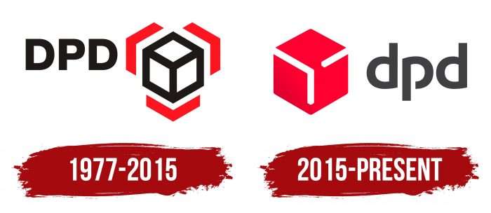
Until 2015, the DPD brand used a logo that passed to it from its German predecessor. The abbreviation was written in black sans serif capital letters and was on the left. On the right was a white cube with black edges, framed by three red lines. The three-dimensional geometric figure symbolized the parcel post.
2015 – today
DPD, together with other delivery services, has been merged into an integrated international DPDgroup network. This happened in 2015 after the restructuring of GeoPost. The Lippincott agency developed the name, logo, and corporate culture for the new holding. Before that, experts analyzed 15 business areas to understand the essence of the company better.
They created the flexible brand positioning, adapting it to all parts of the DPDgroup. Therefore, DPD and Chronopost have very similar emblems: on the left – a stylized cube, on the right – a dark gray inscription. Only the German unit has a red polygon, while the French unit has a blue one.
The multi-faceted figure symbolizes the connection between the different companies in the DPDgroup. The emblem has the shape of a hexagon with two deep indentations on the right and left. White lines create volume so that it is clear that this is a cube and not a flat 2D object.
Another association is directly related to parcels and indicates the occupation of DPD. The figure looks like a box or box – the main cargo of an express carrier. The same logo was used on the previous logo, but Lippincott has visibly modified it to reflect its pragmatic approach. The evolved cube is a tribute to the tradition of Deutscher Paketdienst and a step into the future of Dynamic Parcel Distribution.
DPD: Interesting Facts
Dynamic Parcel Distribution (DPD), established in Germany in 1977, is a major force in the parcel delivery world, known for its innovative services and global reach.
- Origins: Since 1977, DPD has become one of Europe’s top parcel service providers and has a significant global presence.
- Part of GeoPost: Since 2001, when GeoPost (under France’s La Poste) acquired a majority stake, DPD has expanded its services and international network.
- Tech-Driven Services: DPD is a leader in using technology to enhance deliveries, offering real-time tracking and predictive delivery windows to improve customer experience.
- Eco-Friendly Deliveries: DPD is committed to carbon-neutral shipping at no extra charge and focuses on route optimization, alternative fuel vehicles, and carbon offset projects.
- Predict Service: With Predict, customers get a one-hour delivery window notification and options to customize their delivery, improving convenience and control.
- Global Network: DPD delivers to over 230 countries, with a particularly strong ground network in Europe, ensuring efficient service.
- Convenient Pickup Points: A vast network of parcel shops and lockers lets customers easily pick up or drop off packages at their convenience.
- E-commerce Solutions: DPD caters to online businesses with integrated shipping tools, returns management, and specialized delivery options, supporting the e-commerce boom.
- Recognized Excellence: The company has earned multiple awards for its innovation, service quality, and sustainability efforts.
- Part of DPDgroup: As a member of DPDgroup, alongside Chronopost, SEUR, and BRT, DPD benefits from an extensive range of delivery services across Europe.
DPD stands out for its commitment to customer service, innovation, and environmental responsibility, making it a trusted name in parcel delivery worldwide.
Font and Colors
The designers have converted the letters to lower case, wishing to make the inscription more inviting and “human.” They also developed new typography that is radically different from the previous version. The font is similar to Explora Explora by typographer Benoît Sjöholm, except in the word “DPD,” the top edges of both “d” s are not angled. The second analog is Canaro SemiBlod from the German studio Rene Bieder. Regardless of what the logo’s creators were guided by, they modified the typeface, separating the lower part of the semicircle from the vertical line in the letter “p.”
The color scheme has evolved too. The black lettering turned gray (shade # 403F41), and the black and white geometric shape turned into a red cube with a gradient transition from cherry (# C30030) to Pink and Red (# DD002E).
DPD color codes
| Onyx | Hex color: | #424244 |
|---|---|---|
| RGB: | 66 66 68 | |
| CMYK: | 3 3 0 73 | |
| Pantone: | PMS 446 C |
| Crimson | Hex color: | #dc0032 |
|---|---|---|
| RGB: | 220 0 50 | |
| CMYK: | 0 100 77 14 | |
| Pantone: | PMS 199 C |


