


![]() Dream Chasers Records Logo PNG
Dream Chasers Records Logo PNG
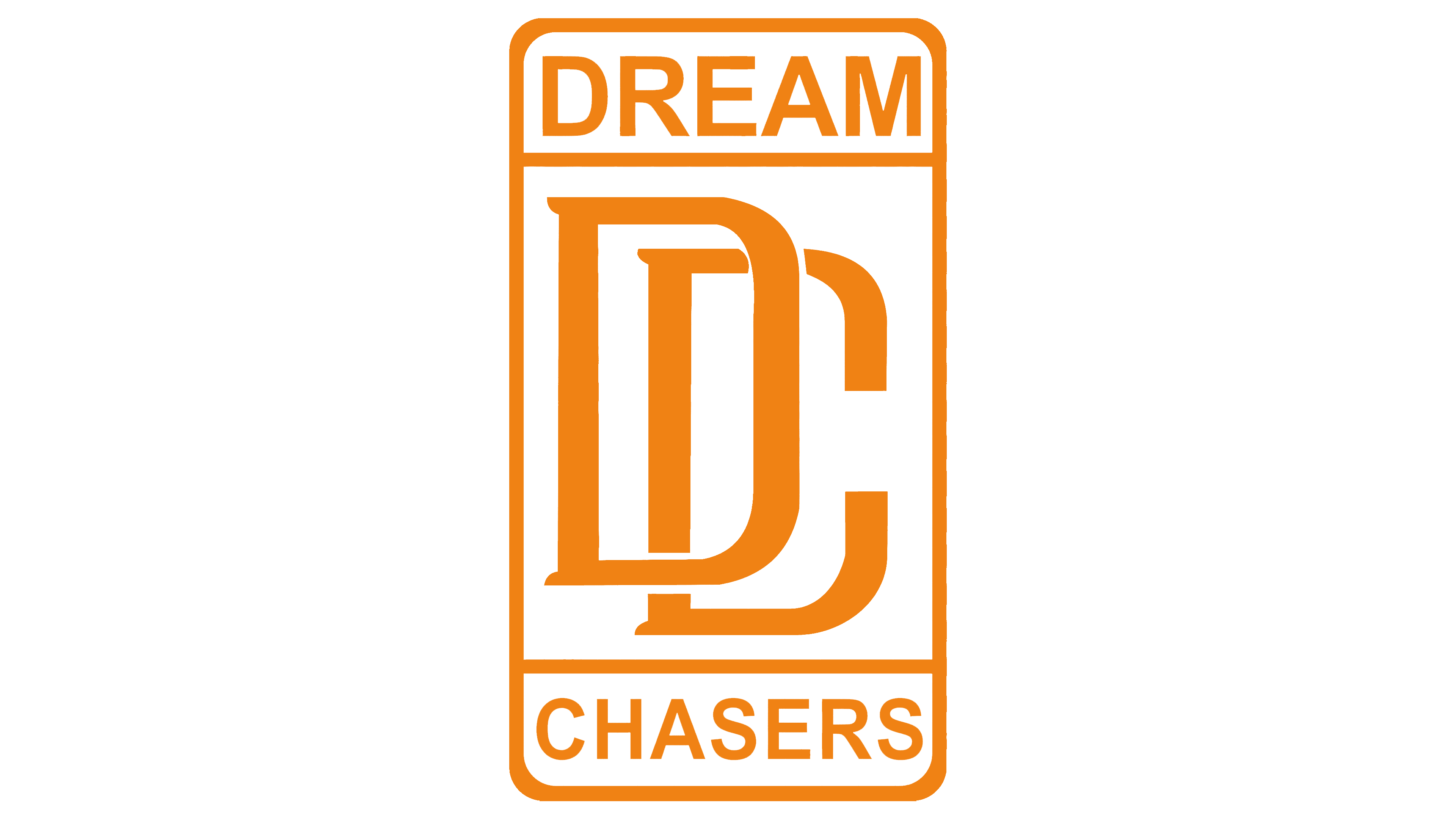
Although the Dream Chasers Records logo has a simple structure, it looks stylish and modern. The geometric balance is associated with confidence and determination. The clear lines symbolize an ambitious spirit, perseverance, and a desire to overcome challenges.
Meaning and History
![]()
The Dream Chasers Records logo reflects its name, which echoes the title of Meek Mill’s 2011 mixtape Dreamchasers. In this way, the hip-hop artist showed that the project belongs to him, the author of the successful and famous song collection. The emblem distinguishes the label from others and enhances its prestige in the eyes of potential partners. It’s an important part of the marketing strategy, allowing the brand to demonstrate its uniqueness in the music world. Visual signs are used in promotional materials and on album covers to draw attention to the company’s products.
What is Dream Chasers Records?
Dream Chasers Records is a record label from the United States. It was founded in 2012 and relaunched in 2019 by rapper Meek Mill in partnership with Roc Nation. Its parent company is Universal Music Group. The main office is located in Philadelphia and New York. The label has collaborated with artists like Lil Snupe, YBS Skola, and Calboy.
2012 – today
![]()
The core of the Dream Chasers emblem is a vertical rectangle with rounded corners. It is divided into three parts:
- At the top is the word “DREAM,” set in tall uppercase letters without serifs;
- In the center, there is a monogram of “D” and “C” with matching shapes and small serifs.
- At the bottom is the inscription “CHASERS,” set in the same font as the top word.
The strict geometric shapes emphasize the professionalism and reliability of Dream Chasers Records, which is important for relationships with business partners. The minimalist design signals the brand’s ambition to remain relevant and aligned with contemporary music industry trends.
Font and Colors
The label’s name is written in a font similar to Diaria Sans Pro Semi Bold by Mint Type. However, some details are different: for instance, in “A,” the left diagonal is thinner than the right, and in “C,” the ends are longer, stretched forward, and only slightly bent inward.

All elements of the logo are black, making them more visible on a white background. The monochromatic color scheme highlights the brand’s purity and straightforward intentions.