


 Duke Energy Logo PNG
“We generate energy,” says the Duke Energy logo. The emblem betrays the importance of the company’s work for people’s lives. Hidden in the symbols is a hint of modern technology and a responsible approach to fulfilling one’s mission.
In the early 1900s, Dr. Walker Gill Wylie saw the Catawba River’s potential for power, as Carolina textile mills needed reliable electricity. The Wylie brothers founded Catawba Power Company and completed a 3.3-MW hydroelectric plant in 1904.
The project drew James Buchanan “Buck” Duke, a tobacco industrialist, who invested in the venture. In 1905, Southern Power Company was incorporated. Duke and engineer William States Lee built the business as a connected system of dams and high-voltage transmission lines, not isolated power plants. In 1913, Duke created Southern Public Utilities Company to serve residential customers across the Carolinas. In 1924, Southern Power became Duke Power.
By the 1930s, Duke Power was one of the region’s largest employers and a core electricity supplier in the Piedmont Carolinas. Coal entered the mix in 1911, then grew during World War II as Duke supplied power to military factories. In 1956, Duke joined the Carolinas-Virginia Nuclear Power Association. The Oconee nuclear license was issued in 1967, and by 1975, nuclear power accounted for 31 percent of its generation.
In 1971, Griggs v. Duke Power Company became a major U.S. Supreme Court case on hiring discrimination. In 1997, Duke Power merged with PanEnergy to form Duke Energy, adding gas infrastructure. In 2007, it spun off the gas business as Spectra Energy. Duke bought Cinergy in 2006, merged with Progress Energy on July 3, 2012, and acquired Piedmont Natural Gas for $4.9 billion in 2016.
Meaning and History
The holding began at the turn of the 19th and 20th centuries when Dr. Walker Gill Wylie and his brother invested in a hydropower project on the Catawba River in India Hook Shoals. Needing additional funds to implement his vision, he convinced James B. Duke and his partner, James Blaney, to invest in a dedicated Southern Power Company.
In 1917, another structure appeared – the Catawba Power Company. It was later established to combine several utilities owned by Duke, Blaney, and their associates. In 1924, the organization was renamed Duke Power. The enlarged company merged several subsidiaries: Western Carolina Power Company, Great Falls Power Company, Catawba Power Company, and Southern Power Company. These companies were the holding company’s true founders. In addition, another company, Southern Public Utilities, supplied retail electricity. Many other mergers and acquisitions followed, influencing the logo.
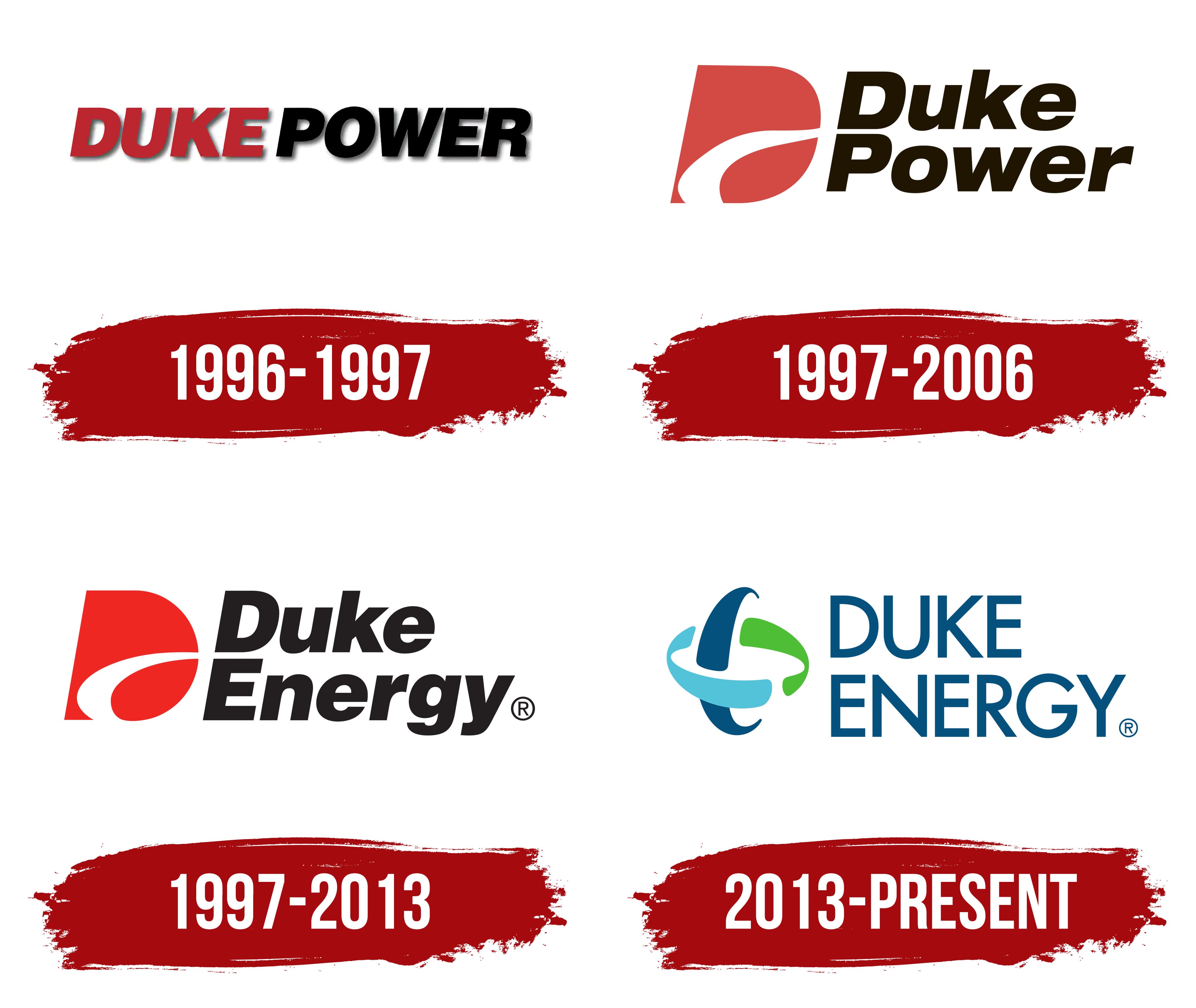
However, the company did not immediately acquire its permanent emblem. It appeared much later, in late fall 1996, when Duke Power announced plans to merge with PanEnergy Corporation of Houston, Texas. So Duke Energy was launched, taking one word from each name. And it was then that he presented his first logo – temporary, for a transitional period. And there are four of them in total.
What is Duke Energy?
Duke Energy is an American holding company that unifies several energy companies. They own gas, coal, nuclear, hydroelectric, wind, and solar power plants. It distributes electricity to more than 7 million customers across several US states. The holding company has built its success over more than 100 years, founded in 1904 as a small company serving North Carolina residents.
1996 – 1997

The debut logo uses only one element: the holding’s name. It is played with different colors. At the same time, the authors connected the parts, leaving a barely noticeable gap between them. They deliberately placed the letters close together so even the smallest distance between words felt more distinct. The first half of the inscription is red; the second is black. The white background also shows dark shadows from left to right, giving the emblem a three-dimensional look.
1997 – 2006
Despite the merger and rebranding of the two energy giants, the former name continued to exist independently. Duke Power was Duke Energy’s subsidiary name until it merged with Cinergy in 2006. The logo features a solid red capital “D” with a curved white stripe. To the right of it are three rows of inscriptions: at the top, “Duke”; in the center, “Power”; at the bottom, “A Duke Energy Company.” The last phrase indicates the organization’s affiliation. The first two words are in bold. The phrase is written in a small, thin typeface.
1997 – 2013
The parent holding received the same logo as the subsidiary, only without specifying the affiliation, and with the second part of the name changed. The inscriptions are wide, with a slight rightward slope. They are in lowercase, except for the first letters.
2013 – today
After the 2012 merger with Progress Energy, the company announced the upcoming redesign immediately. As a result, a new emblem appeared in March of the following year. It is radically different from everything that came before and consists of a stylized letter “E” surrounded by a two-color stripe. The graphic sign reads “Energy,” and the chain’s links serve as an allegory for the relationships among different types of energy. The lines are arched and open. To the right of the icon is the Duke Energy company’s name, grouped in two rows. The designers changed the inscriptions’ style, using a sleek, thin, elongated uppercase font.
Font and Colors

In its first year of operation, the company chose a temporary emblem consisting only of a red-and-black name. In subsequent modifications, the developers added a graphic character, a capital letter “D”, to the text. Then they replaced it with another symbol: an oval and a semi-oval linked together. The designers also corrected the color palette, using a calmer scheme with tones instead of red and black.
The authors chose a typeface for the debut logo that most closely resembles Rude Black Italic, with wide, smooth sans serif characters. In the second version, they used a font close to Foundation Sans Black Italic from FontSite Inc., and in the current emblem, Futura Futuris Regular. The only difference is the cut corners of the letter “N” (in the original, they are sharp).
Signature colors were originally standard in industries such as the power industry: a classic mix of red and black. In the current emblem, they are replaced with natural shades: green #4ebf34, blue #00507e, and blue #52c4db.