


![]() Dulux Logo PNG
Dulux Logo PNG
The British paint company has, of course, chosen a colorful logo. The Dulux logo simultaneously conveys the brand’s specialization, its main product, and the concept. Such a capacious style allows you to convey key information to customers so they do not make mistakes when choosing a manufacturer of high-quality paint products.
Dulux traces its origins to 1919, when the Naylor brothers moved their varnish business from central London to Slough and built production facilities on a 30-acre site. In 1926, the company joined Imperial Chemical Industries, or ICI, a new British chemical conglomerate.
In 1931, chemist H. H. Morgan developed a new alkyd paint using DuPont’s resin technology. Older lead-based paints demanded careful application, while the new formula spread more evenly and resisted wear. The name DuLux came from DuPont and “Luxury.” The first batches appeared in 1932, though contractors doubted that an easier paint could last as long as traditional coatings.
World War II changed that view. In 1939, decorative paint production ceased, and the Slough plant began producing military coatings. After the war, buildings painted with Dulux before 1939 looked better than comparable surfaces painted with older materials. By 1949, Dulux had become the leading paint among professional decorators in Britain. In 1953, it entered retail as more homeowners began doing repairs themselves, and Dulux became the first British paint brand advertised on television.
In 1961, the Old English Sheepdog appeared in Dulux advertising and became closely associated with the brand. During the 1970s, Dulux introduced custom color mixing, while the 1980s home-improvement boom expanded its range to thousands of shades. Crown Paints remained its main British rival. In 2008, AkzoNobel bought ICI and took over Dulux globally. In 2019, Nippon Paint acquired Dulux rights in Australia and New Zealand.
Meaning and History
![]()
Visual recognition of the brand is high because Dulux has millions of customers worldwide. Since the company’s inception, three logos have been presented to the target audience. All of them are made similarly, but each new redesign added unique elements that made the logo more modern and attractive.
What is Dulux?
It is one of the most sought-after paint companies for various architectural needs, with over 90 years of history and extensive market experience.
1932 – 2001
![]()
The first version of the logo appeared a little later than the company was founded. It was a verbal inscription with an emblem located to the left. Regarding the brand name, it was set in an elegant font. All letters, except for the first, were made in lower case. Thick lines in blue letters gave the inscription strength and confidence. A feature of this element is the wave motif in the letters. Smooth and curved lines look extremely confident and attractive.
In turn, the emblem was shaped as a blue circle with a double white-and-blue outline. Inside is the abbreviation “ICI” in white capital letters with rounded corners. Below it are also two wavy white lines.
2001 – 2010
![]()
The first redesign simplified the logo. The company logo has been removed. Also, you can notice slight changes in the style of writing letters. They have become taller, but the lines are becoming much thinner.
2010 – today
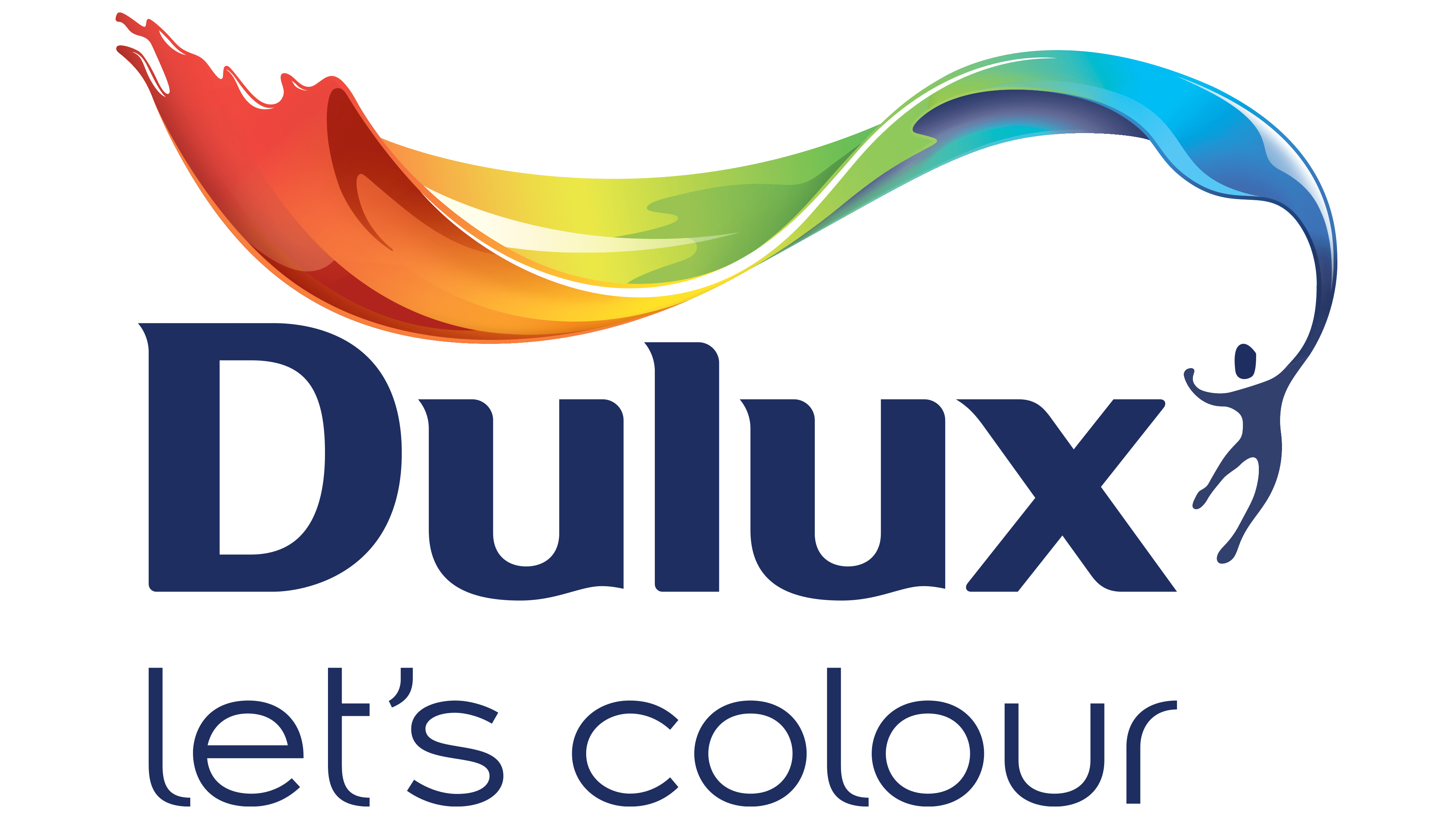
![]()
The latest redesign to date has brought significant changes to the Dulux logo. The word “inscription” itself was set in the same font, with only minimal changes to the letter lines. The well-known Design Bridge bureau created the new logo. The main change is a new color palette that makes the image look bright and confident.
The emblem is located to the right of the name. This small blue man holds a stylized flag in his hands, expanding to the left. The flag consists of all the colors of the rainbow, which are very similar to paint.
An additional “let’s color” inscription appeared at the bottom, made in lowercase letters with thin lines. Minimalism in lines, such as the absence of the left side of the horizontal stripe in the letter “t,” attracts attention. The color is identical to the main name, namely blue.
The new logo looks dynamic and modern. It evokes positive emotions and attracts the target audience’s attention, namely, architects and interior designers.
Font and Colors
Rob Clark, a graphic designer, created the unique writing style of the characters in the Dulux brand name. Visually, the font used is reminiscent of Mart Ultra Front. However, the logo’s author has worked to soften the corners and refine the letter outlines. The chosen font looks modern and progressive at all stages of the company’s development. All parameters in the logo are perfectly balanced both in terms of size and spacing between letters. The inscription is easy to read and attracts attention.
The logo’s basis is a white-and-blue color palette. However, in the latest version, all the rainbow colors were added to show the spectrum of colors you can use to create an interior.