


![]() Dunhill Logo PNG
Dunhill Logo PNG
The Dunhill logo perfectly mirrors the shape of the company’s products. It is sophisticated, stylish, refined, and versatile at once. Its rounded corners, broad lines, and clean lines convey an air of business and elegance.
Alfred Dunhill was born in 1872 in Hornsey and entered his family’s saddlery business on London’s Euston Road in 1887. After inheriting the workshop in 1893, he saw that horse transport was giving way to the motor car. He turned the leather shop into Dunhill’s Motorities, selling early motoring goods such as horns, lamps, leather coats, goggles, picnic sets, compasses, and travel clocks. Its slogan was “Everything But The Motor.”
In 1903, the business was incorporated as Alfred Dunhill Ltd. A year later, Dunhill patented the Windshield Pipe, made for smoking in open cars without sparks or falling embers. The product went on sale in 1905, pulling the company toward tobacco. After leaving the motoring business in 1907, Dunhill opened a shop at 31a Duke Street in St. James’s, selling pipes, cigars, and tobacco, and offering personalized “My Mixture” blends, which were recorded in customer files.
In 1910, a small pipe workshop opened near the store. In 1915, Dunhill pipes gained the “white spot,” a mark associated with the company’s patented pipe construction and later used as a quality indicator. During the 1920s, Dunhill opened stores in New York and Paris, turning a London specialist shop into an international brand. Alfred Dunhill retired in 1929, and management later passed through family hands.
In the 1950s, the company created the Dunhill Rollagas butane lighter. In the 1960s, Dunhill cigarettes entered the premium segment against brands such as Marlboro and Camel. In 1967, British American Tobacco bought the rights to make and sell Dunhill cigarettes outside the UK. In 1993, Richemont acquired Alfred Dunhill Ltd, leaving the name split between BAT’s cigarette business and Richemont’s luxury accessories brand.
Meaning and History
![]()
Many variations of the Dunhill logo were used in the early stages. It could be both a classic and a handwritten font for a word inscription.
In general, brand recognition is now high. This is due not only to the fact that millions of customers purchase the company’s products daily. Also, the current logo, which has been used for many years without significant changes, plays an important role.
What is Dunhill?
This is one of the most famous tobacco brands, with its products available to billions of people worldwide.
Old
![]()
The old Dunhill logo shows a quadrangular crest with a sharp base. It contains a three-line inscription, “OPTIME SIT 1907”, where the first word is translated as “best,” the second as “will be,” and the number indicates the year the brand was founded. The Latin phrase symbolizes the pursuit of high quality and innovation. Above the shield is a crown composed of small, curly elements. It was inspired by the crown of the king of Great Britain because, in 1927, Dunhill cigarettes received a royal warrant. And to the left and right of the shield rise heraldic lions. They stand on a pattern of graceful swirling lines.
Below the logo is a long horizontal line that separates the brand name. The inscription is made in a classic bold sans-serif typeface, but the designers made some letters asymmetrical. In particular, they moved the horizontal “H” stroke slightly lower and the diagonal of the “N” slightly higher. The burgundy color used for glyphs and other logo elements symbolizes luxury and nobility.
1989 – 2000
![]()
The logo’s creators designed the word “dunhill” in an original way, using lowercase black letters. They used a set of individual glyphs with elongated vertical lines for “d,” “h,” and “l.” Moreover, the square dot above the “i” is moved up to the same level as the highest letters. Because of this design, the inscription looks like a stylized barcode.
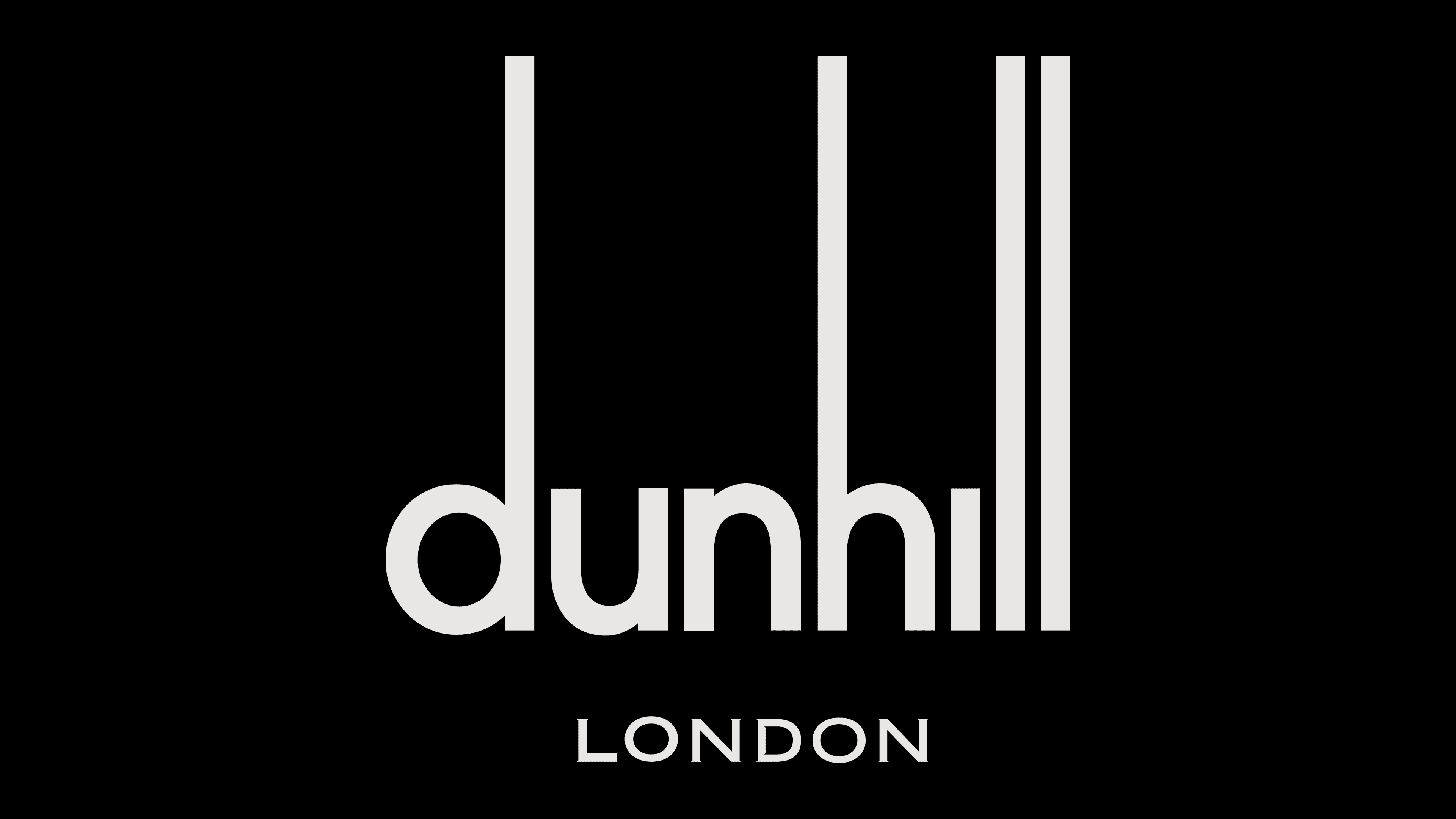
2000 – today
![]()
The Dunhill logo consists solely of the brand name, with no additional elements. Consequently, someone who has never bought the company’s products will not immediately associate the name with a cigarette brand.
The logo is based on a unique, bold sans-serif font. All letters in the word inscription are lowercase, yet each has a unique feature. In some characters, the vertical line is much longer. This effect is observed in the letters d, h, and the last l. An additional inscription, “LONDON,” is sometimes used under the company’s name.
In addition, an emblem is occasionally used that visually resembles a medieval coat of arms. This is a direct reference to Dunhill’s collaboration with George VI, who supplied him with such in the 1930s. As a result, the organization received a royal warrant as one of the tobacco suppliers for Edward, the Prince of Wales. It was issued to Dunhill in 1921.
Font and Colors
The unusual, bold sans-serif type immediately grabs the target audience’s attention. Visually, it resembles Helvetica Bold, but it has several features. The vertical lines in some symbols deserve special attention. They look mysterious yet modern and progressive. The main competitors do not use this approach in the market, and therefore, Dunhill has the opportunity to stand out and attract buyers to its products.
The logo’s basis is a black-and-white color palette. Strict and restrained tones were not chosen by chance. They allow potential buyers not to be distracted from the product, but simultaneously increase their interest in purchasing tobacco, cigarettes, etc.