The Duplo logo is childlike and fun because it accompanies a series of toys for kids. The logo symbolizes optimism, development, joy, and a positive influence on creative thinking. At the same time, the graphics are perfectly balanced with the text: in this way, the verbal information harmoniously complements the visual.
Duplo: Brand overview
| Founded: | 1969 – present |
| Founder: | Lego Group |
| Headquarters: | Nyíregyháza, Hungary |
| Website: | lego.com |
Duplo (full name Lego Duplo) is a set of children’s toys created like a designer. They are specialized versions for the youngest children (aged 18 months to 5 years). Cubes from this series have increased sizes, which significantly increases the level of security. Small children cannot swallow such toys. The development of the famous line was carried out by the famous brand – Lego Group.
Its lines are presented in children’s stores worldwide and are very popular among customers. They can be easily recognized by the corporate logo, which consists of a multi-colored brand name and a bright, cheerful rabbit. This combination of graphic elements is associated with childhood and fun entertainment and demonstrates friendliness. The overall concept is complemented by using a soft three-dimensional font, symbolizing trust.
Meaning and History
Duplo is one of the most popular lines of designers from the world-famous toy manufacturer. Its main feature is the increased size of the components in comparison with other series of cubes. The parameters of Duplo elements, including width, length, and height, are two times larger. This is done to minimize the chance of swallowing toys. But, this characteristic does not affect compatibility with traditional Lego options.
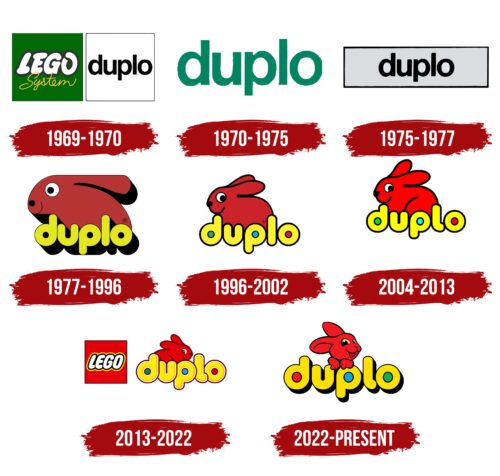
Another feature of the series is an expressive visual concept. In the early years of the brand’s existence, it had a simpler, concise look, but over time it changed to a bright and cheerful corporate identity. From 1977 to this day, the line has been produced under a colorful logo consisting of a smiling rabbit and a stylish flowing font. The chosen solution perfectly impresses the essence of the product. The design emphasizes the children’s orientation and positive and pleasant emotions.
What is Duplo?
Lego Duplo is one of the legendary brand’s most popular toy series. It features multi-colored bricks that are 2x wider and taller than traditional elements from other Lego lines. They are compatible with each other and can also be combined with classic cubes. This is confirmed even by the name Duplo itself, which means double in translation. The assortment includes a variety of figures that are produced at a factory in Hungary.
1969 – 1970
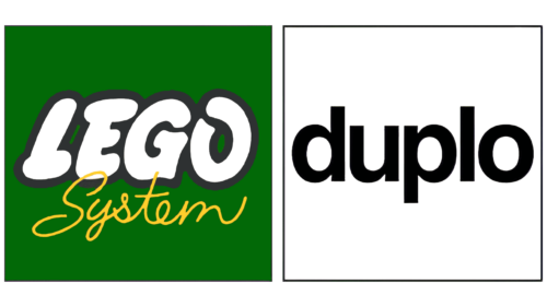
In 1969, the first Lego Duplo set with enlarged bricks was introduced. The packages featured a logo consisting of two squares. The quad on the left was dark green and contained the white word “LEGO” in bubble font and outlined in gray. A little lower was the yellow handwritten inscription “System.” The right square was white and served as a background for the black word “duplo.” Designers designed the brand name in bold lowercase sans-serif letters. This font was reminiscent of Manfred Klein’s KyrillaSansSerif Bold.
1970 – 1975
After a long search for the optimal size of cubes for small children, the management decided to create a line of cubes that were twice as large. The new series was released in 1969 and marked the beginning of another successful line of business for the Lego Group. Lego Duplo’s corporate identity at the time was a simple, unremarkable badge. It had only the company’s name in a soft, flowing sans-serif.
He demonstrated comfort, reliability, and high quality. These are the characteristics that Duplo children’s products have. The new blocks for children aged 1.5 to 5 were wider and larger, eliminating any play-related risks. A turquoise hue was chosen as the color for the logo, which was closer to a light green color. It symbolizes naturalness, health, and generosity.
1975 – 1977
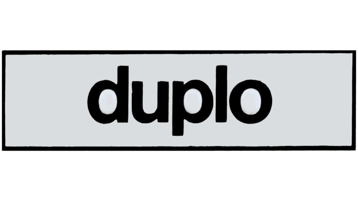
Since 1975, the series has been produced under an updated logo. It was radically different from its predecessor. The changes affected the color scheme, the general concept, and the font. Instead of a greenish color, the designers used an achromatic palette consisting of black and gray. The latter was used for the background. It favorably emphasized the emblem’s main element- the constructor line’s name.
The inscription itself was made in classic black. It is a symbol of prestige, rigor, and special value. Combined with a light shade, the black color becomes more expressive, and the logo becomes more recognizable. An additional feature is a thin black frame in which the inscription is enclosed.
1977 – 1996
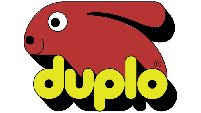
In 1977, the iconic Lego Duplo emblem was created, the prototype of the modern badge. It consisted of a large image of an animal (rabbit) and the name of the constructor line. Both elements were made in a single three-dimensional format. This effect was achieved by creating shadows that complemented the font and figure of the animal.
The colors of the logo have also changed dramatically. Instead of a dull achromatic palette, bright colors were chosen. The title of the series was colored yellow and black, while the rabbit was colored red. Contrasting shades made the emblem bright and memorable and evoked associations with fun, joy, and children’s toys.
1996 – 2002
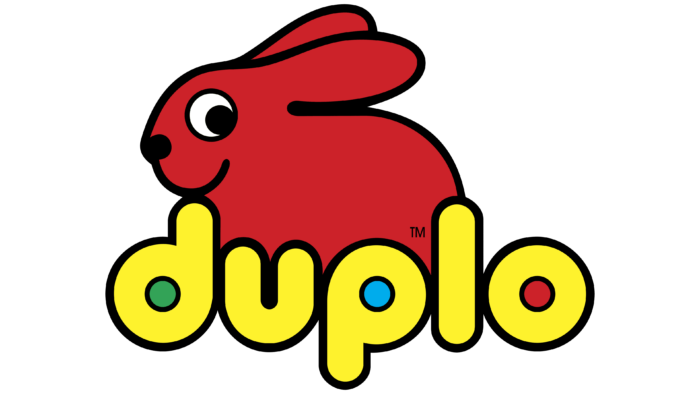
In 1996, the brand management decided on another redesign. As a result of the changes, the line of designers received a new, more sophisticated logo. It retained the main elements: the rabbit and the series’ name. They remained in their original places – the rabbit was located above the inscription. But, in the new concept, bright colors were added, and the shadows that create the volume effect were completely removed.
This format made the brand icon more fresh, cheerful, and bright. This was achieved by adding green, blue, and red splashes in the title. The font type has not changed much. The friendly logo existed until 2002, when the line merged with Lego Explore.
2004 – 2013
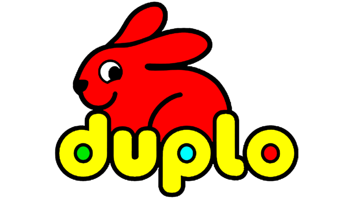
In 2004, the line loved by many children returned to the market. In the windows, you could see toys with a logo that has not changed much since 2002. The only expressive innovation was a brighter color palette.
The shades became more saturated, which made the logo more memorable and attractive. Thicker contours are another feature of the new emblem. The chosen design has become a symbol of positive changes in the production of toys. Also, the Lego Duplo corporate logo demonstrated the success and demand for the product.
2013 – 2022
Over the years, the toy line has become increasingly popular, so the management decided to change the emblem again. The new version was more modern and stylish. An unusual gradient appeared in it, which refreshed the brand icon, and the rabbit completely turned in the other direction.
The picture also has an additional graphic element in the form of a square with the brand name – Lego. It was painted in bright red, harmonizing with other components and symbolizing energy. The inscription was designed in neutral white, showing balance and reliability.
2022 – today
Another redesign also happened in 2022. The result was an updated, beautiful emblem that combined the best features of all its predecessors. Small shadows are visible here, creating the effect of three-dimensional font, stylish bright colors, and the image of a rabbit. But, unlike the previous images, the presented figure of the animal is presented in a different form.
The rabbit looks directly at the customers and smiles at them, raising their spirits. The new design demonstrates cheerfulness, carelessness, and fun. At the same time, soft, expressive font symbolizes comfort, calmness, coziness, and reliability.
Font and Colors
The Lego Duplo children’s designer is easily recognizable by the bright, eye-catching icon. It consists of colorful massive letters and a bright image of a rabbit. The wordmark is made in a thick font, the format of which resembles a 3-D effect through the use of shadows.
The letters have no serifs, which adds softness to the logo as a whole. The palette includes several colors at once: yellow, black, red, blue, and green. All of them are in harmony with each other and emphasize the main goal of the series – joy and fun for children.
Duplo color codes
| Black | Hex color: | #000000 |
|---|---|---|
| RGB: | 0 0 0 | |
| CMYK: | 0 0 0 100 | |
| Pantone: | PMS Process Black C |
| Golden Yellow | Hex color: | #fee003 |
|---|---|---|
| RGB: | 254 224 3 | |
| CMYK: | 0 12 99 0 | |
| Pantone: | PMS 108 C |
| June Bud | Hex color: | #bcd035 |
|---|---|---|
| RGB: | 188 208 53 | |
| CMYK: | 10 0 75 18 | |
| Pantone: | PMS 382 C |
| Pigment Green | Hex color: | #11b14d |
|---|---|---|
| RGB: | 17 177 77 | |
| CMYK: | 90 0 56 31 | |
| Pantone: | PMS 354 C |
| Pigment Red | Hex color: | #f01b22 |
|---|---|---|
| RGB: | 240 27 34 | |
| CMYK: | 0 89 86 6 | |
| Pantone: | PMS Bright Red C |
| Spanish Sky Blue | Hex color: | #0ea8e1 |
|---|---|---|
| RGB: | 14 168 225 | |
| CMYK: | 94 25 0 12 | |
| Pantone: | PMS 801 C |
