Although the DuPont logo is bright, it is also austere. This aura is created by the laconic design, which uses a minimum of elements. They are harmoniously incorporated into the logo, forming a balanced mark without being eclectic.
DuPont: Brand overview
| Founded: | 1802 |
| Founder: | Éleuthère Irénée du Pont |
| Headquarters: | Wilmington, Delaware, USA |
| Website: | dupont.com |
DuPont is the largest company in the chemical industry. It has headquarters in 2 countries (Switzerland and the United States of America), but the scope of its activities is international. A feature of the brand is also specific products. DuPont manufactures weapons (nuclear and incendiary), flammable substances, psychotropic and chemical agents, and military poisons.
Visual identity is fully consistent with a special specialization. The emblem depicts the company’s name, stylized as an oval figure. The form is achieved by reducing and smoothing the letters that are located on the sides. The concept is complemented by bright, eye-catching colors, symbolizing progressiveness and development. The picture uses the classic white color for balance, which acts as a background.
Meaning and History
DuPont is one of the oldest brands with a long history. It all started with a narrow specialization, which eventually expanded and was supplemented by new directions. Constant development has contributed to the fact that the company has entered the international level and has become one of the most famous in its industry. At present, research and development of technologies continue, which allows us to achieve even greater achievements.
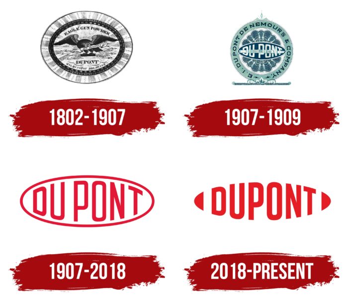
The modern visual identity of DuPont is the result of many years of work by experienced designers. Moreover, the first logos were radically different from those that appeared after 1900. They traced completely different concepts, colors, and content. The company worked under strict multi-component emblems with classic colors in the initial stages. Later, this was all replaced by bright colors and a simplified design.
What is DuPont?
DuPont is a large company operating in the chemical industry. It was founded in the USA and eventually entered the international market. The scope of activity is associated with extensive innovative research and the release of specialized products. Among the developments can be identified a wide range of different chemical materials, including Tyvek, neoprene, Mylar, and Kevlar.
1802 – 1907
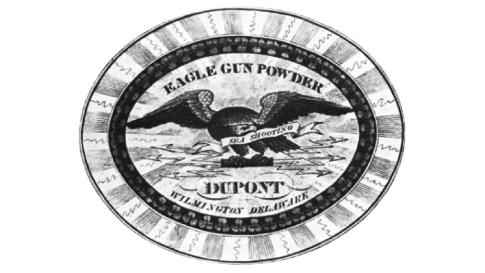
The first logo was created during the foundation of the brand in 1802. The company appeared due to the efforts of two people – Eleter Irene and Dupont de Nemours. The company itself was named after one of them. Its trademark was a rounded sign, inside of which there was an image of an eagle, several inscriptions, and stylized arrows. The color scheme included dark blue and muted blue hues. Light gray color was chosen as the background.
These tones harmonized perfectly with each other and also made the emblem serious and courageous. An additional symbol of the strict style was the eagle. He sat with spread wings and in a straight pose, which gave the logo brutality. The main inscription: “Eagle Gun Powder,” denoted the field of activity (at that time, the production of gunpowder). The classic font ExtraBold, which has serifs, was chosen for its design. Below was also the name of the DuPont brand, done in a similar style.
1907 – 1909
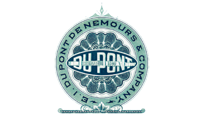
The first logo existed until 1907. After that, it was replaced by a more modern and lightweight sign. From the previous version, the designers left the colors and brand names. The rest of the emblems were significantly different. The new logo was a beautifully designed circle, under which there was a thin line with patterns. Inside it, one could see the company’s name in large letters and two additional inscriptions.
One of them indicated the date of foundation and was made in small white sans-serif type, and the second was a reference to the founder. It was an inscription in a direct, strict font in dark blue. The color scheme included several shades of blue and blue, which favorably emphasized the graphic elements. In general, the palette symbolizes reliability, professionalism, and stability.
1907 – 2018
In 1909, the DuPont brand decided to change the visual concept radically. Instead of complex images that included inscriptions in different fonts and graphic symbols, he began to use a simple, concise emblem. It was more modern and also had a powerful message. The clear geometric lines of the inscription and the oval frame symbolized the success and self-confidence of the brand.
DuPont’s name used the original sans-serif typeface, which was long and thin. Along the edges, they were smoothed into an oval shape, which made the logo unusual. The addition of the new format was a bright red color on a white background. This combination demonstrated success, progressiveness, and energy.
2018 – today
In 2018, the modern version of the DuPont emblem was formed. It has a few differences from the previous logo while being more in line with current brand design trends. The updated logo retains the oval shape. But it is achieved through the original cuts of the letters and not the use of a geometric frame.
Unusual elements were added on the sides that visually completed the oval. Inside, the brand name was still located, made in large letters. The new design looked lighter, more modern, and stylish, symbolizing the brand’s commitment to improvement.
Font and Colors
The DuPont logo looks stylish and powerful. This effect was achieved through the use of the original sans-serif font and an expressive color scheme consisting of only two shades. The central element (company name) is decorated in rich red, symbolizing courage and a progressive approach.
Two graphic elements are made in the same color, complementing the oval shape of the logo. They are located at some distance from the inscription’s first and last letter, making it more expressive. Such a decision demonstrates the confidence and high status of the brand. The white background in this emblem connects all the components into a single whole and also emphasizes associations with honesty.
Complete harmony is achieved through the use of a flowing roman type, which is created with thicker lines. The letters have the same shape and placement order as in the previous logo. This is a kind of symbol of sustainable development. The updated logo can be safely called a visual tribute to the past and the desire to use innovation in production.
DuPont color codes
| Cadmium Red | Hex color: | #e41c25 |
|---|---|---|
| RGB: | 228 28 37 | |
| CMYK: | 0 88 84 11 | |
| Pantone: | PMS Bright Red C |
