The Dynamics 365 logo embodies a Microsoft solution that organizes and simplifies business management and administration. The emblem speaks to applications for business analysis and transformation to achieve maximum profit.
Dynamics 365: Brand overview
| Founded: | November 1, 2016 |
| Founder: | Microsoft |
| Headquarters: | United States |
| Website: | dynamics.microsoft.com |
Unveiled by Microsoft on November 1, 2016, Dynamics 365 represented a groundbreaking shift in the company’s CRM and ERP solutions approach. It integrated these distinct cloud-based services into a single, cohesive platform. The development of Dynamics 365 can be traced back to Microsoft’s early 2000s acquisitions. Buying Great Plains Software in 2001 and Navision in 2002 laid the groundwork for what would later become Dynamics GP and Dynamics NAV, respectively.
To consolidate its diverse portfolio of ERP solutions, Microsoft introduced Microsoft Business Solutions in 2003—this suite bundled acquired products like Great Plains, Navision, and Axapta. Two years later, in 2005, the company rebranded this offering as Microsoft Dynamics, a move that came with new names for individual products, such as Dynamics GP and Dynamics NAV.
Further diversifying its capabilities, Microsoft acquired MarketingPilot in 2011, which led to the creation of Microsoft Dynamics CRM, offering customer relationship management functionalities that complement the existing ERP solutions. By the time 2016 rolled around, Microsoft’s Dynamics product line was already a robust assortment of on-premises and cloud-based offerings.
The inception of Dynamics 365 in 2016 marked the amalgamation of these CRM and ERP products into a unified cloud ecosystem. Since its debut, the platform has continually evolved, incorporating new applications, features, and seamless integrations with other Microsoft services like Office 365. Over the years, Dynamics 365 has become a significant force in the CRM and ERP sectors.
Meaning and History
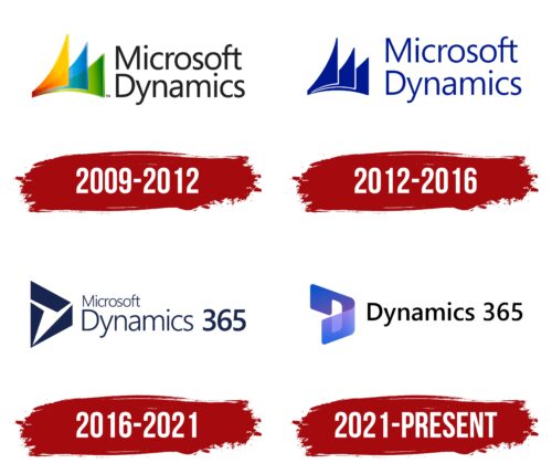
In 2005, Microsoft first used the name Dynamics to acquire business management products. However, each component of the ERP software evolved separately with its logo: Great Plains as Dynamics GP, Solomon as Dynamics SL, and Axapta as Dynamics AX. It was only in 2009 that a unified logo appeared. Subsequent emblem transformations indicated a shift to new technologies and the addition of new tools to the basic software suite.
What is Dynamics 365?
A series of products that assist medium to large entrepreneurs, enterprises, and organizations in managing accounting and conducting online sales. The package includes two main modules: Dynamics ERP and Dynamics CRM. Microsoft acquired this suite of applications by purchasing their developers.
2009 – 2012
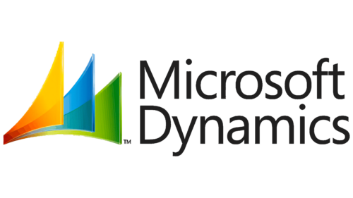
Starting in 2009, products under the Dynamics name began to be marked annually. For example, Dynamics AX 2009 and Dynamics NAV 2009, each featuring a common emblem consisting of a graphical element and a caption.
The title is placed to the right of the image in two levels. At the forefront is the name of the Microsoft company, most familiar to consumers. Its presence elevated customer trust.
The word Dynamics is chosen for the title because the applications help:
- Track processes in production, new customer data, sales numbers, accounting calculations, supplier information, and marketing campaigns.
- Increase turnover. Identify weak areas and gaps in promotion, monitor the effectiveness of campaigns, and update advertising.
- Automate processes. Conduct some calculations automatically, send email newsletters, and interact with customers via chatbots.
The graphical element of the logo consists of three shapes executed in Microsoft’s signature window colors. The elements are reminiscent of:
- Sails, symbolizing motion and dynamics. The company’s product helps fill the brand’s sails with wind and “sail” toward new victories.
- File trays (vertical organizers). These are associated with the paperwork carried out by Dynamics 365 programs.
The elements are connected at the bottom left corner into a single structure. The three sails indicate the system’s division into program groups: for financial management, for commercial enterprise papers, for customer service, and marketing. A row of trays points to orderly documents and smooth business operations.
Typically, an explanation follows the word Dynamics in the emblem to specify which product is being referred to, for example, Microsoft Dynamics NAV.
2012 – 2016
An update to the programs came out in 2012, leading to a transformation of the logo. The main change involved color selection. The monochrome blue made the emblem more formal and businesslike.
Microsoft’s primary brand colors (red, green, blue, and orange) were intended for communication, self-development, hobbies, and work. The choice of blue indicated a focus on the business sphere. The applications targeted a group of medium and large entrepreneurs. The color represented the product line as a professional solution for online business management.
2016 – 2021
In 2016, the product underwent a renaming. Previously, the suite of programs was referred to as Dynamics with the addition of the year. After 2016, the company switched to Dynamics 365. The changes were reflected in the emblem.
The triple sail turned into a single one, composed of three separate elements following one another in a circle. Their sequence pointed to both forward motion and the cyclical nature of processes, repetitive actions.
Individual elements of the drawing emphasized the presence of stages in each module and the division of programs into groups. The number 3 personified the connection between CRM, ERP, and other company programs like Office, Outlook, and SharePoint.
Visually, the sail resembled the letter D.
2021 – today
In 2018, Dynamics 365 Business Central Cloud was introduced, and the support for standalone ERP systems ceased. AX, GP, SL, and new business solutions gradually migrated into Dynamics 365 in the following years.
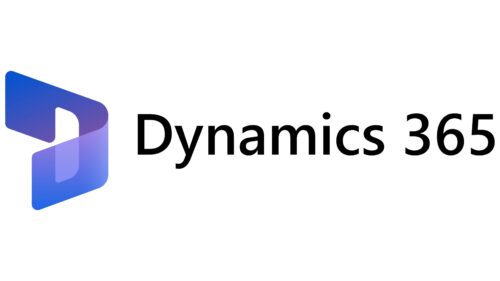
By 2021, a complete package was formed, and the product’s logo underwent rebranding. The graphic element was transformed into a folder icon resembling the letter D, the first letter in the product name. Another innovation is the absence of the Microsoft company name. The programs have gained enough recognition to operate as a standalone brand.
Font and Colors
The visual element of the logo features a blue-purple gradient with white details. This color palette indicates professional solutions. Purple shades are indicative of planning, strategy, and research. Blue highlights computer technology. The shade embodies logic and a well-thought-out process pipeline. White elements signify regular updates.
The black inscription Dynamics 365 uses a font resembling Neue Frutiger Hebrew. The smooth characters convey simplicity and conciseness.
Dynamics 365 color codes
| Tang Blue | Hex color: | #0a53ce |
|---|---|---|
| RGB: | 10 83 206 | |
| CMYK: | 95 60 0 19 | |
| Pantone: | PMS 2728 C |
| Dark Lavender | Hex color: | #6a52ad |
|---|---|---|
| RGB: | 106 82 173 | |
| CMYK: | 39 53 0 32 | |
| Pantone: | PMS 2665 C |
| Black | Hex color: | #000000 |
|---|---|---|
| RGB: | 0 0 0 | |
| CMYK: | 0 0 0 100 | |
| Pantone: | PMS Process Black C |


