The main ideas embedded in the Eaton logo are customer focus and stability. These are the basic principles that the American engineering company seeks to emphasize. Advantageous use of negative space positively influences the logo because it informs clients much more than they imagine.
Eaton: Brand overview
| Founded: | 1911 |
| Founder: | Joseph Oriel Eaton II, Viggo Torbensen |
| Headquarters: | Dublin, Ireland |
| Website: | eaton.com |
Eaton is the name of one of the largest American corporations operating in the engineering industry. Its factories produce components for airliners and cars, as well as various types of hydraulic systems and electrical engineering. Formally, the management is carried out from the headquarters in Dublin (Ireland), but in addition to this, the brand has many operational offices in different countries.
The corporate logo of a global company looks bold and powerful. An original design solution was used for its design, the essence of which was two-color letters. The name Eaton, which is the basis of the emblem, consists of white and blue wordmarks. The unusual contrast makes the icon especially stylish and eye-catching. In addition, it symbolizes high status.
Meaning and History
Eaton’s large-scale enterprise has one striking distinguishing feature – it has developed not only through improvements in the internal structure but also through acquisitions of small companies. As a result, the brand expanded its specialization and strengthened its status. The modern corporation operates internationally, competing with industrial giants such as Schneider Electric, Siemens, and Bosch Rexroth. The visual identity of Eaton is another confirmation of this.
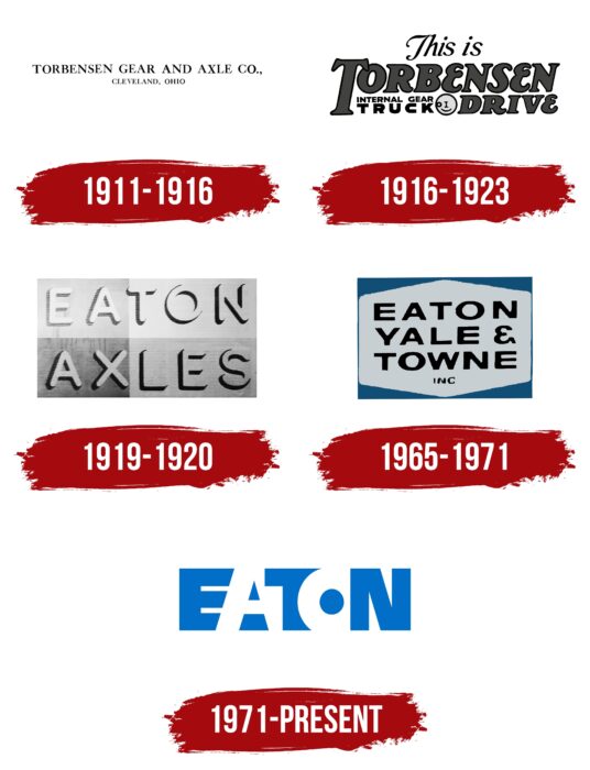
The current badge demonstrates strength, confidence, scale, and professionalism. But, it has been used since 1971, and before that, the brand had several different versions of the emblem. They changed depending on the state of affairs in the company, as well as changing trends in brand design. These were strict pictures with a classic typeface and achromatic colors. More expressive tones and a stylish font appeared in later versions.
What is Eaton?
Eaton is a large modern corporation that includes several divisions in different countries. It is of American origin and has an extensive specialization. It is engaged in producing auto components, equipment for the aviation industry, and various types of electrical engineering.
1911 – 1916
A large corporation began its history with a small enterprise that produced high-strength axles for trucks. The founders were Viggo Torbensen and Henning Taube. The workshop was named after Torbensen. Its name was taken as the basis of the visual identity. The logo included Torbensen Gear & Axle CO and a reference to the region (Cleveland, Ohio).
It was a strict simple icon that did not have any expressive features. The font was distinguished by thin straight lines with serifs. Newspaper articles were often printed in this format. All letters of the name were capitalized, emphasizing the importance and value of the contribution to the engineering industry.
The inscription of the region was made in miniature size with simple laconic letters. The coloring included the classic black color, in which the inscriptions are decorated, and a light background. Such a combination demonstrated high quality, conscientiousness, and reliability.
1916 – 1923
Soon it was decided to change the original logo to a more modern version. As a result, the company 1916 received an updated emblem consisting of many inscriptions. Among them are:
- this is;
- Torbensen drive;
- internal gear;
- truck.
Each of them had a special semantic load and was designed in different fonts. The first used an elegant, thin font with tails, providing for the italic format. The second inscription was more massive and expressive. Her letters are created with thicker serif lines. The third and fourth inscriptions were directly located and decorated with simple letters without serifs. Black and gray were used as the color palette. This design decision symbolized increased brand profiles, expansion, and development.
1919 – 1920
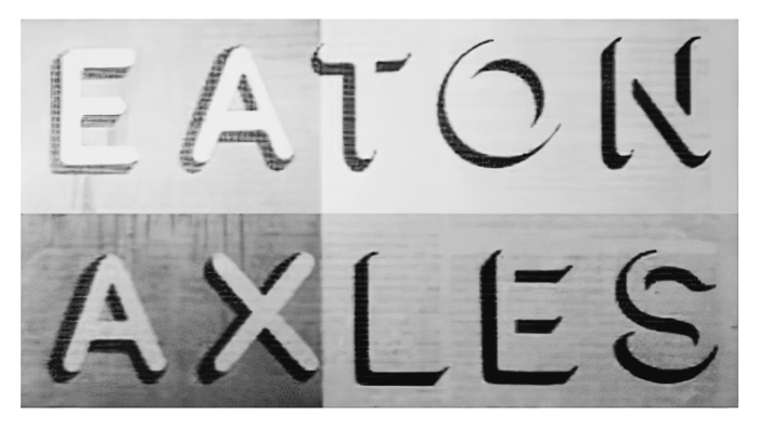
During this period, the management and the name of the company changed. Torbensen Gear & Axle CO was renamed Eaton Axle and Spring. All this is reflected in the visual identity. The old logo with many inscriptions was replaced with a more concise and uniform icon. It consisted of only two words Eaton Axle. Both of them were made in the same style and font.
These were large light letters, the contours of which were complemented by a shadow. This design created a three-dimensional effect, which made the overall concept more attractive and modern. The background on which the inscription was located included dark and light shades. They demonstrated prestige, responsibility, and openness.
1923 – 1932
During this period, the company developed especially actively. This was mainly due to a large number of acquisitions. Eaton first bought out several small auto parts manufacturers in Cleveland and, a little later – outside of it. After that, Eaton Axle and Spring began to produce springs, bumpers, poppets, and some components for use in the aviation industry.
1932 – 1965
The company’s entry into the international market can be traced to this period. The company opened a factory to produce auto parts in Canada, and a little later created a joint venture with British corporations E.N.V. and Rubery Owen. Until 1965, the brand already had many divisions in European countries.
1965 – 1971
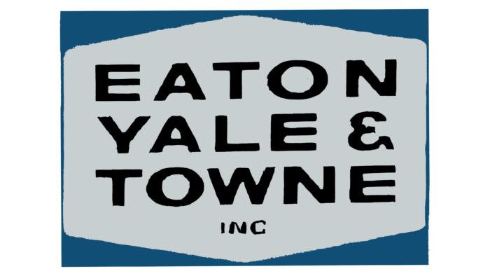
Another change in visual identity happened during the period when the company was renamed Eaton, Yale, & Towne. Since then, a new, more expressive logo has been used. It was an original figure, similar to a rectangle, inside of which was the inscription Eaton Yale & Towns Inc. In the upper and lower parts, the frame was supplemented with small graphic symbols in the form of flats of an unusual geometric shape.
The new brand name was designed in a straight and slightly stretched font that did not have serifs. The font was black, but the graphic symbols diluted the strict palette. Inside the letter, O was a light purple dot, and the geometric stripes at the top and bottom were blue. The chosen palette symbolized trust, reliability, and honesty.
1971 – today
The logo that the brand currently uses was created in 1971. At that time, the discreet version of the predecessor was replaced by a more stylish and modern emblem with an original design. It included only one word Eaton, which is the brand’s name.
All letters in the logo are superimposed on each other and painted in harmonious contrasting colors. The letters A and O have an original shape – they are created without clear contours. The chosen design demonstrates development without borders, professionalism, and solid status.
Font and Colors
The Eaton brand logo features an incredibly expressive font and harmonious color scheme. It is based on thick capital letters created in bold type. The enlarged letters slightly overlap each other and do not have serifs. Despite this format, the emblem looks balanced due to the original use of the space between word marks.
An advantageous addition to the overall concept is the color palette. Three of the letters are blue, and two are white. The first shade demonstrates authority, the value of experience, and the introduction of innovation. The white color confirms openness and loyalty to customers.
Eaton color codes
| French Blue | Hex color: | #006ec7 |
|---|---|---|
| RGB: | 0 110 199 | |
| CMYK: | 100 45 0 22 | |
| Pantone: | PMS 285 C |
