The Efes logo, the only genuine Turkish beer, is distinguished by its classic style. The thick white font on a rich blue background within a golden oval frame symbolizes the richness of taste and consistency of the product’s quality, known worldwide.
Efes: Brand overview
| Founded: | 1966 |
| Founder: | Izzet Özilkhan, Camille Yazichi |
| Headquarters: | Istanbul, Turkey |
| Website: | anadoluefes.com |
Meaning and History
The Efes logo has a classic beer brand logo design, from the color scheme (blue, gold, and white) to the barley ears on the emblem.
The emblem features thick white letters on a blue background in a golden frame – thick white letters on a blue background in a golden frame. The frame’s shape looks like a modern oval with two protruding peaks.
The Efes logo aims to demonstrate the brand’s dynamism and authenticity and its value for quality and taste.
The design agency Interbrand is responsible for the latest version of the Efes logo. They did an excellent job creating a new dynamic image of the brand, which now enjoys great success in Turkey and across 80 territories worldwide.
What is Efes?
Efes is the flagship brand of the Turkish company Anadolu Efes Biracılık ve Malt Sanayii. Its range includes various beer types: the flagship Pilsener with refreshing bitterness, coffee-chocolate lager Dark Brown, aromatic and smooth Ice, strong Xtra, low-alcohol Light, and caramel Dark. They are made using natural ingredients and are widely demanded in bars and restaurants.
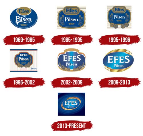
1969 – 1985
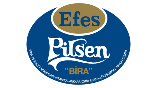
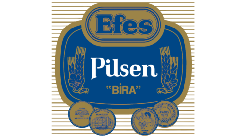
One of the old Efes logos contained the phrase “BIRA VE MALT FABRIKALARI ISTANBUL-ANKARA-IZMIR-ADANA- LÜLEBURGAZ-AFYON-ÇUMRA.” It was written in small but bold letters in white at the bottom of a large dark blue oval. Just above was the brown word “BIRA” in quotes, and above it was the white “Pilsen,” underscored with a graceful wavy line and consisting of stylized letters with curled crests. A small brown oval was located at the top, serving as the base for the dark blue word “Efes.” A bold geometric font with large serifs was used for the brand name.
1985 – 1995
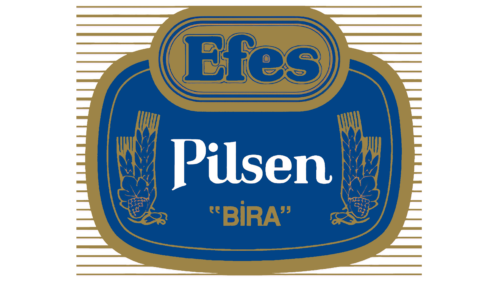
In the 1980s, the logo’s appearance changed. Designers transformed the original color palette, making shades slightly lighter. Ovals turned into rectangles with rounded edges. The long line at the bottom disappeared as the secondary information about the alcoholic drink was moved to another part of the label. Only the most important inscriptions remained: “Efes,” “Pilsen,” and “BIRA.” The brand name and its brown base now had unusually thin, dark blue outlines. Conversely, the word “Pilsen” was simplified. Designers shortened some letters’ decorative crests and swirls but used a serif font to retain a hint of the old style.
Floral ornaments were added to the right and left, signifying the natural composition of the drink. They were depicted without details – only using contours. The large dark blue base now had a wide brown frame. The background for the emblem became a rectangle, speckled with many horizontal white and brown lines.
1995 – 1996
To demonstrate the high quality of the alcohol, designers added four awards to the Efes emblem – two on each side. They looked like brown circles with dark blue inscriptions and drawings. The medals testified that the brand participated in various competitions and won prizes, so its products deserve trust. This marketing trick was intended to increase sales.
1996 – 2002
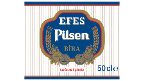
In mid-1996, designers changed the design of the Efes label. Two rounded rectangles were combined into one large dark blue figure with a thin red outline and a wide brown stroke. The brand name was translated into uppercase and became white. At the same time, it and the word “Pilsen” appeared in thin brown shadows to the right of each letter. The serifs used in the last decades disappeared from BIRA. The medals were moved slightly higher and decorated with leaves. And the floral pattern changed: artists elongated the spikes so they beautifully curved upwards. Horizontal background lines turned into vertical, and bright inscriptions appeared under the emblem.
2002 – 2009
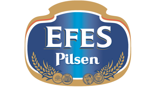
After the redesign, the word “BIRA” was removed. This allowed moving the “Pilsen” inscription down and enlarging the brand name. Additionally, the first letter “E” and the last “S” became disproportionately large – much bigger than the “FE” located between them. The right brown outline disappeared. Each glyph now had three-dimensional dark blue shadows. In the word “EFES,” they were shifted to the left and seemed voluminous due to additional gold outlines.
The blue base acquired a linear gradient, starting from the center as a vertical light blue column. The red outline was partially “eaten” by a white stripe along the logo. The outer brown rim became uneven: too narrow at the edges and wide at the top and bottom. The composition of the floral ornament with medals also changed. Artists reduced the four medals, shortened the spikes, and redrawn the hop cones.
2009 – 2013
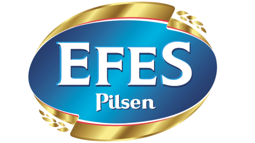
The white words “EFES” and “Pilsen” were moved into a horizontal oval with a blue gradient. In this version, the shade transition was diagonal but also started approximately from the center. The frame turned into two golden ribbons, which were reflected in a mirror reflection. They curled at the ends and seemed voluminous due to an uneven gradient. The round awards disappeared, and only two minimalist spikes remained – at the top and bottom.
2013 – today
In 2013, designers changed the proportions of the inscriptions to make the brand name more noticeable. The gold frame shifted, and its parts were now positioned diagonally. The ribbons turned into graceful arches with pointed edges. The lower spike disappeared, and the upper one increased and shifted to the left. The background depicted a “whirlpool” of light blue spirals with a gradient, surrounded by dark blue space. This symbolizes purity, freshness, and progress. And such a pattern is associated with a falling drop, from which circles spread in all directions.
Efes: Interesting Facts
Efes is Turkey’s top beer and a big deal around the world.
- Beginning and Growth: Efes was started in 1969 by the Anadolu Group. By 1973, they were making beer. Named after an old city, Ephesus, near its first brewery in Izmir, Efes quickly became famous in Turkey for good beer.
- Worldwide Reach: Efes isn’t just sold in Turkey but in over 80 countries. People can enjoy Efes beer in many places.
- Lots of Choices: Efes makes different kinds of beer – not just the regular kind but also dark, light, and even non-alcoholic ones. So, there’s something for everyone.
- Supporting Culture and Sports: Efes doesn’t just make beer; it also helps with music and sports. They’ve been a big part of the Efes Pilsen Blues Festival for over 20 years and support basketball, too. The Anadolu Efes Sports Club is a top team in the EuroLeague.
- Smart Advertising: Efes is smart about getting the word out. Their ads use their history and Turkey’s rich culture, which makes people love them even more.
- Growing Bigger: Efes has joined forces with other beer makers to sell even more beer, especially in Russia and Ukraine.
- Trying New Things: Efes also makes craft beer and special editions for people who like trying new and different beers.
- Good for the Economy: Efes helps Turkey’s economy by creating jobs and exporting beer, which brings in money from other countries.
- Helping Others: Efes works on projects to help with education, sports, and caring for the planet. They care about making life better in the places they work.
Efes has grown from a local Turkish beer to a famous international brand by sticking to quality, trying new things, and helping out in its community. It’s more than just a beer company; it’s a part of culture and good causes.
Font and Colors
The Efes logo uses two contrasting fonts. The trademark name is written in a bold sans-serif font with large triangular serifs and slanted cuts at the ends. The word “Pilsen” is typed in cursive, stylized as calligraphic handwriting, with all letters separated despite the very narrow spacing between them. The elegant cursive is adorned with curls and swirls, especially pronounced in the capital “P.” Although these two fonts are very different, they are united by visual dynamics.
The emblem’s color palette also creates a movement effect, as designers used several shades of blue to depict the “whirlpool.” The highlighted center, with a gradient, instills hope and confidence. Against this backdrop, the white inscriptions are clearly visible, accentuated by shadows. The shimmering gold frame with a loop resembles the color of fresh Pilsner. It is complemented by thin red lines, diversifying the palette.
Efes color codes
| Blue | Hex color: | #004a8c |
|---|---|---|
| RGB: | 167 30 49 | |
| CMYK: | 5 100 71 22 | |
| Pantone: | PMS 2945 C |
