![]() Elizabeth Arden Logo PNG
Elizabeth Arden Logo PNG
The Elizabeth Arden logo is the door to the world of beauty and youth. The emblem indicates that the company has secret knowledge it incorporates into its recipes. The brand can work miracles, and customers can experience this firsthand by opening the cherished door.
Elizabeth Arden dates back to 1881, when Florence Nightingale Graham was born in Ontario. In 1908, she moved to New York, worked at Squibb, and learned how industrial R&D operates while training as a manicurist.
In 1910, she opened a salon on Fifth Avenue with Elizabeth Hubbard. After a split, she rebranded herself as Elizabeth Arden, combining her partner’s name with a reference to Tennyson. The red door became a constant marker of her salons.
Arden positioned cosmetics as skincare rather than theatrical makeup. In 1914, she hired chemists, launched her own products, and then studied French methods in Paris. By 1915, distribution expanded to pharmacies and department stores across the US, Canada, and Europe.
By 1925, US cosmetic spending reached $6 million annually. Her main rival, Helena Rubinstein, competed aggressively through staff poaching and pricing wars.
In 1930, Arden introduced Eight Hour Cream, originally intended to treat skin irritation. In 1931, she entered horse breeding; her horse Jet Pilot won the Kentucky Derby in 1947.
She divorced her business partner-husband in 1934. In 1946, she appeared on the cover of Time, and in 1962, received a Royal Warrant from Elizabeth II. By the 1960s, the brand operated over 100 salons in 78 countries.
Arden died in 1966. In 1971, the company was sold to Eli Lilly, which later bought it out in 1987. In 2001, it became part of FFI Fragrances and was listed on NASDAQ. In 2016, Revlon acquired the brand for $870 million.
Meaning and History
![]()
After a series of sales and purchases, the company has not lost its own identity, reflected in the logo. From the very beginning, she focused on the red door, behind which the whole world is hidden – perfect and beautiful. It’s just that her image is used to celebrate the Elizabeth Arden Red Door Salons day spa. The trademark had no other logo variants.
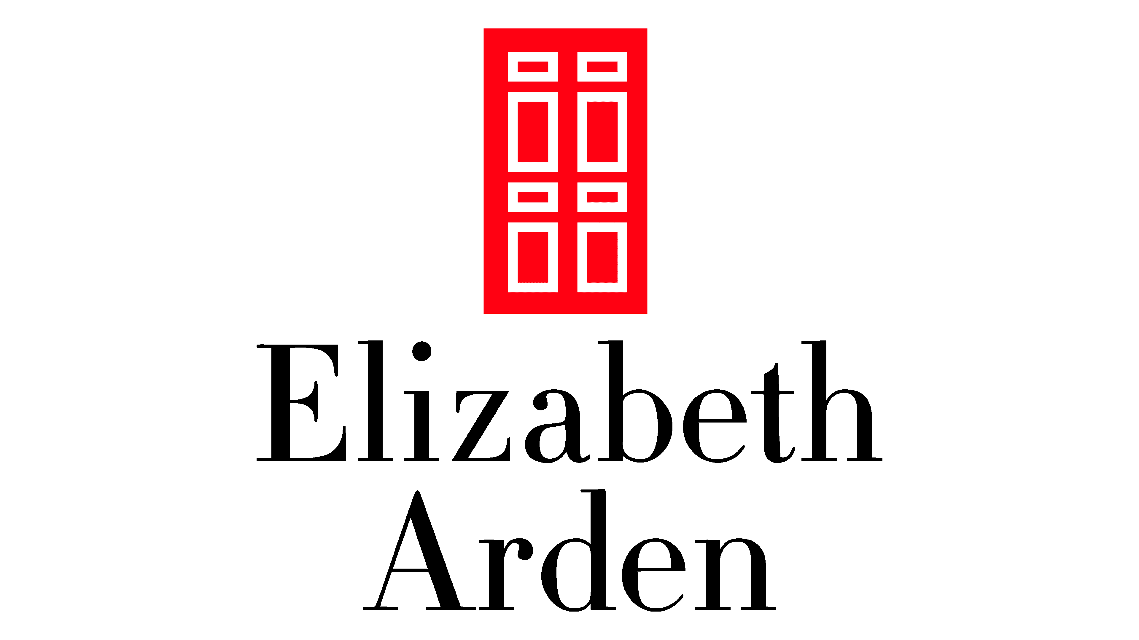
The logo consists of graphic and text elements, both of which are equally important. They reflect the same information – they demonstrate the original brand. In the most conspicuous place (top and center), there is a red door. It is a vertical rectangle with six miniature geometric shapes in the door panels. Each of them is outlined with a white stripe. Below is the company name “Elizabeth Arden,” in a classic style: the first letters are uppercase, the rest lowercase. There is a small inscription “New York” under it.
What is Elizabeth Arden?
Elizabeth Arden is a cosmetics company based in the United States, founded in 1910, that gradually transformed into a fashion empire. It offers perfumes and skincare products. Currently, the brand is owned by Revlon. The headquarters is located in Miramar, Florida.
Font and Colors
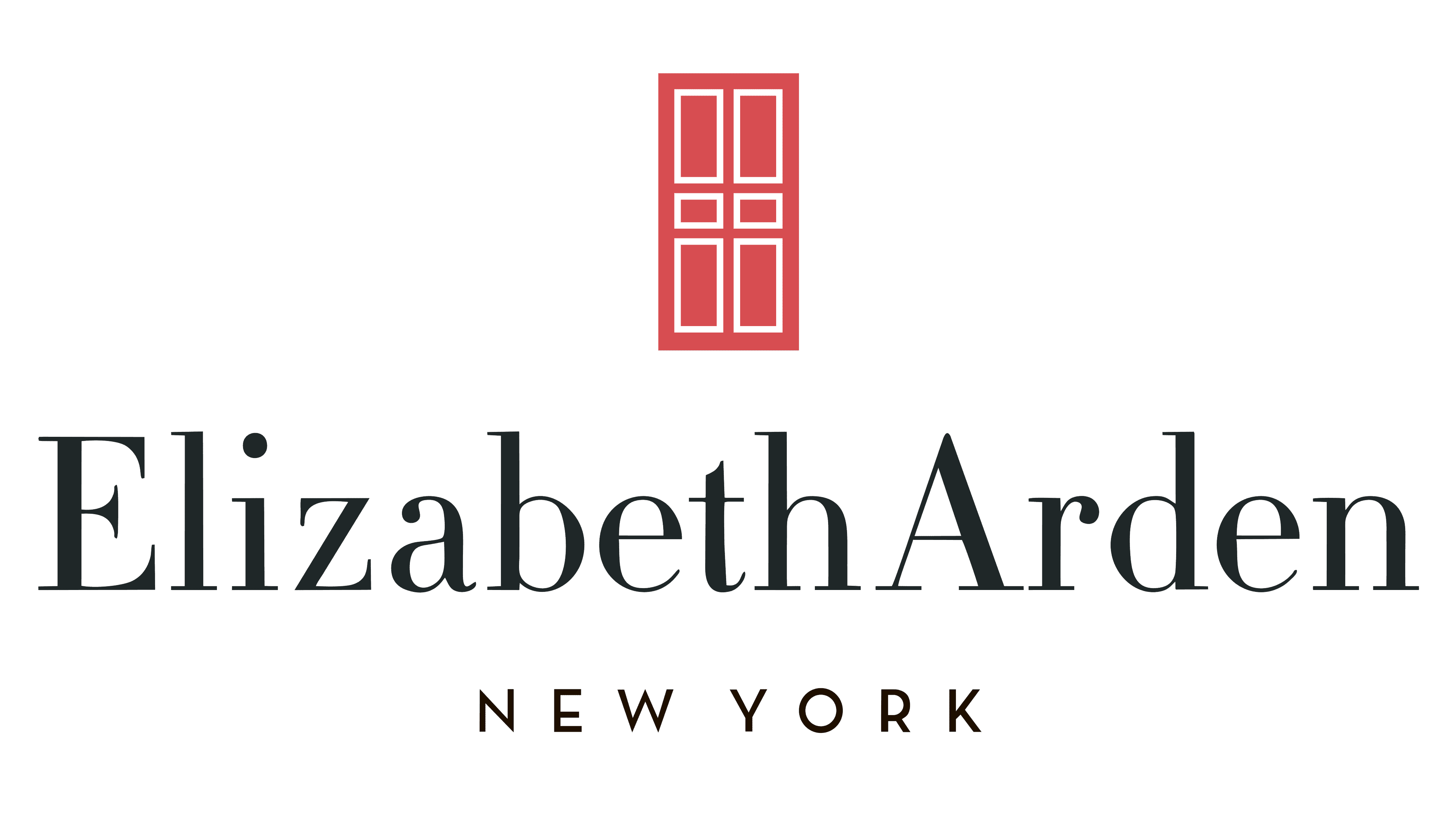
For the brand name, the designers used a large, traditional print in an original design. They made the upper serifs of “l”, “b”, “h”, and “d” straight. The lower serifs were added to the same letters, which are usually not visible. The second inscription is stricter: it is set in a smooth, chopped typeface. The emblem’s palette is contrasting: it contains white, red, and black.