Elko: Brand overview
In 1993, Elko appeared in Riga, Latvia, a company created from scratch by four enterprising IT students. Initially, they focused on the local market, assembling and selling computer components. The company quickly gained momentum when, in 1994, they signed their first distribution agreements with industry titans such as Seagate and Samsung. This important move served as a catalyst for Elko’s rapid growth.
Four years later, in 1998, Elko spread its wings and opened a branch office in Lithuania. This was soon followed by expansion in Ukraine in 1999 and in Slovakia in 2000. Realizing the need for a more structured management model in connection with the expansion of its presence, in 2005, the company established the holding ELKO Grupa AS. In 2007, Elko took the leading position in Latvian business, exceeding annual revenues of USD 1 billion – a first for a Latvian company.
In 2013, the company entered the Kazakhstan market, and two years later, it was admitted to the prestigious Global Technology Distribution Council. In 2017, the acquisition of Scandinavian distributor Gandalf was the company’s entry point into the lucrative Scandinavian markets. Even amidst the turmoil of a global pandemic, Elko achieved a record revenue of $2.2 billion in 2021.
Today, the company is present in 31 countries in Europe and Central Asia and employs more than 1,100 people. Elko has become one of the most powerful IT and consumer electronics distributors in the region.
Meaning and History
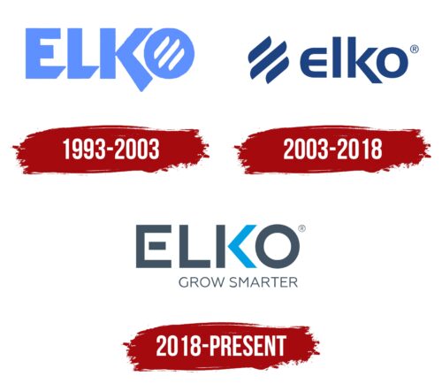
1993 – 2003
2003 – 2018
2018 – today
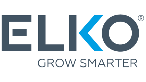
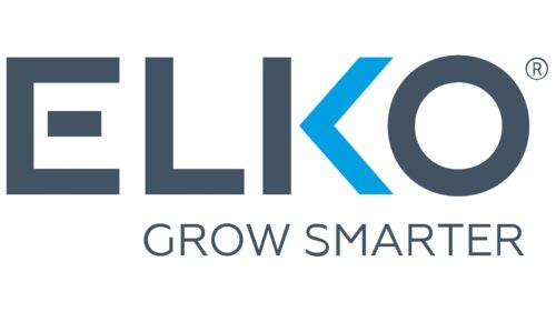
This logo is a two-level inscription in different styles. The word “Elko” is typed in large capital letters, bold, even, geometric, with many angles. Two details stand out in particular: the right part of the letter “K” is colored blue and resembles an arrow, and the letter “E,” the middle line of which is shorter than the rest, looks like a rectangle floating in the air. The bottom row contains the phrase “Grow Smarter.” It is thin, strict, businesslike, aligned on the right edge, and extends to the top of the letter “L.” The dominant color of the emblem is gray.
The blue in the letter “K” adds a splash of color, making it more interesting. The floating rectangle in the letter “E” gives the emblem a whimsical look. The phrase “Grow Smarter,” which is different in style from “Elko,” creates contrast, making the whole logo eye-catching without being flashy.
Elko color codes
| Marengo | Hex color: | #425463 |
|---|---|---|
| RGB: | 66 84 99 | |
| CMYK: | 33 15 0 61 | |
| Pantone: | PMS 7545 C |
| Rich Electric Blue | Hex color: | #009fe3 |
|---|---|---|
| RGB: | 0 159 227 | |
| CMYK: | 100 30 0 11 | |
| Pantone: | PMS 801 C |
