


![]() Elseve Logo PNG
Elseve Logo PNG
The Elseve logo seems to be made of strong and resilient hair. All rods are of the same thickness and obediently fit. The sign promises customers ideal hair condition and health, encouraging them to buy the product and start using it sooner.
The story of Elsève begins with L’Oréal. In 1909, chemist Eugène Schueller founded a small business in Clichy to produce safer synthetic hair dyes. His first product, L’Auréale, later gave the company its name. By 1934, L’Oréal introduced a soap-free shampoo, followed by Ambre Solaire in 1935.
After Schueller died in 1957, François Dalle led expansion through acquisitions. In 1963, L’Oréal went public and added brands such as Lancôme, Garnier, and Biotherm, forming a multi-brand structure.
In 1971, Elsève launched with a restoring conditioner, entering a market where shampoo was still treated as a basic hygiene product. In 1972, a matching shampoo followed, creating a system approach to hair repair ahead of competitors like Pantene by Procter & Gamble.
Elsève became a leading brand in France, at times exceeding 11% market share in the shampoo market. Its closest rival, Fructis, was part of the same group as Garnier.
Internationally, the brand used different names. In 1997, it entered the UK as Elvive, fronted by Jennifer Aniston. In the US, it operated as Hair Expert until 2018, when L’Oréal Paris unified the name to Elvive.
Over time, Elsève expanded its line with Total Repair 5, Extraordinary Oil, Color Vibrancy, and Dream Lengths. In 2023, a hyaluronic acid range launched in the US through Walmart, reflecting shifts in product focus and distribution.
Meaning and History
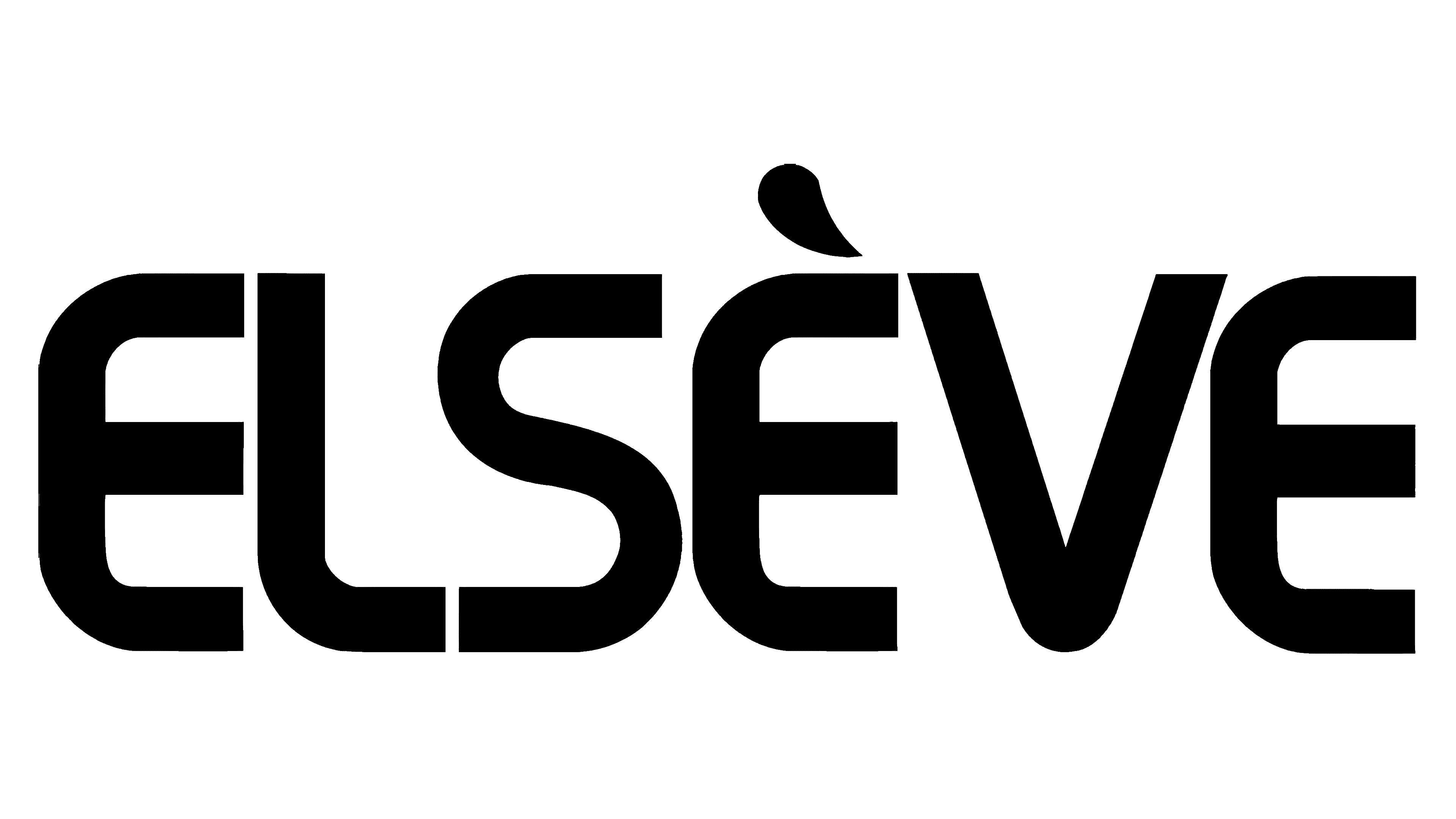
The logo is purely textual and consists of a single word: “Elseve.” The series name was chosen deliberately because the parent company manufactures a range of products. And to group it, it assigns a separate name to each line. This represents the category of hair- and scalp-care products. Since its inception, it has only had one logo.
There is no graphic art in the logo, only text. Therefore, from the drawn elements’ point of view, only the diacritical mark of the letter “e” can be noted. It is depicted as an inverted comma, with one side thickened and the other pointed.
What is Elseve?
Elseve is a brand owned by the French company L’Oréal, which is considered a leader in the beauty industry. This line represents modern hair and scalp care products, including shampoos with advanced formulas that address issues like hair loss, dryness, split ends, and brittle strands. Its headquarters is located in the city of Clichy.
Font and Colors
The letters don’t have the usual corners. Thanks to this design technique, each symbol is perceived as a strand of hair: now straight, now twisted, now with a half-curl. This is done on purpose to emphasize the purpose of the line. The emblem color is monochrome, consisting of black (lettering) and white (background).