A manufacturer of electrical equipment has to maintain the image of a company that strives for progress. That’s why designers ensured the Emerson Electric logo was synonymous with innovation, cutting-edge technology, and development. And it is not directly related to any product but has an abstract design.
Emerson Electric: Brand overview
| Founded: | 1890 |
| Founder: | John W. Emerson |
| Headquarters: | Ferguson, Missouri, U.S. |
| Website: | emerson.com |
Emerson Electric is a global enterprise with more than 200 manufacturing sites in America and other countries. The scale of activity is so large that the Fortune 500 magazine included it in the list of the largest corporations in the world. The main specialization of a large company is the development of technological solutions for consumer, industrial, and commercial markets.
The product range includes refrigeration units, heating equipment, control systems, etc. The visual identity of the world-famous brand is based on a thematic logo, which is a confident and powerful image. It includes a symbol associated with the line of business and an impressive brand name.
Meaning and History
Emerson Electric has achieved incredible results in engineering and technology. It is a real transnational corporation that has more than 100 enterprises in the United States of America and about the same number of sites in other countries. The company has several achievements in producing modern high-tech equipment used in various industries.
There were many important events in the history of Emerson Electric that also influenced visual identity. The most important of them became the reason for changing the old logo to a modern version, which is still used today. It was created based on an original design solution that provides stylish elements that do not lose their relevance. Among them are an unusual geometric figure with a special meaning and a massive inscription indicating the company’s name.
What is Emerson Electric?
Emerson Electric is one of the world’s largest corporations producing electrical equipment and engineering solutions. Currently, it is located in the USA (Missouri), and individual production facilities are also located in other countries. Emerson Electric factories produce high-quality air conditioning, heating, automated, and refrigeration systems.
Old
The basis for the future transnational corporation was laid by its future president, John Wesley Emerson. In 1890, he created the Emerson Electric Manufacturing Co. It produced fans and electric motors based on the technology of the Meston brothers. At that moment, a visual identity was also formed, reflecting the brand’s basic principles and values.
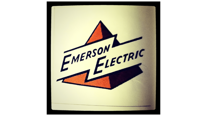
The logo consisted of a figure resembling a pyramid and a two-level inscription in the form of a company name. The words Emerson Electric were placed inside a symbol that looked like lightning. All this was located on a classical background. The pyramid was located so that two sides were visible. One had a brown color, and the other side was in the shade.
This decision created the effect of volume and expressiveness. The figure generally showed rapid growth and active progress towards success, and the brown color symbolized stability. Additional characteristics of the company are also reflected in the name. A thin sans-serif font was used for the inscription, made in italics.
He showed confidence and a desire for improvement. This was also confirmed by stylized lightning, inside of which there was an inscription. The figure symbolized energy and progressiveness and also emphasized the direction of Emerson Electric. All elements were combined into a single harmonious concept that emphasized professionalism.
New
The original logo has been used for many years. But, he gradually lost relevance, so the company decided to rebrand. In the process of creating a new emblem, a completely different approach was used. It is based on the use of neutral and, at the same time, expressive shades, as well as a bold font with thicker and smoother outlines.
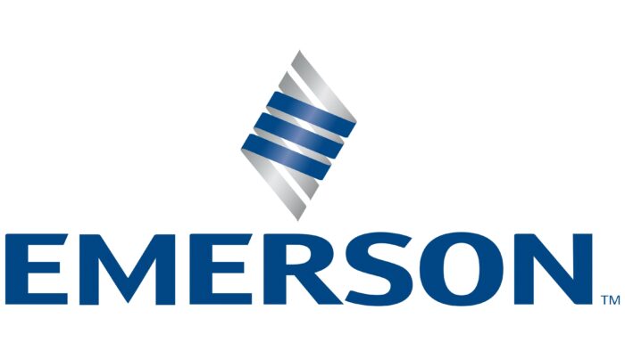
The updated emblem also has an original graphic symbol reminiscent of a part in electrical appliances. It was a kind of emphasis on the products that the corporation produces. The figure was a twisted spiral consisting of several stripes. Due to the use of two colors in the design and a glare passing in the middle, it looked very natural.
Below is a large company name. The words are in roman script, which features thick sans-serif lines with beveled cuts in some of the letters. The presence of straight contours, smooth curves, and unusual cuts makes the inscription stylish and concise. Combined with the 3D spiral icon, it is a harmonious reflection of the essence of Emerson Electric.
Font and Colors
The Emerson Electric corporate identity is an example of a successful combination of a three-dimensional image, deep coloring, and simple font. The figure, resembling a spiral, is decorated in several shades. Its outer part is painted in deep blue, symbolizing reliability, trust, and high quality. A light gray shade was used for the inner part of the spiral.
These shades are also complemented by a subtle highlight that gives the figure a more natural look. The company’s name is created in a simple font, which is notable for its jagged cuts and soft outlines. Such an inscription perfectly complements the spiral, as it is made in a similar style and color. Emerson Electric’s words are deep blue and represent the company’s commitment to the business.
Emerson Electric color codes
| Gainsboro | Hex color: | #e1e2e3 |
|---|---|---|
| RGB: | 225 226 227 | |
| CMYK: | 1 0 0 11 | |
| Pantone: | PMS 663 C |
| Quick Silver | Hex color: | #9fa1a3 |
|---|---|---|
| RGB: | 159 161 163 | |
| CMYK: | 2 1 0 36 | |
| Pantone: | PMS 422 C |
| Dark Cerulean | Hex color: | #004685 |
|---|---|---|
| RGB: | 0 70 133 | |
| CMYK: | 100 47 0 48 | |
| Pantone: | PMS 2945 C |
