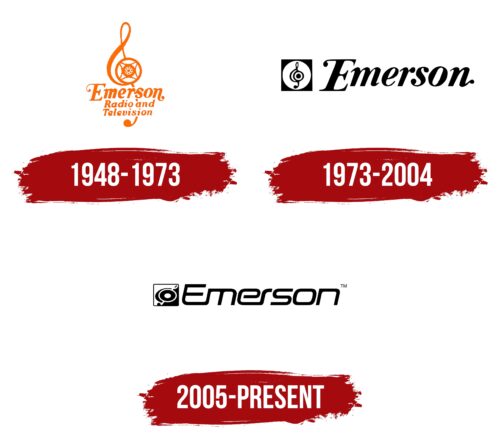
The Emerson logo is a decisive element of the distributor’s home and electronics identity because it demonstrates the brand’s winning points. It represents the brand as a virtuoso of its craft and emphasizes its advantages. Smooth strokes, rounded corners, and soft transitions show the company’s adaptability and its concept’s flexibility.
Emerson: Brand overview
| Founded: | 1948 |
| Headquarters: | Hackensack, New Jersey, USA |
| Website: | emersonradio.com |
Emerson (also known as Emerson Radio Corporation) is a renowned American distributor of innovative electronics and home appliances. The head office is located in the state of New Jersey (USA). But, the company itself works not only within the country but also on the international market. It supplies smart accessories (including smart sets), wireless devices, TVs, audio systems, and other types of in-demand products.
Emerson is a successful brand that specializes in the creation and sale of various types of consumer electronics. But he wasn’t always like that. His story began with the production of records, which brought a fairly high profit in the first years, and then came a period of decline in sales. The company had to change direction and look for new ways to improve. Through trial and error, the management managed to save the enterprise and bring it to a leading position.
Meaning and History
Emerson products are easily recognizable by their dynamic logo, which combines classic design with modern style. The main element is the brand name, made with clear soft lines. It is complemented by an icon created in the shape of a treble clef. The central part of the key has a rather rounded shape, which makes it similar to the company’s products – Universal Cut Records. This is a symbolic mark for Emerson as these items have become historical products.
The strict achromatic logo has a thematic element in the form of a treble clef and a sophisticated brand name. All components are in balance and also favorably complement each other. As a result, the symbol looks like a single entity and demonstrates the main strategy of Emerson’s development. Its essence boils down to the desire to create perfect products that have excellent technical characteristics.
What is Emerson?
Emerson is the name of one of America’s oldest consumer electronics companies. The brand has a long history and a wide range of products in different parts of the world. Among them are high-quality speaker systems, televisions, combined devices, microwave ovens, and many other products.
1948 – 1973
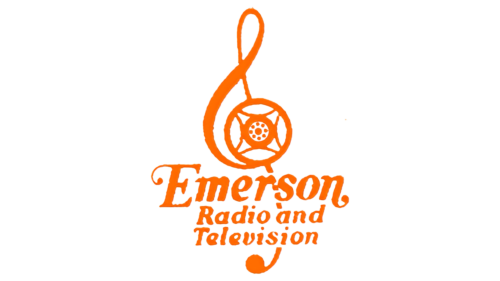
The large treble clef in the Emerson logo represents musicality and sound – something without which radio would not make sense. This is a simple and powerful symbol associated with the leader of the US radio market. The curl of the sign forms a circle in which a stylized player speaker is drawn. And at the bottom, “Emerson Radio and Television” is written in elegant cursive letters. Apparently, the emblem appeared during the period when the company began to produce televisions and increased its sales. The bright orange color goes well with the expressive font.
1973 – 2004
The first Emerson enterprise was created in 1915, but the visual identity had not yet been formed at that moment. The first official logo appeared in 1973. This version combined a graphic symbolizing a connection to the industry and a traditional brand name. The original badge is made in the form of a black treble clef located inside a white circle. The last figure was placed in a dark square.
The essence of this original performance was to make associations with the radio. It was this technique that the company manufactured in the early periods. The inscription is dynamic and, at the same time, elegant design. The wordmarks are reminiscent of the cursive handwriting used in classical calligraphy. Here you can see the same strokes and sizes.
Some letters have decorative dots at the ends. They reference the time when the ink was used for writing, leaving traces in the form of miniature drops. An additional difference between the font was the capital letter E, which stood out against the general background due to the size and elongated top stripe. The color scheme included only black and white. They demonstrated prestige, solid status, and reliability in such a presentation.
2005 – today
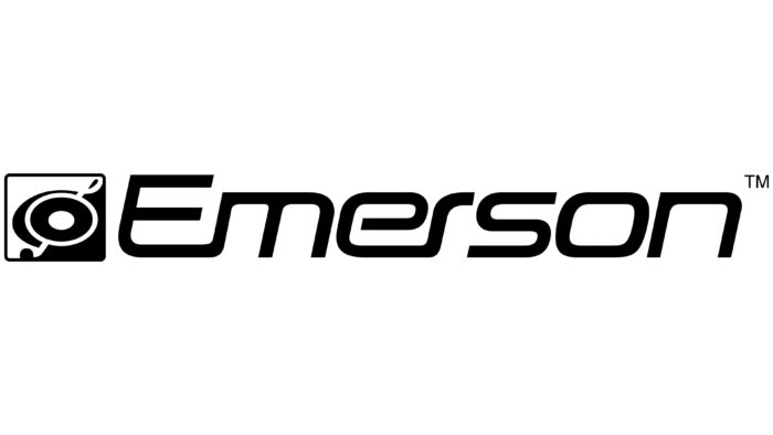
In 2005, the Emerson brand decided to change its corporate identity. The old emblem no longer corresponded to the essence of the company and design trends, so they decided to refresh it. The updated logo retained the general design principles and incorporated new style solutions. The icon has changed the font format, as well as the visual presentation of the graphic symbol. The treble clef took on a perfectly rounded shape and was placed at an angle.
The square he was placed inside was split into two parts. One of them was black and the other white. For the inscription, a more modern font was used, the letters of which were located at a slight slope. The chosen format demonstrated development, progressiveness, and dynamism. The colors remained the same, which was a confirmation of stability and confident positions in the market.
Font and Colors
The Emerson logo is a complete concept that symbolizes the combination of tradition and new technological solutions. The main element is the original futuristic typeface, which symbolizes innovation, and complements its neat icon in the form of a musical symbol. Both components are in harmony with each other, just as the company combines modern technologies and traditional solutions.
An original electrified font is used for the design of the name, similar to the design of neon signs. The letters have a streamlined style as well as the same width. There are no decorative dots at the ends of the letters. The color palette includes two colors: black and white. The latter is used to decorate the background. It reflects openness and honesty. Black is used for the company name. This color is an ageless classic that is still relevant today.
Emerson color codes
| Indigo Dye | Hex color: | #094874 |
|---|---|---|
| RGB: | 9 72 116 | |
| CMYK: | 92 38 0 55 | |
| Pantone: | PMS 7693 C |
| Celestial Blue | Hex color: | #539fd1 |
|---|---|---|
| RGB: | 83 159 209 | |
| CMYK: | 60 24 0 18 | |
| Pantone: | PMS 2995 C |
| Cool Gray | Hex color: | #7b84a1 |
|---|---|---|
| RGB: | 123 132 161 | |
| CMYK: | 24 18 0 37 | |
| Pantone: | PMS 7667 C |
| Ruddy Blue | Hex color: | #81aad8 |
|---|---|---|
| RGB: | 129 170 216 | |
| CMYK: | 40 21 0 15 | |
| Pantone: | PMS 292 C |


