The call for savings, the careful use of resources, and responsibility in using energy reflect the Energy Star logo. With simple lines and classic images, the designers managed to convey the aspiration to save an invisible but very important factor for mankind. The color palette inspires confidence and gives hope for the best.
Energy Star: Brand overview
| Founded: | March 15, 1992 |
| Founder: | John S. Hoffman. U.S. EPA |
| Headquarters: | United States |
| Website: | energystar.gov |
Meaning and History
This program was adopted in connection with the requirements of the Clean Air Act and the Energy Policy Act, which reduced electricity costs by at least 430 billion dollars. The Environmental Protection Agency now manages it. Many other organizations are also involved in the project to help track, compare, analyze and provide technical support. This is the voluntary labeling of products with increased energy efficiency. Such a stigma appeared on personal computers and printers for the first time.
Then Energy Star labels began to be put on domestic cooling and heating systems, as well as on energy-efficient homes (since 1995). To this end, a unified labeling design was adopted to associate the mark with energy savings immediately. Currently, this designation is found on 75 types of certified products, industrial facilities, commercial buildings, factories, pharmaceutical plants, mills, lighting devices, consumer electronics, and so on. It is a standard label, well recognizable by a star and a handwritten inscription on a rectangular background. There are two versions of the logo in total.
What is Energy Star?
Energy Star is a label confirming the high energy efficiency level of a product, technique, or building. The EPA (Environmental Protection Agency) regulates the program and promotes reasonable energy consumption. It mainly operates in the Asian and North American regions. The project was launched in 1992.
1992 – 2003
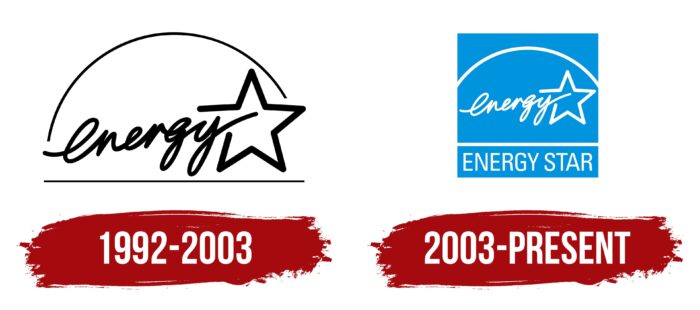
Handwriting has been on the Energy Star logo since the beginning. But only the first word of the name was written in cursive, sweeping handwriting, while the image of a star replaced the second. This approach made the logo very extravagant and unusual. The text was lowercase and cohesive, with smooth connections between characters that immediately passed into neighboring elements. The inscription was located above a thin horizontal strip and went diagonally. On the right side, a classic five-pointed star was drawn; one ray was not completely completed because the letter “y” opened it. At the top, they were connected by an arch. It was the same thickness as the bottom line.
2003 – today
The modernized version of the logo became colored: instead of a black and white spectrum, a blue and white one appeared, symbolizing fresh air and cleanliness of the surrounding space. In addition, the designers added a square where they placed all the main elements: handwritten text, a star, an arch, and an underline, under which the printed form of the program name was placed. They chose a grotesque, capital, non-bold font. The new version also changed the location of the upper arc: its ends are now at the same level – both on the right and left.
Font and Colors
The basic focus of Energy Star’s visual identity is on cleanliness, simplicity, and minimalism. This label, as it were, is “saving” in itself due to the lack of many details. In it, even half of the name is encoded in a star, which makes the label much easier and well recognizable.
The debut logo’s inscription was italic, fluent, and handwritten. Then the developers added a more understandable transcript to it – a printed version of the name, made in a font that simultaneously resembles Tyler Finck’s Atiga Medium and Christian Robertson’s Roboto Condensed. The palette is unstable and was once changed from monochrome to light blue combined with white.
Energy Star color codes
| Blizzard Blue | Hex color: | #1abcee |
|---|---|---|
| RGB: | 26 188 238 | |
| CMYK: | 89 21 0 7 | |
| Pantone: | PMS 312 C |


