The EngagedMD logo acts as a point of contact between the brand and the public. It represents the warmth, accessibility, and trust that are integral to the healthcare industry. The logo creates an emotional connection, sending an unspoken but clear message that the brand stands for well-being and peace of mind. It subtly conveys the company’s commitment to quality service and innovation, evoking a sense of trust that encourages people to delve deeper into what EngagedMD offers.
EngagedMD: Brand overview
EngagedMD was founded in 2014 by Jeff Issner and Taylor Stein in the US. Their goal is to revolutionize patient information and consent procedures in the medical field with state-of-the-art tools. The company initially focused on infertility treatment centers, offering tools to transition and streamline patient initiation, education, and consent processes. The EngagedMD platform transformed traditional paperwork into digital versions, facilitating patient self-study and simplifying routine tasks for clinic staff.
By the time 2018 arrived, more than 150,000 patients had utilized EngagedMD’s infertility tools, serving multiple infertility patients in the US, UK, and Canada. Clinics have significantly reduced administrative tasks, with time savings averaging 56 minutes per patient. In 2022, MonCap led an $11 million funding round for EngagedMD, allowing the company to expand beyond reproductive health and into other areas of healthcare.
EngagedMD remains at the forefront of offering patient education and procedure automation tools for fertility clinics. At the same time, the company is venturing into untapped areas of medicine. Their innovative tools aim to improve the quality of care for both healthcare providers and their patients, driven by a commitment to utilizing advanced tools to improve the quality of care for patients and healthcare providers.
Meaning and History
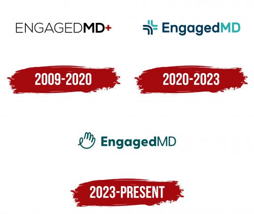
2009 – 2020
2020 – 2023
2023 – today
The EngagedMD logo has a benevolence that is conveyed through both its content and color. The turquoise hue is associated with lightness, calmness, and peace, while the waving hand evokes a sense of openness, friendliness, and simplicity. It is drawn with one curved line, smoothly passing from finger to finger. Next to it is the company name, visually divided into two parts: bold and semi-bold. Each word is also highlighted in an individual font: at the beginning – rounded and lowercase, and at the end – straight and uppercase. In both cases, the letters are spaced as far apart as possible.
The close spacing of the letters signifies unity or closeness, which is in line with the idea of brand engagement and connection. Different fonts and text weights draw attention, making the logo stand out. The hand symbol, which is a universal sign of greeting, gives the logo an overall friendly character.


