The Enkei logo is an image of the road, rims, and wheels, directly indicating the company’s direction. Long-term presence in the market and continuous improvement can be seen in the elements of the emblem.
Enkei: Brand overview
| Founded: | October 5, 1950 |
| Headquarters: | Japan |
| Website: | enkei.co.jp |
The automobile wheel has gone through many changes over the last century, from wooden wheels to composites and superalloys. Japanese manufacturers made many rims, but few managed to stay on the market for a long time and win world recognition. Enkei has been considered one of the best manufacturers since the 1950s.
Enkei is a world-famous Japanese corporation specializing in the cast and forged wheels. The brand produces wheels for cars and motorcycles, both for personal use and for the world’s leading competitions. Enkei does not stand still and constantly strives for excellence.
Meaning and History
The manufacturer generates and produces sophisticated high-tech racing wheels for various motorsports such as rally, drift, sportscar racing, and single-seat racing, including the supply of lightweight magnesium Formula 1 racing wheels for the McLaren Honda team. Enkei has been the official supplier of the McLaren F1 team since 1995. Enkei has also participated in the world’s leading competitions for more than three decades. Enkei is now a large recognizable corporation with a wide range of premium quality products.
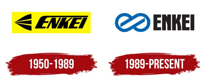
During the existence of the company, the identity has changed twice. One of the main ideas of the brand is movement. The identity supports the idea of the brand.
1950 – 1989
The style of the logo is combined, consisting of a brand name located to the right of the stylus style. The emblem of the logo depicted a road consisting of three lanes and expanding towards the right. It also resembled the letter “E.”
The initial letter “E” was especially characteristic; its upper part stretched over all other letters and symbolized the road. There is a possibility that a modified Kiez font, sans-serif, was used for writing.
As mentioned above, the brand positions itself as a dynamically developing company, and the main idea is movement; therefore, italics were used in the style of the pin. A logo using coursework styles will immediately acquire the effect of movement. It reflects speed and sharpness. This inscription expresses unstoppable strength, speed, and movement. Among other things, the tilt to the right symbolizes a positive direction.
The color scale is black/yellow. The black color in the logo creates an image of authority, the color of restrained and hidden power—the color of successful and serious people. The yellow backing gave the logo motivation for action.
1989 – today
The style of the logo also remained combined; it consists of a brand name and a pin style. The brand’s infinity emblem, which forms the race track, symbolizes continuous movement. It also symbolically depicts wheels.
Font and Colors
The smooth and solid forms of the emblem rhyme well with clear letters in style. Most likely, a modified Robuck typeface was used for writing. This is a sans-serif typeface; the letters are massive and heavy; however, it does not argue with the logo icon. The letters are of the correct geometric shape, with even lines and right angles, without extensions at the end of the letter strokes.
To set the accents, the image of the logo is blue, and the font itself is black. The use of shades of this color in the brand identity makes the company reliable and stable in customers’ eyes. The blue logo helps earn consumer trust.
Today, the brand identity is quite recognizable along with competitors. And the logo looks impressive on various surfaces and also adorns any facades.
Enkei color codes
| Medium Persian Blue | Hex color: | #0066b1 |
|---|---|---|
| RGB: | 0 102 177 | |
| CMYK: | 100 42 0 31 | |
| Pantone: | PMS 285 C |
| Licorice | Hex color: | #1f191a |
|---|---|---|
| RGB: | 31 25 26 | |
| CMYK: | 0 19 16 88 | |
| Pantone: | PMS Neutral Black C |
