 Enterprise Rent-A-Car Logo PNG
The Enterprise Rent-A-Car logo shows the convenience of ordering, renting, and buying cars from an American transport company. It conveys forward motion, energy, and the ability to escape problems. The flatness and smoothness of the glyphs symbolize the company’s straightforwardness and desire to help customers by all available means.
Enterprise Rent-A-Car: Brand overview
Enterprise Rent-A-Car is an American company that offers various transportation solutions. It is engaged in car sharing, commercial fleet management, truck rental, and car sales. To do this, the company has more than 8,000 offices worldwide. It was founded in 1957. The headquarters are in Clayton, Missouri. The founder is Jack C. Taylor. The current owner is Enterprise Holdings.
In 1957, a former Navy pilot, Jack Taylor, started a car rental business in the basement of a Cadillac dealership in St. Louis. He only had seven cars but was determined to offer great service to the local community, not just airport travelers. Taylor named his company after the USS Enterprise, the aircraft carrier he served on during World War II. His goal was to make customer satisfaction and local service the heart of his business.
Over the years, Enterprise grew fast. In the 1960s and 1970s, it expanded across the US, opening more than 300 offices. By the 1980s, Enterprise went international, starting in Canada and moving into Europe, Latin America, the Caribbean, and the Middle East.
The 1990s and 2000s saw more growth through buying other car rental companies like National Car Rental and Alamo Rent-A-Car. This made Enterprise the biggest car rental service in North America. It also started offering new services like truck rentals, fleet management, car-sharing, and exotic car rentals.
Enterprise has always cared about the environment and helping the community. It invests in green cars like electric and hybrids and supports various charitable causes.
Enterprise operates in almost 100 countries and has over 1.85 million vehicles. Taylor’s family still owns it. The company focuses on customer service and supporting the local communities. It adjusts its services to meet local needs while maintaining high standards everywhere.
Since starting with just seven cars, Enterprise has become a leader in the car rental industry by always putting the customer first and innovating. Today, it uses the latest technology to meet its customers’ changing needs worldwide.
Meaning and History
It all started with pilot Jack Taylor’s return to St. Louis after a lengthy military service in the South Pacific. The WWII veteran was devoted to his family and locality, so he decided to master an innovative business that no one had previously practiced. This is how the family Executive Leasing Company appeared, offering a car rental service. Initially, the fleet consisted of only seven cars.
Things were going uphill, so the entrepreneur expanded his business services a few years later. He later rebranded and renamed the company Enterprise Rent-A-Car. This happened in 1996. He named it after the aircraft carrier he served on during The Second World War and added a line of business. Having gone beyond the boundaries of one city, the organization began to work not only in other places of the country but also in different parts of the world. As a result, subsidiaries appeared, and more than 8,000 offices were opened. Its visual identity has also evolved in parallel with the company’s development. In general, now she has seven full-fledged logos.
What is Enterprise Rent-A-Car?
Enterprise Rent-A-Car is an American car and truck rental service. She is also engaged in its sale and carsharing. The company is part of the Enterprise Holdings network, being its leading brand, and has about 8,000 offices in almost all countries worldwide. The year of its inception is 1957. The founder is Jack C. Taylor. The headquarters is located in Clayton, Missouri.
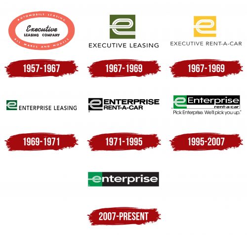
1957 – 1967
The debut emblem is an oval in a wide red frame, close to the coral color. Its entire area is occupied by information messages indicating the company’s services. It says “Automobile Leasing” at the top and “All Makes and Models” at the bottom. Both phrases are typed in small print with lowercase letters. Glyph spacing is wide, and the glyphs themselves are smooth and sans-serif. In the center of the ellipse is the debut name of the organization, ungrouped into two rows. The first word is “Executive.” It is cursive, handwritten, and connected. The second is the phrase “Leasing Company.” This part, on the contrary, is printed and not oblique.
1967 – 1969
The next logo was a breakthrough for Enterprise Rent-A-Car. First, it turned into the original icon. Secondly, I was imbued with the conceptual reflection of the company’s occupation. How is it shown? In a highway that curves into the shape of a lowercase “e.” The loop forms the middle of the letter, and its right and left sides end at the border of the olive square that serves as its background. Separately, at the bottom is the company’s name – “Executive Leasing.” The text is typed in the subtle grotesque. All characters are in the upper case and are colored black.
1967 – 1969
The logo represents the strong and well-known brand Executive Rent-A-Car, later known as Enterprise Rent-A-Car. It features a yellow rectangle with a black ‘e’ enclosed in a curved abstract shape, combining simplicity with a touch of sophistication. The use of bold yellow and black represents energy, optimism, and professionalism, while the clean lines signify solidity and reliability.
The font for “RENT-A-CAR” is modern and straightforward, emphasizing the company’s professional approach and contemporary offerings. The logo’s elements come together in a style that reflects the brand’s core principles: accessibility, customer focus, and innovation.
Thus, the logo encapsulates the brand’s visual identity, growth history, and adaptation to customer needs. The restrained yet expressive elements in the logo’s design mirror the company’s ambition to lead the industry by delivering high-quality services and meeting customer demands.
1969 – 1971
After renaming the company Enterprise, the owner changed the logo. But the redesign was not full-blown. The modernization that was undertaken touched only the color of the background square (it became green instead of olive) and the regrouping of the name of the car rental service. The text has been moved to the right and is on one line. Although the letters are kept in capital letters, they have become vertically elongated, that is, narrower than before.
1971 – 1995
The management then added the phrase “Rent-A-Car” to the existing name, indicating the exact scope of the company. The logo is black and white. The text remained in the same place but took up two lines, as it increased significantly due to the addition. The font has completely changed: the inscription in the top row has become bold and large, and the bottom is bold and a third shorter than the first. They are left aligned.
1995 – 2007
Despite the saved concept, the emblem has changed a lot. First, she had an exact shape – a horizontal rectangle delimited into several sectors. On the right is a branded icon, which the designers again painted green. Against a black background, a white inscription “Enterprise” appeared. It starts with a capital “E,” while all other letters are lowercase. Below is the second part of the name – “Rent-A-Car.” It is short, made in small characters, and aligned on the right side. In this part, the background is white, and the text, on the contrary, is black. Below the logo is the company’s slogan: “Pick Enterprise. We’ll pick you up.”
2007 – today
After a 2007 redesign, the “e” of the motorway in the icon looked like a real letter from the alphabet. The developers shortened the right lane and slightly sharpened the loop to do this. They also made the first glyph part of the name so it starts the word “enterprise” in full lowercase. The second line is gone, as is the white rectangle it was on; only the black one remains.
Font and Colors
Enterprise Rent-A-Car’s visual identity is built on two concepts: valuable memories (Enterprise was the name of the aircraft carrier on which the company’s founder once served) and type of activity (vehicle rental). Over the years of evolution, these concepts have acquired different forms. However, the personal sign has always remained the same, except for minor adjustments: it resembles a looped autobahn with a central marking.
Since the beginning of the logo, several fonts have been used, but they have always remained grotesque – even smooth sans serifs. This approach emphasizes the absence of obstacles on the way to the services of this service. The identical typefaces are Montserrat Semi Bold, Core Sans NR SC 77 Cn ExtraBold, Work Sans Medium, and Syncopate Bold with minor changes. In the early logo versions, Brother 1816 Bold and Savigny Medium Ext analogs are used, in which small strokes are slightly changed. The corporate palette is more stable: it combines two shades of black, white, and green. The debut logo also featured coral red.
FAQ
What is the slogan for Enterprise Rent a Car?
The slogan “We’ll pick you up” has been synonymous with Enterprise Rent-A-Car since 1994, capturing the essence of the company’s customer service philosophy. This simple yet powerful statement underscores Enterprise’s commitment to convenience and going above and beyond for its customers. The slogan emerged as a differentiator in the competitive car rental industry, emphasizing the brand’s dedication to making the rental process as easy and seamless as possible for its customers. This customer-centric approach is reflected not just in their advertising but in their services, including offering to pick up customers and bring them to the rental office, a feature particularly appreciated by those who find themselves without a car due to repairs or other circumstances.
However, the distinctiveness of this slogan drew attention from competitors. By 1998, Enterprise observed that other companies, notably Hertz and Advantage, were using similar catchphrases, which they felt echoed the sentiment of their slogan too closely. This situation highlights the impact of a strong, service-oriented slogan in the competitive landscape, where unique value propositions are key to standing out. “We’ll pick you up” represents a service promise and has become integral to the Enterprise’s brand identity, reflecting its commitment to customer convenience and satisfaction.
How many locations does Enterprise Holdings have?
Enterprise Holdings, the parent company of Enterprise Rent-A-Car, National Car Rental, and Alamo Rent-A-Car, boasts an expansive global network with more than 9,500 locations worldwide. This extensive presence underscores the company’s status as a leading car rental and mobility services industry player. With locations across almost 100 countries and territories, Enterprise Holdings caters to a wide range of customer needs, offering everything from car and truck rentals to car sharing and vehicle sales.
This vast network allows Enterprise Holdings to serve millions of customers each year, providing convenience and accessibility regardless of where their travels take them. Whether for business or leisure, customers can find Enterprise Holdings brands in major cities, airports, and neighborhood locations, making it easy to start their journey. The company’s global reach is a testament to its commitment to expanding mobility solutions and services, ensuring that, no matter where you are, “We’ll pick you up” is more than just a slogan—it’s a promise of unparalleled service and convenience.
Is there an Enterprise in Thailand?
Yes, Enterprise Holdings is set to expand its global footprint to Thailand, bringing its renowned car rental services to this popular travel destination. Scheduled for July 2024, branches under the Enterprise, National, and Alamo brands will open across Thailand, marking a significant step in the company’s international expansion efforts. This launch will include branches at every major international airport in Thailand and several other strategic locations nationwide.
Introducing Enterprise, National, and Alamo brands in Thailand is especially noteworthy for travelers seeking reliable and convenient transportation options. Thailand, known for its stunning landscapes, rich culture, and bustling cities, attracts millions of tourists annually. The availability of Enterprise Holdings’ services at nine locations, including major gateways like Bangkok’s Suvarnabhumi Airport and Phuket International Airport, ensures that visitors have easy access to rental cars right from the moment they land.
This expansion benefits leisure and business travelers to Thailand and signifies Enterprise Holdings’ commitment to extending its reach and services in Asia. By establishing a presence in Thailand, Enterprise Holdings continues to build on its promise of providing exceptional service and convenience to customers, regardless of destination.
Is there an Enterprise in India?
Yes, Enterprise Rent-A-Car has established its presence in India, catering to the diverse and growing demand for car rental services in one of the world’s most populous countries. In India, Enterprise provides convenient pick-up locations for rental cars in main cities, popular neighborhoods, and, importantly, at airports. This strategic placement of pick-up locations ensures that domestic and international travelers and residents can easily access Enterprise’s services.
Having pick-up locations in major cities allows Enterprise to serve a broad spectrum of customers, from business travelers needing to move swiftly between meetings to tourists eager to explore India’s rich cultural heritage. Additionally, by positioning themselves in popular neighborhoods, Enterprise taps into the daily transportation needs of locals and visitors alike, offering a reliable alternative to public transport or personal vehicles.
The availability of pick-up points at airports in India is particularly beneficial, providing arriving passengers with immediate access to rental vehicles. This service is invaluable for those looking to seamlessly continue their journey, whether heading to bustling city centers, tranquil beach resorts, or remote rural destinations.
Enterprise’s expansion into India and establishing pick-up locations across the country reflect the company’s commitment to offering flexible, convenient, and reliable car rental solutions. By adapting to India’s unique transportation needs and preferences, Enterprise reinforces its global reputation for quality service and customer satisfaction.
