Designers created an abstract Ericsson logo that indirectly hints at the company’s field of activity rather than directly. It symbolizes innovation and a business approach to work, as the telecommunications equipment manufacturer uses progressive technologies.
Ericsson: Brand overview
| Founded: | 1876 |
| Founder: | Lars Magnus Ericsson |
| Headquarters: | Kista, Stockholm, Sweden |
| Website: | ericsson.com |
Meaning and History
The company’s trademark was approved in 1894 after it was officially registered. Throughout its existence, it has undergone several redesigns.
What is Ericsson?
Ericsson is one of the world’s largest suppliers of network technologies. This Swedish company was the first to launch a commercial 2G network and continues to work in the 5G field. Its primary task is to create network infrastructures and technologies for various types of wireless communication and the Internet of Things. The company supplies equipment to many cellular operators, such as T-Mobile, Verizon, and AT&T.
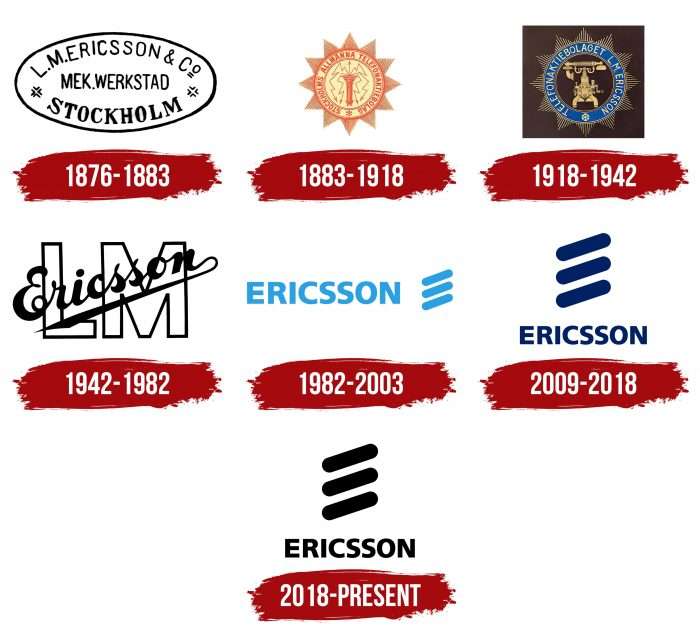
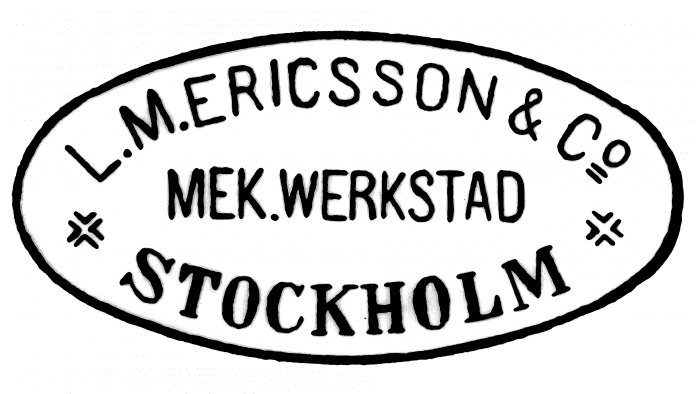
1876 - 1883
After its foundation, the company used an oval mark containing vital information: the name, location, and address.
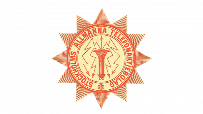
1883 – 1918
Then, a circular logo appeared in the form of a sun with triangular rays. Thin lines inside it indicate the company’s field of activity. The primary colors are beige and red.
1918 – 1942
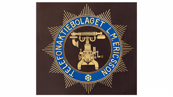
That year, designers placed a retro telephone in the circle’s center and surrounded it with a dark blue band with the company’s name.
1942 – 1982
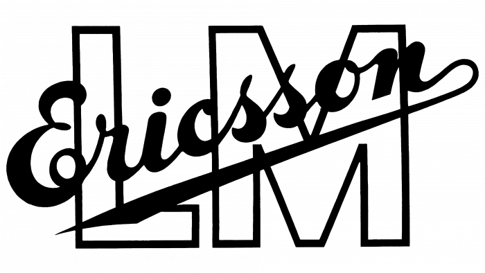
The emblem became monochromatic. Large letters “LM” (short for Lars Magnus) were used as a background, and the founder’s surname (Ericsson) was placed on top diagonally, written in italics.
1982 – 2009
From this year, the logo acquired a modern style: the company’s name in uppercase with three perpendicular lines.
2009 – 2018
The three diagonal lines were moved onto the word “Ericsson.”
2018 – today
After several years of uniformity, the company decided to change the logo to a more modern one. This event is dated to 1982. Before that, variants in the form of seals, badges, initials, and the founder’s signature were used. The current version essentially represents the debut of the brand’s real visual identity. The administration entrusted the work on the logo to Terry Moore from AID and then involved the Stockholm design lab.
The decision was made to base the design on the word “Ericsson” and the letter “E.” For this, the developers chose a sans-serif font and stylized the capital letter. They cut off the connecting leg, leaving only three protruding lines. Then, the designers rotated them 18,435 degrees to make the logo easier to pixelate. These strokes are colloquially called “three sausages.”
Ericsson: Interesting Facts
Ericsson is a big company from Sweden that’s been important in making phone technology better for more than 100 years.
- How It Started: Lars Magnus Ericsson founded the company in 1876 in Stockholm, Sweden. He began with a small place where he made stuff for telegraphs and phones. Now, Ericsson is a huge name in the phone world.
- Making Phones Better: Ericsson has been making big steps in phone technology since the start. They helped make phones work automatically long ago and created technology for mobile phones to talk to each other without wires.
- Bluetooth: Ericsson invented Bluetooth in the 1990s. It allows headsets and phones to connect without cables. Today, we use Bluetooth for lots of wireless stuff.
- Mobile Networks: Ericsson is important in making our phones’ networks, from the old 2G networks to the superfast 5G networks.
- Around the World: Ericsson works in over 180 countries and has over 100,000 workers. They help set up phone networks all over the globe.
- 5G Technology: Ericsson is helping develop 5G technology, the next big thing for phones and the internet. They’re working with phone companies and governments to make it happen.
- Caring for the Planet: Ericsson wants to be good for the environment. They’re trying not to contribute to climate change and are improving their technology so it uses less power.
- Ericsson Studio: They have a special place in Kista, Sweden, where they show off new tech. People can go there to see what’s next on phones and the internet.
- Inventing New Stuff: Ericsson spends much time and money on new phone technology. They have many patents, meaning they’ve developed many new ideas.
- The GSM Standard: Ericsson played a big part in creating GSM, a system that most of the world’s phones use to talk to each other. It helped make mobile phones popular worldwide.
Ericsson started small but now helps connect people everywhere with their phone technology. They’re always trying to improve things and care for the planet simultaneously.
Font and Colors
The modern version is a word written in uppercase sans-serif letters and a graphic symbol in the form of three broad, short lines. The monochromatic design embodies practicality, authority, power, and security.
Over time, several types of fonts have been used in the logo. One of the most recognizable is Frutiger Black sans serif, created by Adrian Frutiger. The company received its font from the Stockholm design lab. It was named Ericsson Hilda and is based on Latin, Greek, and Cyrillic characters. The design update received two Red Dot Awards.
The color palette is uniform and consists of a combination of cornflower blue and white: blue letters on a white background or vice versa.
Ericsson color codes
| Black | Hex color: | #000000 |
|---|---|---|
| RGB: | 0 0 0 | |
| CMYK: | 0 0 0 100 | |
| Pantone: | PMS Process Black C |
