Conciseness is how you can describe the Ernst & Young logo. The company decided to make just one bright accent in the emblem to achieve international status because the abundance of details confuses potential clients. But it is as catchy as it is easy to remember. The simplicity of the icon helped the firm rise to a high level because it is a feature that represents the main concept of the consulting and auditing organization.
Ernst & Young: Brand overview
| Founded: | 1989 |
| Headquarters: | London, England, U.K. |
| Website: | ey.com |
Meaning and History
The company originated from the merger of two US firms, after which it became the largest representative of the UK consulting, auditing, and financial services sector. The first of these is Harding & Pullein, which appeared in 1849 and was renamed several times. At the time of the merger, it was called Ernst & Whinney in honor of Alwin C. Ernst. The second organization is Arthur Young & Co., founded in 1906. As a result, a large accounting company appeared, named after the founders’ names.
Like many similar services, Ernst & Young has expanded its range of services and offered a lot – from strategic financial measures to advice on personnel issues. For the role of visual identity, the international firm first chose the text version of the logo, introducing its name into it. Even the icon was literal: it consisted of capital characters that began each word in the name (EY). Otherwise, it was a simple informational emblem that communicated what kind of company it was and what it did. She has only two logos in her arsenal.
What is Ernst & Young?
Ernst & Young (EY) is a consulting and audit company that includes several specialized firms from many countries worldwide. In particular, it has 728 branches in 150 states. The largest of these operates in the United States. The head office is located in the capital of Britain – the city of London. The year of origin of this international organization is 1989. Now it is included in the Big Four accounting services.
1989 – 2013
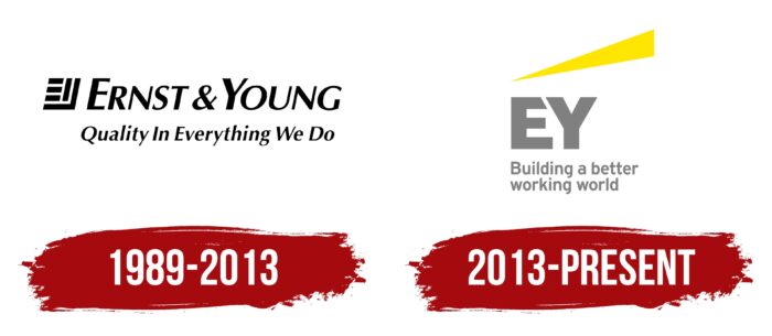
The debut version contained several inscriptions. The most important was the name, so it occupied most of the emblem and was at the top, in the first line. The phrase “Ernst & Young” was in sans-serif italics. The letters consisted of a harmonious combination of narrow and wide lines. Even though the glyphs were capital, “E” and “Y” were still larger than the rest of the characters.
They also formed the basis of the graphic sign located on the left side. It was a unique icon, which was an interweaving of capital letters. “E” was placed first and consisted of three short horizontal stripes. Next was “Y.” It was composed of two elements: a right angle and a wide vertical stroke. Below was the phrase “Quality in Everything We Do” in the same style as the top lettering. Everything was painted black and visible against a white background.
2013 – today
The current logo reflects Ernst & Young’s tendency to simplify, so after the rebranding, the abbreviation “EY” appeared in it. It was she who was taken as the basis for the new identity of the audit and consulting service. This choice turned out to be expedient from a practical point of view, making it easier and more convenient for clients to navigate among competitors in the financial market. In confirmation of this, the management used a large font, making it the emblem’s base. “E” and “Y” are tall, wide, and massive, which conveys the main goal of the British company – to become the No. 1 brand in its field of activity.
Although the modern Ernst & Young logo is considered very progressive, it still received criticism from graphic artists. The reason is excessive standardization. It is assumed that it looks like the badge of some transport and technology company and not a consulting and auditing organization. In this regard, Business Insider named this emblem the worst in the financial system and ranked it second from the bottom in the ranking of the most failed corporate changes of 2013.
Font and Colors
The Vera Humana 95 BoldItalic typeface, designed by BX Fonts, was first chosen for the logo. After the rebranding, it was replaced by Roadgeek 2005 Series E Regular by Michael D. Adams. The corporate palette consists of a combination of black and white (in the debut logo) and gray and yellow (in the current emblem).
Ernst & Young color codes
| Middle Yellow | Hex color: | #ffe700 |
|---|---|---|
| RGB: | 255 231 0 | |
| CMYK: | 0 9 100 0 | |
| Pantone: | PMS 803 C |
| Rich Black | Hex color: | #0e171e |
|---|---|---|
| RGB: | 14 23 30 | |
| CMYK: | 53 23 0 88 | |
| Pantone: | PMS Black 6 C |
