


 Exo Logo PNG
The Exo logo is stylistically similar to the emblems of many popular Asian groups. This is an abstract, philosophical sign with deep meaning. Moreover, each musician’s album features its own unique symbol.
A striking representative of the Korean musical Olympus is the South Korean-Chinese music band “Exo”, based in Seoul. It first announced itself in 2011, when the full lineup was formed. SM Entertainment, the boy band’s founder, began forming the group in 2006 through a selection process that included auditions, followed by internships and additional training. It consists of nine male members. They perform music in three languages: Japanese, Korean, and Chinese. The style is quite diverse, including pop, hip-hop, R&B, house, and rap. On Dec. 29, 2011, the group made their first television appearance on the SBS Gayo Daejeon program. To reach as wide an audience as possible, the group formed two units: Exo-K and Exo-M. This allowed them to participate in events held simultaneously in different places and perform in Korean and Mandarin.
One of the band’s features is SM Entertainment founder’s creative approach to the musical brand he created. The company pays close attention to developing an image and decorating each album with a special, memorable EXO logo.
Meaning and History
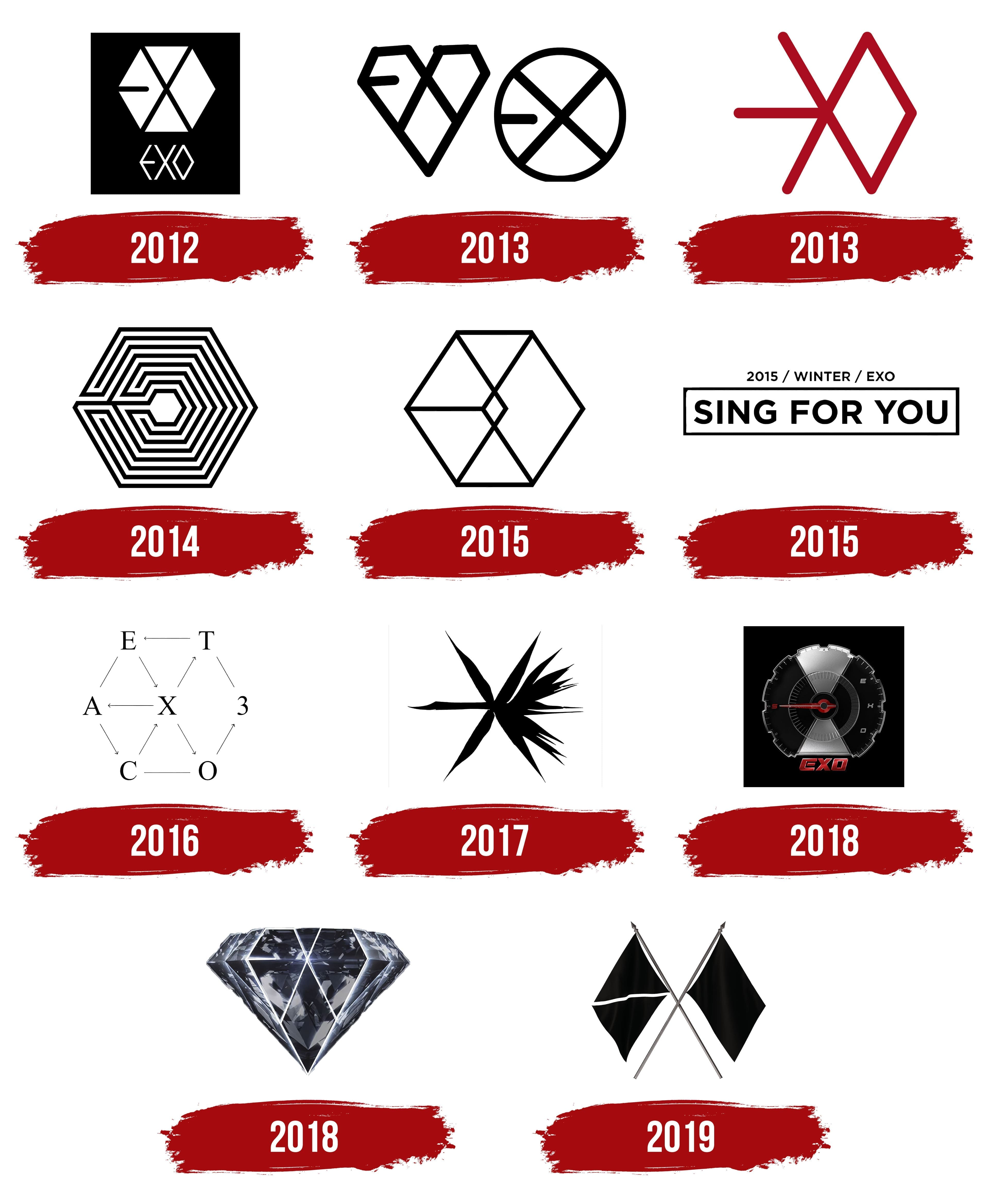
The “Exo” logo is a puzzle assembled from many broken pieces of feeling. It captures the essence of emotion because this Korean-Chinese boy band sings for its most vulnerable audience: teenagers. Their repertoire is also diverse, spanning various musical directions. They also symbolize parts of a single whole.
The first member was EXO-K’s future leader, Suho, who auditioned in 2006. The selection process ended in 2011 when both teams were recruited. SM Entertainment founder Lee Soo-man announced the male musical lineup in May 2011 at a regular seminar at Stanford University. There, the company announced its strategy to form two musical subgroups under a common name. The company had already secured the official name Exo in December of the same year, before performing at the SBS Gayo Daejeon ceremony.
On Apr. 8, 2012, both bands debuted with the single “Mama,” followed by a mini-album.
Commercial success came early in 2013, following the release of the joint bilingual album XOXO in June. The album was updated with three new releases in August, ranking third on the Billboard K-Pop Hot 100 and second on the Gaon chart.
Spring 2014 marked the release of the band’s third album, Overdose, which became the album with the most pre-orders in Korean-Chinese music history.
In 2015, the band was already at No. 95 on the U.S. Billboard 200 and No. 98 on the Billboard Canadian Hot 100. No other Korean music group has ever achieved this level of success.
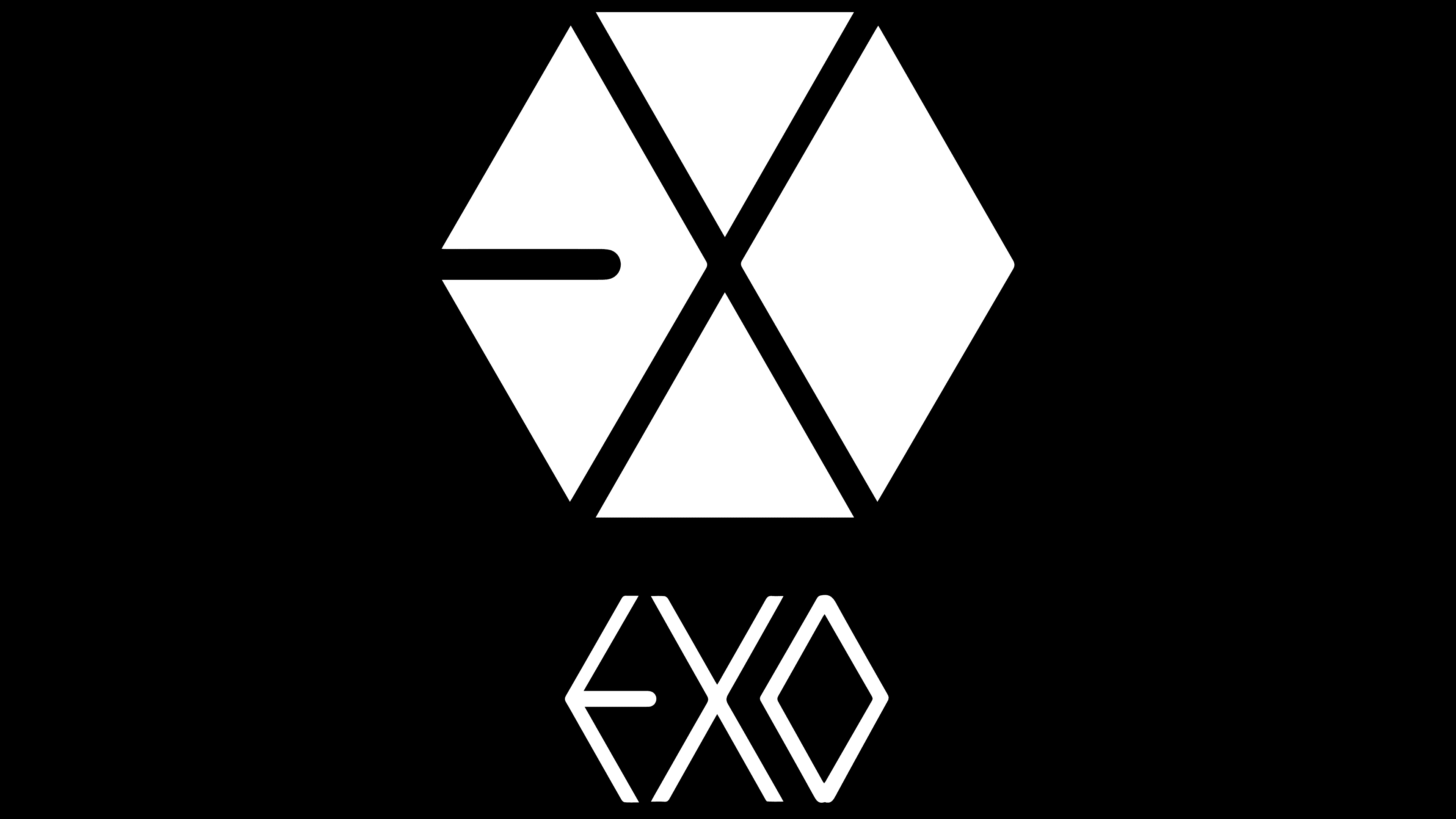
The third tour on Jul. 22, 2016, already took place without Chris and Luhan.
On May 28, 2017, the team gave their historic concert at Seoul Olympic Stadium, completing another tour. The performers’ solo concerts characterize this period.
Since 2018, the band has continued its successful march through the international music scene, earning gold certification for their album Countdown on Feb. 9. A historic event for EXO was its performance at the closing of the 2018 Winter Olympics.
Starting in May 2019, the band members began to be drafted into the military. At the same time, the remaining members released their solo albums. Meanwhile, the remaining members formed new subgroups, CBX and SC. In November, they recorded an album called Obsession, the first created with a smaller lineup, marking another milestone in the band’s history.
Each new stage of the tour captures the album they recorded in the original design while maintaining the style developed and adopted at the time of the first single’s release, “Mama.” Its originality lies in creating a unique design while also fostering visual recognition.
2012

The cover of the first “Mama” album was a black rectangle with a white hexagon inscribed inside. Its sides and the lines dividing the space formed a stylized image of the band’s name. This symbol became the brand’s distinctive emblem. It will be repeated in this or that form on all the following albums, “hiding” in the outlines, contours of compositions, figures, and images.
2013


This year’s first album, HOHO, had two marks. The first was a stylized “angular” heart. The second was located to its right, forming a circle. Each one hid a stylized letter of the name. In this way, it was claimed that both Exo bands recorded it at the same time.
An extended Miracles album was released later that year. Its cover was occupied by a symbol made in red lines, which was represented by the middle line of the letter “E,” connected to the place of intersection of the lines forming the letter “X.” Its top and bottom elements were connected to symmetrically mirrored lines, forming a stylized letter “O,” the third letter of the band’s name.
2014

The extended version of the album Overdose was slightly different in composition from the previous ones. It consisted of a hexagonal figure resembling a labyrinth schematic.
2015


EXODUS’s studio work appeared to fans in the hexagonal version, with black outlines, and the intersecting lines inside allowed you to see all the letters of the band’s name. At the same time, the intersection of the elements of the letter “X” was represented as a rhombus.
In the same year, admirers of the boy band’s music also heard the new album Sing for You, which featured a black-rimmed plate as its design, with the album title on the inner margin, printed in black capital letters. Above it, across the slash, small black letters read 2015/WINTER/EXO.
2016

The Ex’Act album release included an original rendition of its cover art, featuring the traditional hexagon. The letters of the band and album name formed it, each marking the top of the figure. Short black dashes connected them, echoing the slope of the geometric element’s sides. Some dashes ended in an arrow, indicating the flow from one letter to the next. If one followed the pointers, one would get the right words for the names. At the center was the letter “X.” At the same time, these dashes formed the EXO inscription when viewed from a certain angle.
2017
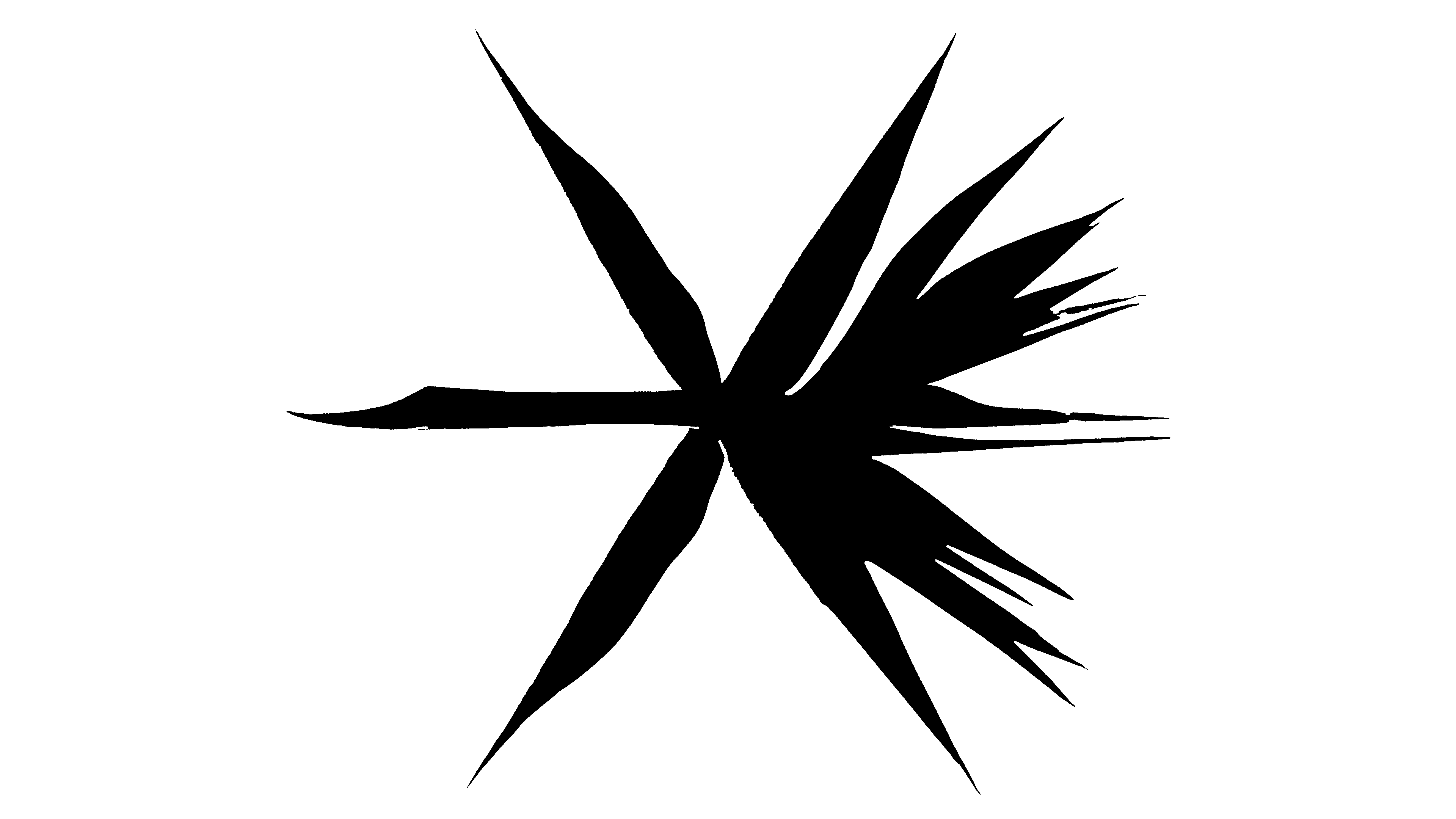
The album, whose title speaks for itself, The War, has become associated with an image reminiscent of an explosion. The rays diverging from the center create the illusion of a geometric figure and the letters of the band’s name in the black, blank sectors.
2018
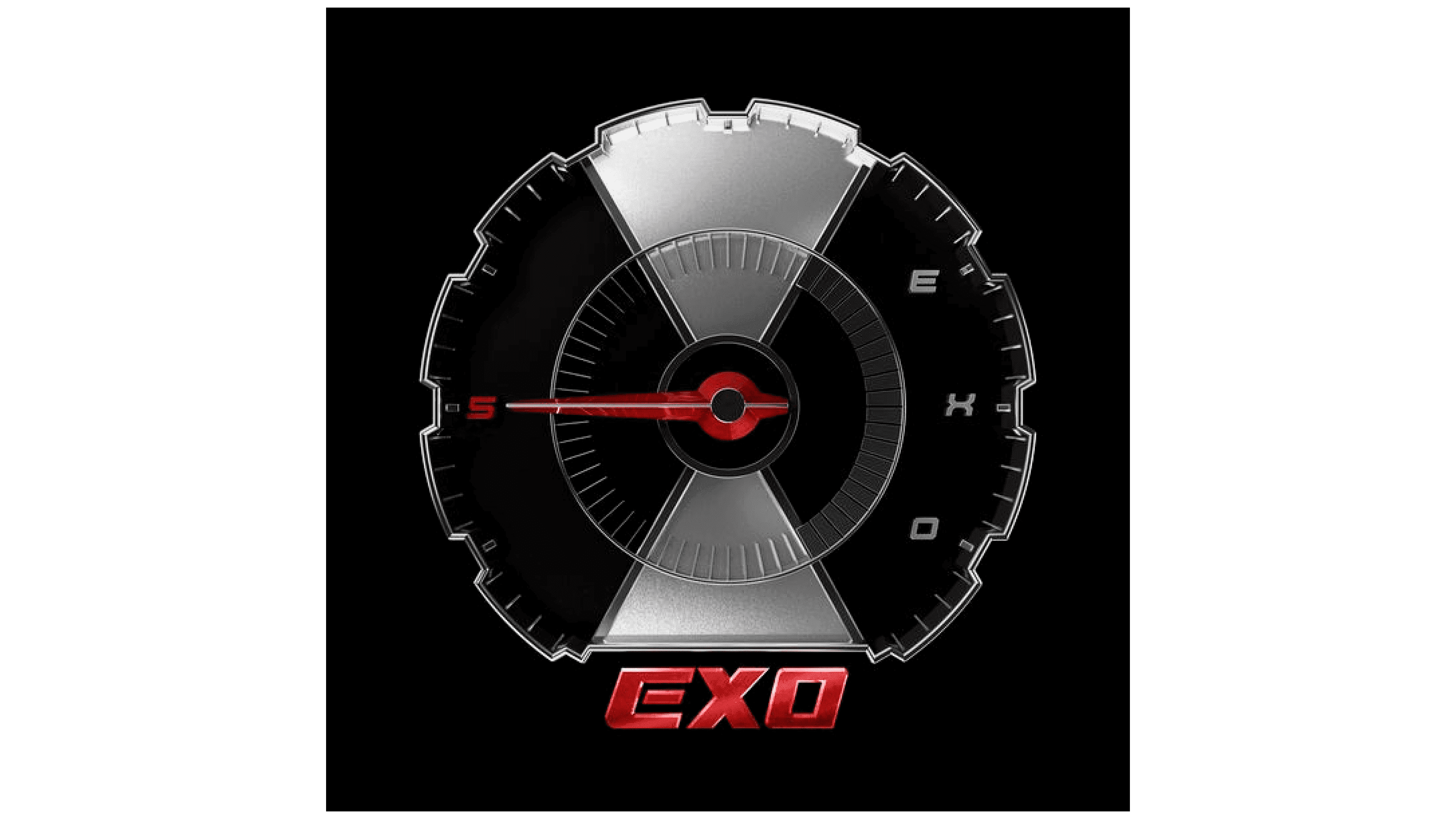
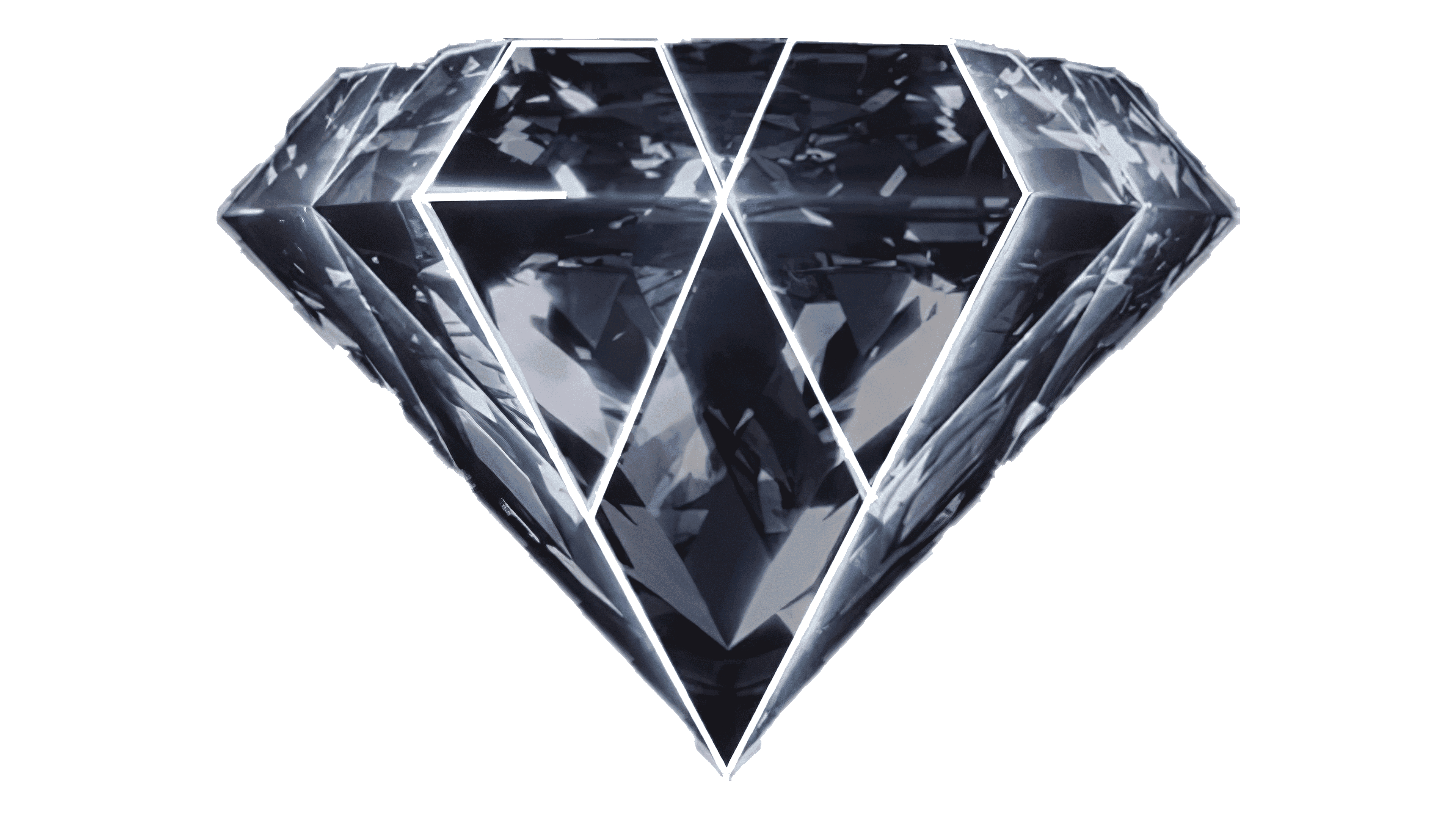
This year, the band released two albums: Don’t Mess Up My Tempo and Love Shot. The first features a speedometer image, with the band name’s letters arranged in an arc in the right sector. At the bottom, the artist’s name appears in thick red font with a gradient transition, as does the arrow. Everything is on a black background. The second album is shaped like a cut diamond, with its front sides forming a hexagon, with a slightly extended section in the middle. Traditionally, it also bears the band’s name.
2019
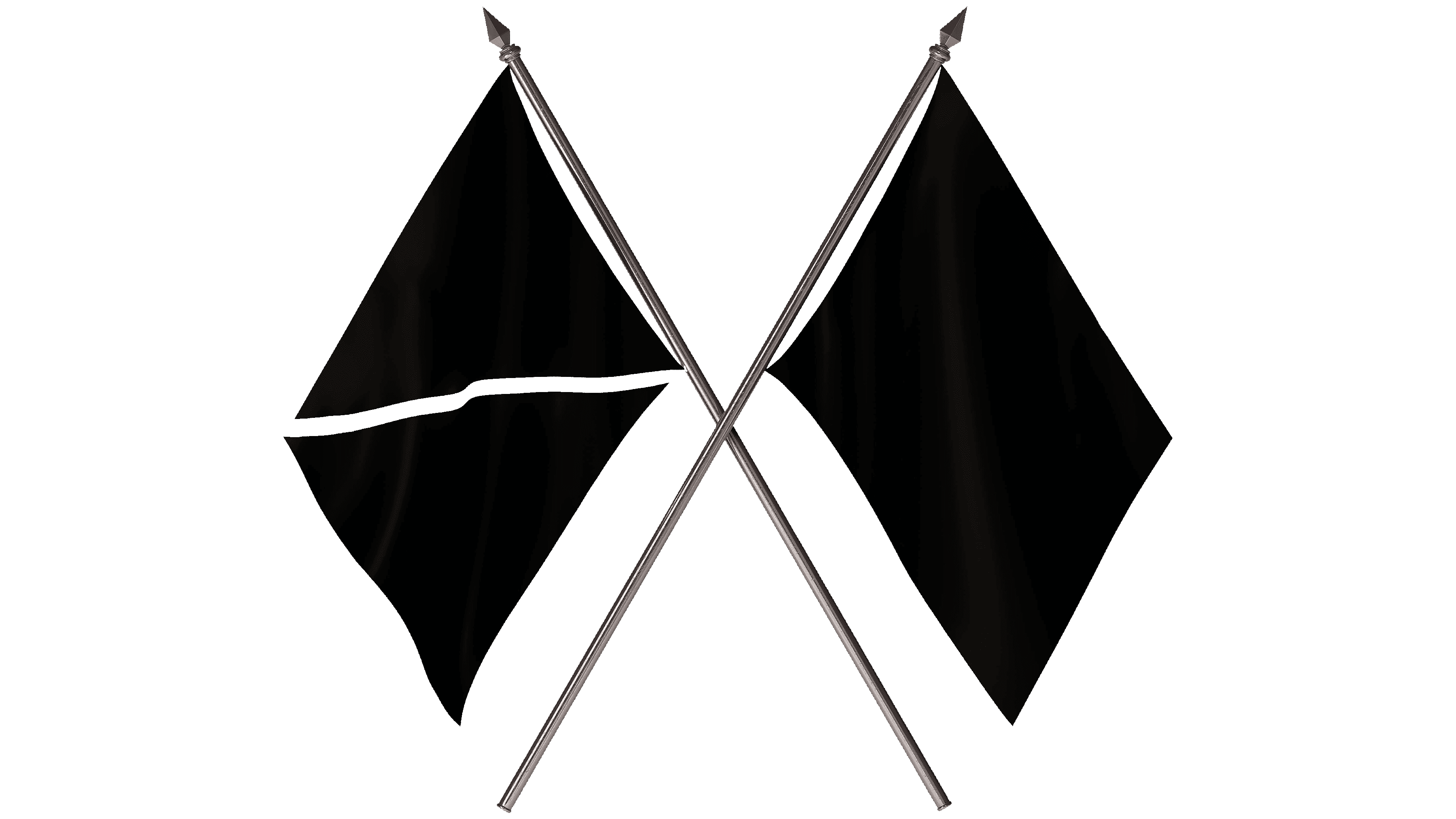
The first album was created with a scaled-down team. The emblem is two crossed black flags. Their crossed flagpoles form the letter “X,” the middle letter of the artist’s name. The top and side edges of the flags create the hexagon’s boundary outlines and, at the same time, the first and last letters of the band name. The left flag has a diagonal band, left unfilled, to comply with this correspondence. It visually forms the middle element of the letter “E,” with the other sides representing the flag’s two faces.
Font and Colors

The main emblem of the musical group, whose theme is elaborated in the design of each new album, is a geometric equilateral hexagon, whose sides and the intersections of the inner lines form the visual perception of the letters that make up the brand name. The image uses only two contrasting colors, white and black (a variant interpretation will be used in the future). The execution is based on the composition’s contour construction and the need to view it from a certain angle. The group name “EXO” is conceived as components of the hollow image of a hexagon inscribed in 2/3 of the space above the black rectangle.
Under the figure, on the remaining part of the rectangle, the name EXO is repeated in large letters in the style of the ancient Greek alphabet. The emblem’s brevity, combined with the hidden visualization, is not only attractive. This method turns on the imagination, maximizing impact on the viewer and forcing him to look closely and spontaneously solve the problem of finding the hidden letters, a unique and effective method of increasing memorability, guaranteeing compulsory brand recognition.