The Fa logo contains only the brand name, but the designers were able to convey a deep meaning in two letters. Smooth lines and rounded corners represent tenderness, whether the pleasant texture of soaps and shower gels or the skin that feels soft after using them. And the blue color is a traditional symbol of reliability and confidence.
Fa: Brand overview
| Founded: | 1954 |
| Founder: | Henkel |
| Headquarters: | Germany |
| Website: | int.fa.com |
Meaning and History
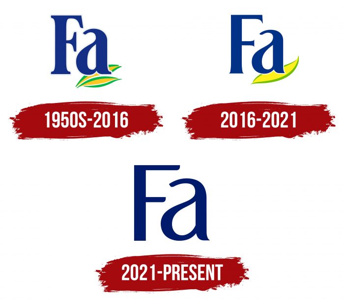
In the early years of its existence, the Fa line offered talc and bar soaps, but in 1975 it underwent a rebranding and significantly expanded the range. Naturally, the changes affected all aspects of the brand, not just products. The logo was also corrected, so the brand has two of them.
What is Fa?
Fa is a German brand of personal care and hygiene products. It was established in 1954 and is owned by the international corporation Henkel. Initially, the company was called Dreiring KG, but after launching a unique soap product, it changed its name to Fa. This is an abbreviation of the German words “fabelhafte” (fabulous) and “fadenseife” (thread soap), both of which refer to its innovative product.
the 1950s – 2016
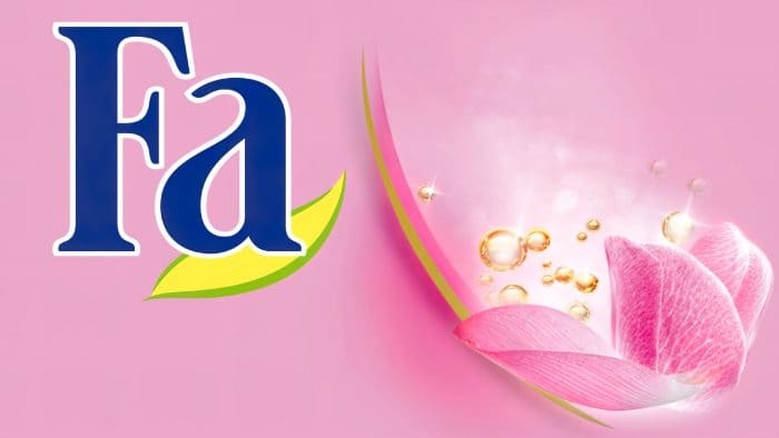
The debut emblem consists of an abbreviated company name and two leaves. They confirm that the inside of the bottle with this name contains only herbal ingredients. One letter is uppercase; the other is lowercase. Both are outlined with a thin, light gray line. The “a” sign is on the top sheet, while the other goes along its bottom border. The leaves are elongated and have a green edging.
2016 – 2021
The current version appeared as a result of a redesign and almost repeated the previous version. The difference between them is small, in small details. For example, the developers removed the edging and the second sheet and turned the remaining upside down. At “F,” they cut off all serifs, keeping the miniature protrusions, the letter “a” shortened the tail.
The Fa logo contains a short word from the stem of two German words at once: the first is “fabelhafte,” the second is “fadenseife.” It also contains a symbol of vegetation – a leaf, as a sign that natural extracts are included in the products.
The opening emblem has expressive letters with large serifs. In the current version, they are even and smooth. The palette was bright at first, now muted. The main colors of the logo are blue, yellow, olive, and white.
2021 – today
Modernization with shortening serifs continued. Gradually, they became so short that they disappeared altogether. The curvatures took their place at the ends of the letters. Only the tail of the lowercase “a” remained sharp. Now the word looks a little taller and more elegant. In addition, the designers removed the sheet, making the inscription more versatile since it is convenient to use it to mark products of any shape – from narrow tubes to wide jars.
Fa: Interesting Facts
Fa is a popular brand that makes things like deodorants, shower gels, and soaps. It’s part of Henkel, a big company in Germany that makes lots of different products.
- Starting: Fa began in 1954 with a new idea: the first cream soap bar in Europe. Since then, they’ve made many other products, focusing on natural stuff and ensuring everything smells great.
- Everywhere: Fa products are available in over 120 countries. People worldwide love them because they’re good quality, and the ads are fun to watch.
- New Ideas: Fa was one of the first to put liquid soap in a pump, making it easy to use. They keep coming up with new smells, ways to use them, and packaging.
- Helping the Planet: Fa works on being more eco-friendly by using recycled materials for its packages and making things in a way that’s better for the environment.
- Smells Amazing: Fa is known for having many different smells inspired by nature and places worldwide, making shower time more exciting.
- Ads People Remember: Fa’s ads are full of life, with cool music and pictures that show people having fun and feeling free.
- Loves Sports: Fa supports sports because it fits with being lively and active. They sponsor events and teams to show they’re all about having energy and doing things.
- For Guys Too: Seeing that men also want good grooming products, Fa made a special line with shower gels, deodorants, and soaps that have manly smells and work well.
- Caring for Others: Fa gets involved in helping out with health and hygiene projects and wants to help people feel good about themselves.
- Always Improving: With Henkel’s help, Fa keeps improving its products by discovering what people like and using science to create things everyone will enjoy.
Many like Fa because it combines good quality, smart ideas, and environmental care, offering products that help people feel fresh and happy.
Font and Colors
With the disappearance of serifs, the letter “F” seems to have received a different typeface, but it is not – only its style has changed. The font remained the same; just a different version was chosen. The color is the most stable – it is the same in all variants of the emblem. It is a blue cornflower blue.
Fa color codes
| Midnight Blue | Hex color: | #001a6b |
|---|---|---|
| RGB: | 0 26 107 | |
| CMYK: | 100 76 0 58 | |
| Pantone: | PMS 2748 C |
