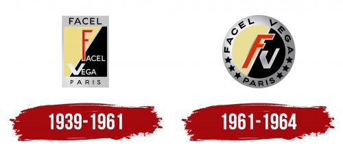
The Facel Vega logo represents elite, fast, and technically advanced cars. The emblem conveys the beauty, luxury, and power of Facel vehicles and the company’s dedication to creating true works of art.
Facel Vega: Brand overview
Established in 1939 as an offshoot of the French aviation firm Bronzavia, Facel originally specialized in creating stamped steel parts for wartime needs. In 1945, after World War II, the company began making bodies for various automobile manufacturers, including Simca, Ford France, Panhard, and Delahaye.
By the 1950s, Facel, under the direction of designer Jean Daninos, produced a line of cars. The lineup included models such as the Facel Vega Excellence, the Facel Vega FV, and the Facel Vega HK500. These cars featured refined aesthetics and powerful Chrysler V8 engines, positioning them as luxury grand touring cars.
However, the company faced challenges it could not overcome. Despite hand-building nearly 2,900 cars, Facel was forced to close its doors in October 1964 due to financial difficulties. Despite its relatively short existence, the brand managed to carve a niche for itself as a manufacturer of high-end luxury cars. Today, Facel creations are in great demand among collectors, being unchanging symbols of the 50-60s French automobile craftsmanship.
Meaning and History
What is Facel Vega?
It is a French luxury car manufacturer known for producing stylish, high-end cars. The company, founded by Jean Daninos, combined French craftsmanship with powerful American engines to create elegant and fast grand touring cars. Famous models included the Facel Vega FV, HK500, and Facel II, which are popular with celebrities and wealthy buyers. Despite the acclaim, financial difficulties led to the company’s closure.
1939 – 1961
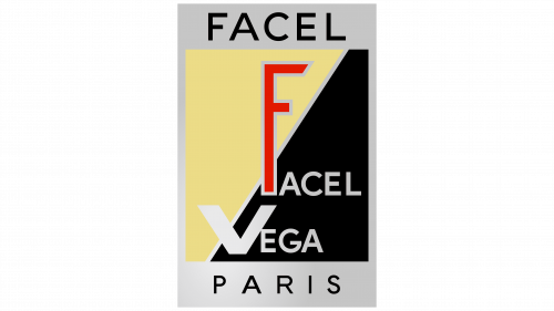
The logo is designed like a workshop sign. The central image is divided diagonally, showing work during peaceful and wartime periods when the brand focused on military parts.
The company name is displayed in two levels. The upper part, Facel, stands for Forges et Ateliers de Construction d’Eure et Loire, which means “Smiths and Engineering Workshops of Eure-et-Loir” in French. Vega is the name of a star in the Lyra constellation, hinting at the connection to the parent company, Bronzavia, a military aviation firm. It reflects the desire to create superior products.
The red letter F enhances the idea. Its large size and color symbolize the aspiration to reach the pinnacle. The bright shade of the letter stands out against a yellow background, representing peaceful times. Symbols on the black “war” side are monochrome, focusing on the company’s efforts towards victory without seeking popularity.
The metallic frame of the logo resembles stamped steel parts, reflecting the company’s early production focus. The name and country of production are highlighted on the top and bottom.
1961 – 1964
The Facel Vega emblem captures the unique style of the 1960s. The central design features a circle split diagonally into yellow and black halves, creating a dynamic look. A red “f” and a silver “v” are prominently displayed inside this circle, with a playful, distorted shape reflecting the era’s experimental spirit.
Surrounding the circle is a gray ring, darker on the right to add depth. This ring frames the central elements and adds elegance. The company’s name, “Facel Vega,” is written in bold font on the outer ring, ensuring readability and brand recognition. The word “PARIS” is also displayed, emphasizing the brand’s French roots and association with luxury.
Six five-pointed stars on the ring symbolize success and excellence, adding a touch of glamour. These stars highlight the company’s achievements and reinforce its reputation for quality and innovation.
The playful shapes of the letters “f” and “v” reflect the creative and adventurous spirit of the 1960s. This typography choice makes the logo distinctive and memorable, setting Facel Vega apart from other brands.
The color palette is vibrant and sophisticated. The yellow and black circle grabs attention, while the red and silver letters add vibrancy. The gray ring balances the design, allowing the central elements to stand out without being overwhelming.


