


 Fakro Logo PNG
The Fakro logo is businesslike and serious. Its practicality lies in its simplicity, as the design is composed of solid yet uncomplicated elements. Smooth lines, smooth strokes, geometric style- that’s what characterizes this logo. It conveys the main thing, the concept of the company, to produce folding ladders and skylights. Especially for this, the developers used wide stripes and a restrained color palette.
FAKRO was founded in 1991 in Nowy Sącz, Poland, by Ryszard Florek, who had started a woodworking business in Tymbark in 1986. Profits from that factory were used to develop a product that was still rare in Poland at the time: the roof window. Velux, the global leader, already shaped the market, while Roto, Blefa, and Braas offered similar products in Germany.
At first, FAKRO focused on Poland. The company built sales through construction stores, promoted attic living, and presented its windows at building trade fairs. Its early strategy combined quality, lower pricing, and steady product development. In 1994, the first FAKRO roof windows were exported to the Netherlands and Slovakia, opening the way into Central and Eastern Europe.
In the early 2000s, FAKRO created foreign sales branches in the United Kingdom, Germany, Austria, France, Spain, the Netherlands, Ireland, Hungary, Russia, Ukraine, and Latvia. Outside Europe, it entered the United States, Canada, Australia, South Africa, and China. The company also built a strong engineering base, with more than 100 designers and engineers and over 100 patents.
FAKRO’s growth led to a sharp dispute with Velux. The Polish company accused its Danish rival of blocking competition in several European and neighboring markets. Still, Polish regulators and the European Commission declined to open a case. In June 2022, the Court of Justice of the European Union upheld the Commission’s position. FAKRO still became the world’s second-largest roof window producer, with about 15% market share, 12 production plants, 17 sales subsidiaries, more than 3,300 employees, and products sold in over 60 countries.
Meaning and History
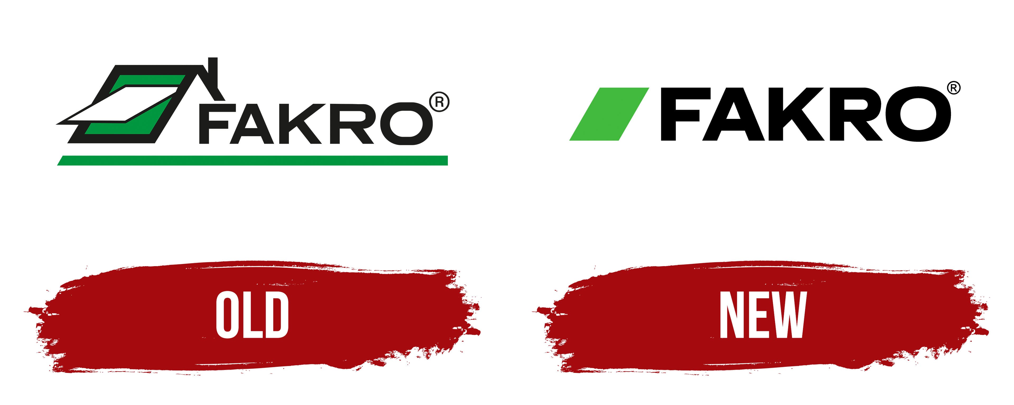
The Fakro company quickly gained popularity, which contributed to its entry at the international level. Three years after the opening, Polish products began to arrive in Slovakia and the Netherlands (in 1994). In 1998, the company established exports to European countries and opened distribution centers and production sites. This allowed it to significantly expand deliveries to Latvia, Austria, China, Denmark, Spain, Italy, the USA, France, Great Britain, and other countries.
Thanks to a highly professional development team, the company quickly became famous, and it now has operational offices on all continents. Not only trade structures but also design, architectural, and construction companies from all over the world support cooperation with it. In particular, Fakro has 12 factories with over 4,000 employees. And its agencies and products are recognizable by a specific marking, a strict name with an imitation of a dormer window.
What is Fakro?
Fakro is a Polish company that manufactures windows for attics and related accessories. Among them are folding stairs, attic hatches, glazing for terraces, and protective roofing materials. Founded in 1991 by entrepreneur Richard Fljorek, it is now the world’s second-largest manufacturer of roof windows. Its headquarters is located in New Sonch.
Old
The very first logo includes a detailed designation of the Polish corporation’s activity. The sign depicts a house fragment with a gable roof, one side of which is partially drawn and the other completely. On the visible part of the flat roof is a dormer window. It is semi-open, demonstrating its broad functionality. This design is composed of strict geometric shapes: a green rhombus, a white parallelepiped, and long rectangles with solid black fill.
A wide bar is at the bottom, aligned with the icon on the left. It contains the name of the Polish company, composed of even, angular letters of the same width as the lines near the roof on the left. All characters are large, in capital letters, and geometrically proportional. This visual identity is minimalist yet recognizable, evoking a sense of high quality.
New
The current logo is a continuation of the old one. The changes are insignificant and have not affected the emblem’s design, concept, or style. It is still composed of two parts, graphic and text, with the same font type. The adjustments affected only the icon: it has become simpler and lighter. The gable roof, chimney, and window opening disappeared from it. Only a hint of a skylight with a modern hinged frame remains. A parallelepiped plays its role. In addition, the logo’s green color changed from rich dark green to light green.
The early version of the logo is more detailed than the current one. More graphical details are used to indicate the scope of the Fakro company, whereas the modern version does not include such details. However, this is due to the developers’ desire to lighten the visual identity while retaining elements of the skylight without an excessive graphics load. And they succeeded quite well.
Font and Colors
For the inscription in the logo, the designers preferred geometric glyphs, even, smooth, massive, with stripes resembling window frames. Therefore, the word “Fakro” is typed in a grotesque style, as close as possible to Remora Corp and Workhorse Regular, with minor changes. In terms of the color palette, everything remains stable: the emblem features black (inscription, edging), white (background, glass), and two shades of green (improvised window).