


![]() Falabella Logo PNG
Falabella Logo PNG
Lightness, beauty, and grace, present in the emblem, show how the company masterfully manages all its stores and outlets. The Falabella logo signifies a master of his craft who knows the taste of life and how to live beautifully.
Falabella began in 1889 on Ahumada Street in Santiago, where Italian immigrant Salvatore Falabella opened a large tailoring atelier. Chile was growing through the nitrate economy, and wealthy families ordered European-style clothing. The workshop gained a strong position in the city and was later passed down to the next generation of the family.
A turning point came in 1937, when Alberto Solari joined the business. He turned the tailoring shop into a clothing store with ready-made garments and custom tailoring. In the same year, the company received its legal name, S.A.C.I. Falabella. In 1958, the range expanded to furniture, appliances, and home goods, turning Falabella into Chile’s first department store. In 1962, the first store outside Santiago opened in Concepción.
In the 1970s, the company faced pressure during the Allende government, when private firms were affected by nationalization policies and restrictions. Falabella survived and expanded again in the 1980s. In 1980, it launched CMR, Chile’s first credit card with a revolving line of credit. By the late 2000s, CMR had 5.5 million cardholders and had become a major financial asset.
In 1990, Falabella entered Mall Plaza and opened Mall Plaza Vespucio, Chile’s first modern mall. In 1993, it opened its first location abroad in Mendoza, Argentina. In 1995, it bought 70% of Peru’s Saga, the former Sears stores in Lima. Later came Falabella.com in 1999, Tottus in 2002, the Sodimac merger in 2003, Banco Falabella in 2006, and expansion into Colombia and Brazil. The company competed with Cencosud, Jumbo, Easy, and Ripley while building a model based on retail, finance, and malls.
Meaning and History
![]()
Falabella was a one-stop tailor shop before becoming the largest South American department store chain. It employed Salvatore Falabella, who emigrated from Italy to Chile and founded his business in 1889. In the second half of the 1930s. Alberto Solari joined the company, under whose leadership the atelier began to sell clothes and household goods. By 1958, he had turned Falabella into Chile’s first department store.
Then the network of stores began to expand and go international. Its current distribution area covers Chile, Peru, and Colombia, the three countries where all of Falabella’s department stores are located. They are well aware of its logo, which contains a light green inscription with a dot at the end. Changes to the wordmark were gradual: designers experimented with fonts and palettes until they settled on a visually appealing option. It was accepted in 2007.
The rebranding carried out in 2021 affected only the web platform and the application: the company decided to consolidate all its digital platforms and adopted a new orange logo for them. At the same time, the identity of the retail stores themselves has not changed: the Falabella brand, unrelated to e-commerce, continues to use the green wordmark.
What is Falabella?
Falabella is the oldest chain of department stores in Chile and throughout South America. It is part of the conglomerate of the same name, which provides a wide range of services in insurance, banking, real estate, and retail.
1889 – 1952
![]()
In 1889, the Sastrería Hermanos Falabella sewing workshop was opened, which later became the basis for a department store. Its logo contained a black inscription, centered and divided into two lines. At the top was the word “Sastrería”, “studio” in Spanish. It was decorated with a script imitating calligraphic handwriting. All letters, except the first, were lowercase and connected. Only the capital “S” stood alone.
The second line contained “FALABELLA” and “HNOS” in uppercase. It is noteworthy that the letters “NOS” were reduced, slightly raised, and underlined with a short horizontal line. For this part of the inscription, an antiqua with rectangular serifs was used. Of modern fonts, Hanch Regular by Roger White, Non-Solus Medium by K-Type, Battlefin Regular by Kostic Type Foundry, and Prumo Text Medium by DSType are roughly similar to it.
1952 – 1967
![]()
In 1952, the clothing store was renamed Falabella, leaving only one black word on its official logo. The designers opted for handwritten typography that looked stylish and neat. They retained a slight tilt to the right but changed the letter style, thickening all the main lines. The junctions between the symbols protruded slightly, making them look like short spikes. This word sign became the main one in 1952, although it appeared much earlier.
1967 – 1992
![]()
When the company got tired of using the elegant logo, it changed the calligraphic font to a script that mimics sloppy handwriting. The word was illegible due to disproportionately wide lines and small intra-letter gaps. Black has been replaced by dark green.
1992 – 2001
![]()
In the early 1990s, the wordmark was black again. All letters, including the first “f,” were lowercase. At the same time, a high-contrast geometric font with long thin serifs at the tops of the “l” and “b” was used for the inscription. The ends of the “f” were decorated with protruding teardrop-shaped dots. The closest analogs of this serif are Ingeborg Heavy Italic by Typejockeys, released in 2011, and Century Modern FS Bold Condensed Italic by FontSite Inc., which was released in 2010.
2001 – 2002
![]()
In the 21st century, the Falabella chain of stores adopted a new logo similar to the previous one. The designers slightly increased the slant of the letters to the right, removed the serifs, and changed the “f” to a long, curving line. Because of the pointed ends, the “f” resembled a sword or dagger with a large handle.
2002 – 2007
![]()
In 2002, the company began using a wordmark with a modern font. Smooth elegance has disappeared from its name: earlier, the lower ends of the strokes pointed upward, but in the new version, they were cut off. With the same goal, the designers made all the lines approximately the same thickness and smoothed out the opposite edges of the “f.” A large round dot appeared at the end of the inscription. The classic black color has been changed to green, not the same as in 1967, but a little lighter. The only thing that remains unchanged is the slope of the letters to the right.
2007 – today
![]()
The modern version of the logo was developed in 2007. The color scheme differs from the previous one: the designers gave green a yellow tint to make the brand name stand out more.
Since the Falabella logo is used primarily as a store sign, it contains the brand name. The only unusual detail is the dot at the end of the word. It was added not to follow the grammar rules but to show that the chain’s department stores have everything you need. In the context of the emblem, the punctuation mark represents completeness, stability, and the absolute.
Font and Colors
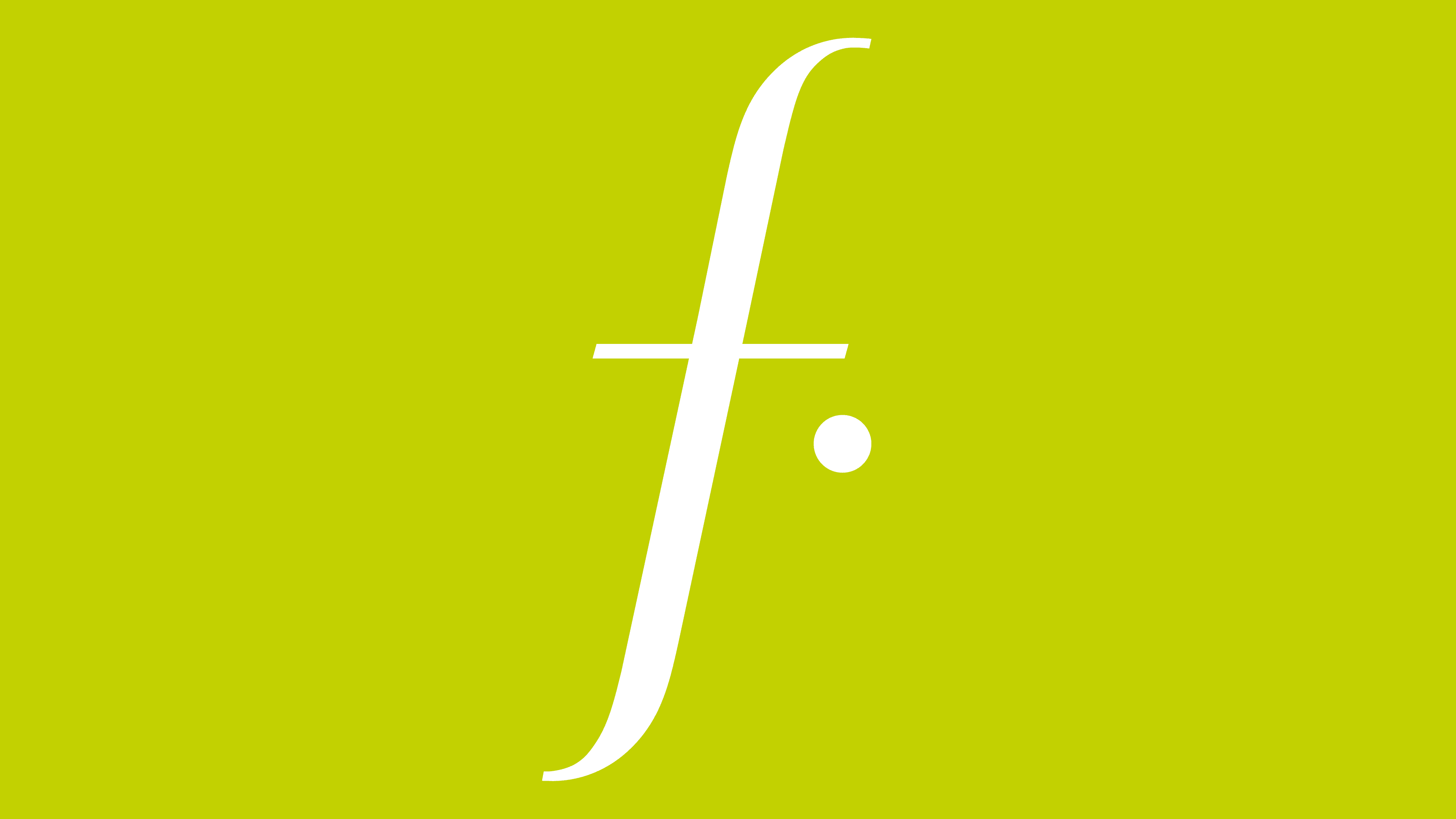
The font used in the logo is roughly similar to Grenale #2 Cond Demi Italic by Insigne Design. But it appeared in 2014, which is much later than the retail company’s symbol. The brand name is written in elegant slanted sans-serif letters. Some lines are cut and rounded. The diagonally stretched “f” looks the most unusual. Despite its initial position, it is lowercase like all other characters.
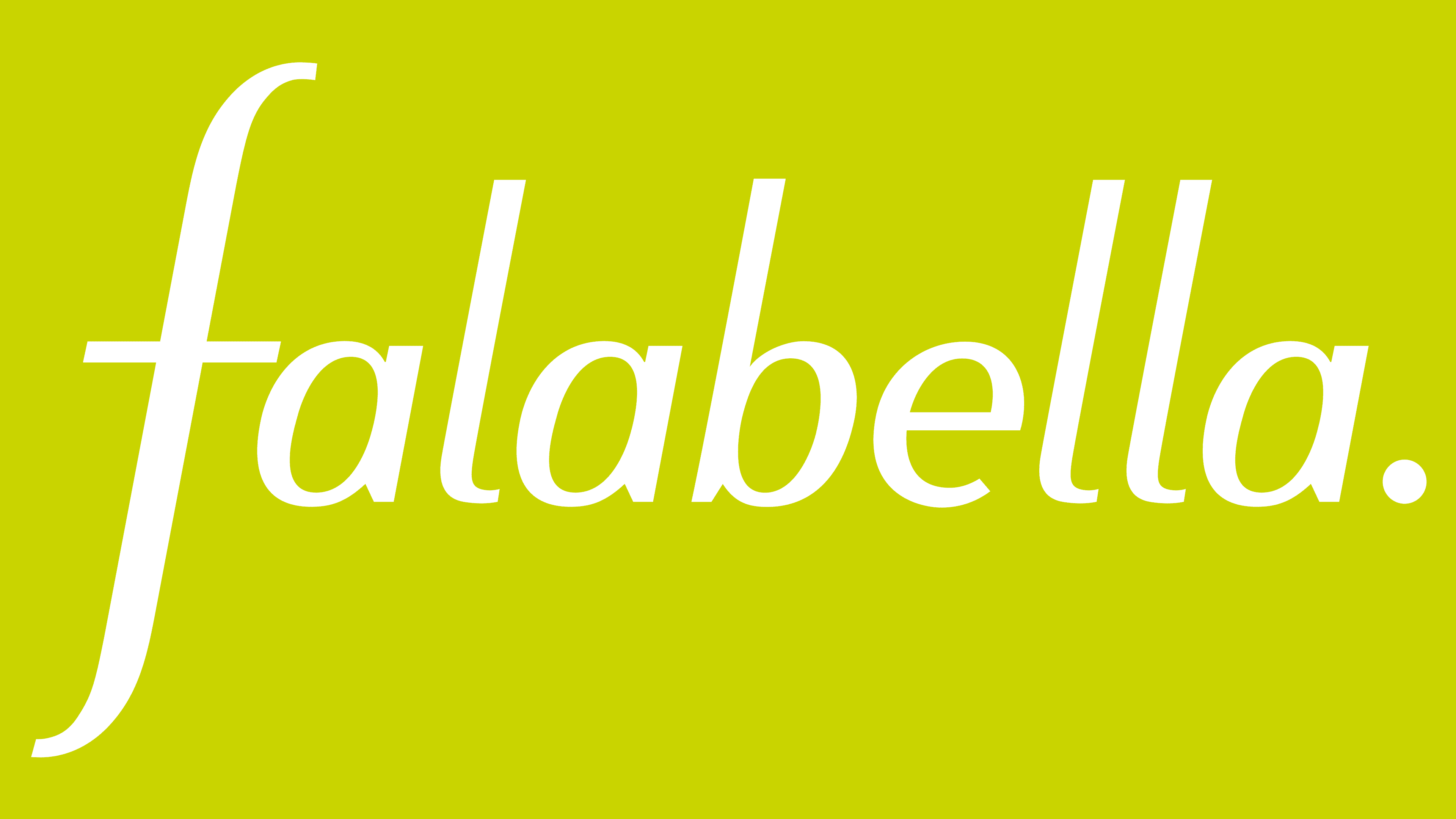
Green is Falabella’s signature color. The modern version has a warm yellow tint (#c3d200). The chain of stores uses green to demonstrate its environmentally conscious production and sales. It is also the color of calmness, trust, harmony, and renewal.