


 Falken Logo PNG
Falken Tire was created in Japan in 1983 by OHTSU Rubber & Tire as a performance tire brand. In 1985, Falken Motorsports was founded, marking the start of product distribution in the United States. In 1988, Falken Tire Europe GmbH was established in Offenbach am Main, Germany, providing the brand with a base in the European market and a broader international structure.
Motorsport became part of Falken’s development early on. In 1988, its motorsport team won the international Mirage Cup, and the Sincera tire debuted in the same year. In 1990, a GT-R R32 won the 400 km N1 Endurance Sugu race. In 1991, the BNR32 won Japan’s Super N1 Taikyu series, while Falken also competed in an endurance rally in Kenya.
The company expanded its racing and market presence in the 1990s and 2000s. In 1991, Falken opened its US headquarters in Rancho Cucamonga. In 1994, Falken became an official sponsor of the American Le Mans Series. In 2003, it introduced the AZENIS line, and in 2004, added the Dakar Rally to its sponsorship portfolio.
Later launches broadened the tire range. In 2007, Falken introduced the EUROV line for ultra-high-performance tires. In 2011, it became an official sponsor of the FIA World Endurance Championship. The WILDPEAK A/T3W followed in 2012, AZENIS FK510 in 2015, a VLN Endurance Championship title at the Nürburgring in 2018, and AZENIS FK520 in 2022.
Meaning and History
What is Falken?
This international tire manufacturer specializes in products for passenger cars and light and medium-duty trucks. The company is headquartered in Japan, with additional offices in Europe and the United States. Its tires are distributed in over 100 countries and are recognized for their quality and reliability.
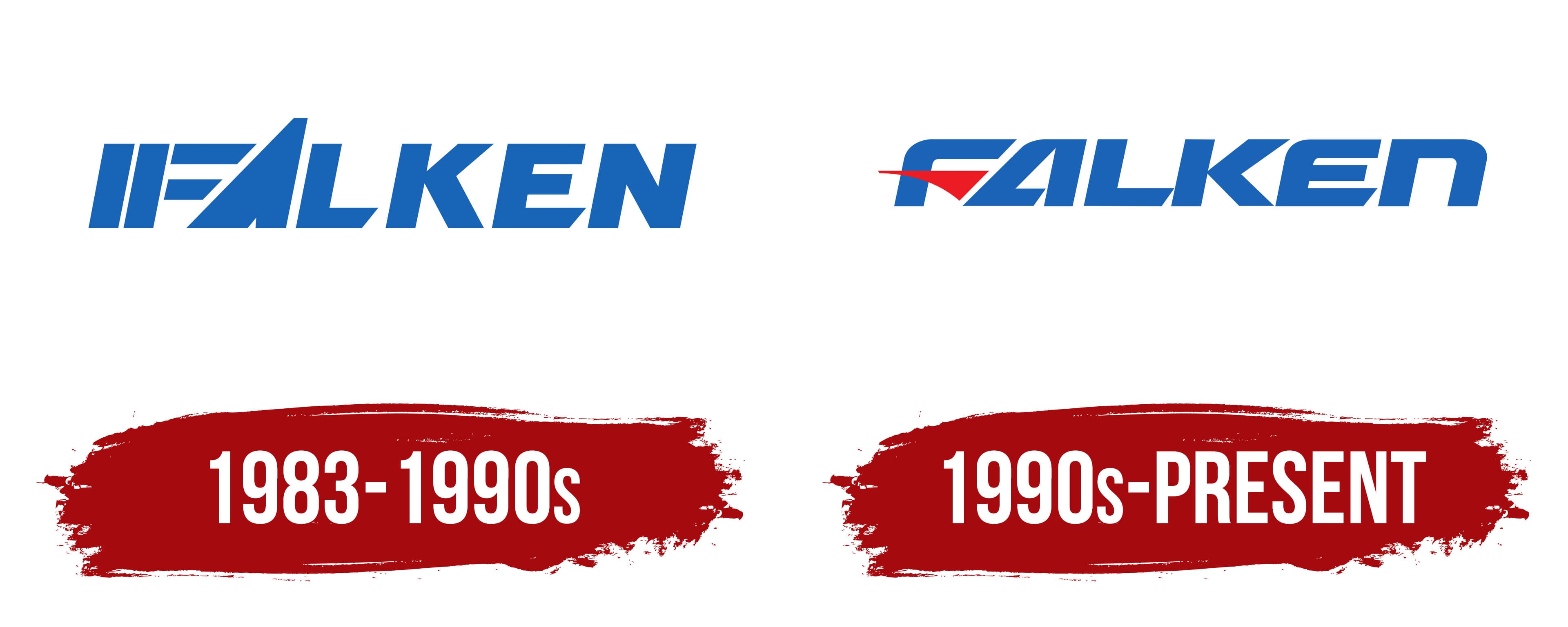
1983 – 1990s

1990s – today
The Falken logo is designed to reflect the company’s core identity and specialized focus. The brand name is centered and presented in bold uppercase letters, conveying strength and dynamism. A key design feature is the letter “F,” partially rendered red and shaped to resemble a wheel spoke or tire tread pattern. Its sharp, angular form suggests speed and rapid acceleration.
The primary colors blue and red are carefully chosen to represent the brand’s values. Blue conveys safety and reliability, essential qualities for a tire manufacturer. Red brings energy and a competitive spirit, highlighting Falken’s deep connection to motorsports.
The custom typeface combines smooth curves with sharp edges, mirroring the dual nature of modern vehicle design, where performance and comfort coexist. The angular elements of the letters subtly echo tread patterns, reinforcing the brand’s technical expertise in tire production.
The name “Falken” is derived from the word “falcon,” a bird symbolizing speed, agility, and power qualities that the company aims to embody through its high-performance products. The logo design combines motion, precision, and engineering aesthetics, creating a strong and recognizable visual identity for the Falken brand.