


![]() Fall Out Boy Logo PNG
Fall Out Boy Logo PNG
The modern logo of the American rock band Fall Out Boy is striking and recognizable. A volcano with the band’s name abbreviation as a crown, rendered in a unique “trembling” monochrome, symbolizes the group’s musical creativity.
Fall Out Boy formed in 2001 in Wilmette, Illinois, when Pete Wentz and Joe Trohman launched a pop-punk side project outside the hardcore scene. Patrick Stump began as a drummer candidate, then became the vocalist, and Andy Hurley completed the lineup.
In 2002, the band released a split EP on Uprising Records, followed by “Evening Out with Your Girlfriend” in 2003. After signing with Fueled by Ramen, they released “Take This to Your Grave” on May 6, 2003, and built a following through constant touring.
The breakthrough came in 2005 with “From Under the Cork Tree” on Island Records. Singles “Sugar, We’re Goin Down” and “Dance, Dance” drove double platinum sales. In 2006, the band received a Grammy nomination. Alongside Paramore, they stood out for Wentz’s lyricism and Stump’s melodies.
In 2007, “Infinity on High” debuted at number one on the Billboard 200, selling 260,000 copies in its first week. Singles “This Ain’t a Scene, It’s an Arms Race” and “Thnks fr th Mmrs” entered global charts.
In December 2008, “Folie à Deux” received negative reviews, and the tour became difficult. By late 2009, the band went on hiatus after a final show at Madison Square Garden on October 4.
The return came in February 2013 with the single “My Songs Know What You Did in the Dark.” The album “Save Rock and Roll,” recorded with Butch Walker, debuted at number one. Later that year, they toured with Panic! at the Disco and Twenty One Pilots.
In 2018, “Mania” earned a Grammy nomination, and the band headlined Wrigley Field. In 2023, they released “So Much (for) Stardust.”
Meaning and History
![]()
The team’s most famous logo is the crowned volcano. It was used both on its own and in combination with the band’s name. Yet it’s not the only one: many other legendary emblems have appeared on album covers over time.
What is Fall Out Boy?
Fall Out Boy is an American pop-punk and pop-rock band. They have been around since 2001 and comprise four individuals who began their careers separately. Pete Wentz and Joe Trohman later joined them.
2002 – 2003
![]()
The musicians had long refrained from using the word “FallOutBoy”. It was represented by alternating uppercase and lowercase letters. The font is simple, sans serif.
2003 – 2005
![]()
At this time, the band decided to stand out, so they radically changed the logo. It went from black to light blue with a thicker font. Each word in the name is written separately.
2005 – 2007
![]()
2005 brought a refresh to the musicians: one of the legendary logos then appeared on the album cover, From Under the Cork Tree. It’s the all-seeing eye located in the center of a lock. Instead of a ring around it, a rope. Above the keyhole is a crown, and below is a banner with the music group’s name. The words are written in a stylish, thin font, all letters uppercase.
2007 – 2008
![]()
The rock band continued to use fonts, and in 2007, they switched to italics. The name of that time looks as if it were handwritten in lowercase letters.
2008 – 2013
![]()
Then came a combination of two fonts. In the center is the miniature thin “Out,” and on the sides are the wide “Fall” and “Boy,” which are slightly larger.
2013 – 2016
![]()
All letters became the same: uppercase and elongated. Graphic symbols changed. The logo was created by Brandon Travis Rike, a designer from Ohio who played in several rock bands. The logo was placed on the cover of the music album Save Rock and Roll.
2016 – 2018
![]()
Then the band changed the font again: the name acquired a classic look with serifs.
2018 – 2019
![]()
In this version, the words are spaced apart and made thin, as if emerging from a mist.
In addition to the famous “volcano with a crown,” the music group has other corporate identity marks. These are names executed in various styles. One of the latest is the thin, broken inscription “Fall Out Boy.” The words are spaced far apart, and the symbols are at different heights. In the first fragment, a low “A”; in the second, a skewed “U,”; in the third, an upward pointing “O.” The corners of the letters are rounded, and the lines of some symbols are interrupted, as noticeable on “B,” “O,” and “A.”
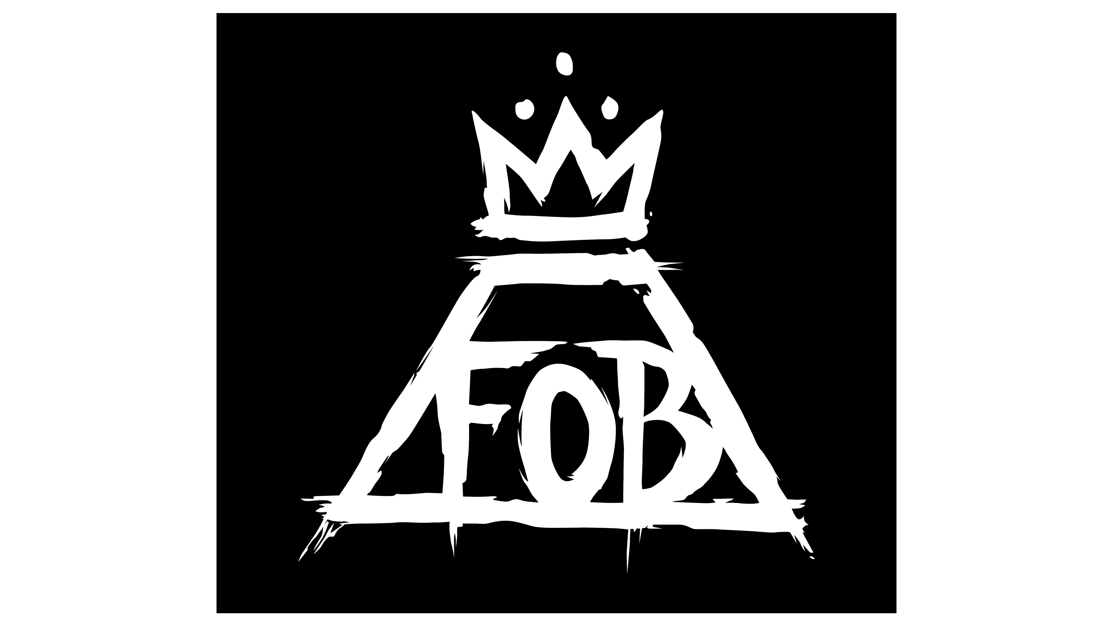
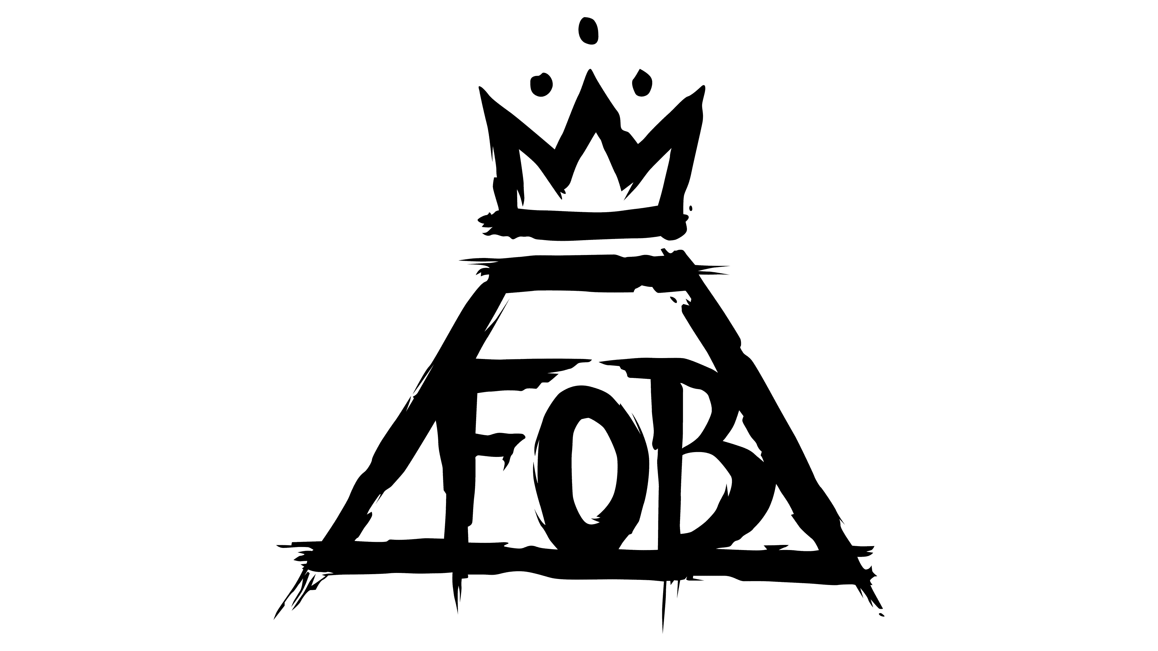
The most recognizable logo of the rock musicians is the crowned volcano. It’s a truncated triangle. It’s believed that the trapezoid conveys the image of a volcano from the composition Young Volcanoes. Above it is a three-pointed crown, symbolizing the artist Jean-Michel Basquiat (1960-1988). The abbreviation “FOB” is centered and set in large letters. All lines on the brand name look uneven, as if carelessly applied with broad strokes.
A graphic symbol designated each album. It was selected according to the songs’ content and the cover’s overall design. The font was always different – from the classic serif (American Beauty / American Psycho) to the adapted sans serif (Mania).
The group’s primary color combination is black and white. They fit perfectly into the unique mood and emphasize the rock-metal style. Usually, the dark dominates, serving as a background for the light emblem. However, an inversion scheme is also used.
2019 – today
![]()
In this version, the American rock musicians again decided to play with letters. As a result, a unique logo was created, consisting of an inscription, having no analogs, as each symbol is original. The distortion of symbols is done in the style of horror movie titles with “trembling” text. Moreover, it is impossible to find two identical letters; each is played in its own way. For example, the first “L” is much shorter than the second; the leg of “A” protrudes to the right; the lower part of “U” is drawn to the left; and both “O”s are elongated and squashed on the sides.
Font and Colors
This time, the musicians chose a bold sans-serif font with distorted letters. Therefore, the inscription looks “trembling,” as if from waves spreading over water. But they remained faithful to the old color palette: the emblem still predominates in monochrome.
FAQ
What does the Fall Out Boy logo represent?
Fall Out Boy has a very recognizable logo, a volcano with a crown. It’s an isosceles triangle with a crown of artist Jean-Michel Basquiat instead of a vertex. In the center of the trapezoid is the inscription FOB, the abbreviation of the band’s name.
Does Fall Out Boy have merchandise?
Yes, Fall Out Boy has its merchandise. It’s presented in their official online store. These are mainly souvenirs, records, t-shirts, baseball caps, sweatshirts, backpacks, wallets, and much more.
Where did Fall Out Boy get its name?
Fall Out Boy got the nickname “Radioactive Man.” It’s taken from the cartoon “The Simpsons”: it was the name of Bart’s buddy.
What is Fall Out Boy known for?
Fall Out Boy is known for its pop-punk music. In particular, its popularity came after the song Sugar.