The Fantastic Four logo is soaring and impressive. It talks about enormous experiences and countless episodes and stories standing behind the emblem. The sign invites you to listen to the new adventures of your favorite quartet in blue costumes.
Fantastic Four: Brand overview
| Founded: | November 1961 |
| Founder: | Marvel Comics |
| Headquarters: | United States |
The Fantastic Four is a well-known Marvel universe media franchise consisting of comics, animations, and movies about four superheroes connected by friendly and family ties: Mr. Fantastic (stretches body), Invisible Woman (generates fields and becomes invisible), Human Torch (flies and creates fire), and Thing (has incredible strength and a body of a stony structure).
Meaning and History
The logos pertain to the issues of the original comic book series that were regularly printed until 2015. In 2018, the publication continued. The magazines come out monthly. Their covers and the color of the inscription alternate. The time frames below indicate the years in which the Fantastic Four title got a new style. Meanwhile, in separate series, they occasionally reverted to previous images. The primary reason for the returns is the reboot of the storyline and the search for new plots.
What is the Fantastic Four?
Famous Marvel Universe comics, compiled into six volumes. The longest first one included 2001 issues. The creators, Jack Kirby and Stan Lee, worked on creating the characters. Later, many artists and scriptwriters took part in the issues.
1961 – 1962
The first comic book by Jack Kirby and Stan Lee was released in 1961 and received many responses, prompting the creators to continue the topic.
The emblem was the title. The backstory for the series and the Fantastic Four team was a golf game between Marvel comic publisher Martin Goodman and a representative of DC Comics, where the latter boasted about the success of the Justice League series. After this, Stan Lee was tasked with creating a comic with a team of heroes. Lee came up with the story and the title.
The first logo consisted of dark blue letters of varying sizes with serifs. The symbols in the inscription are placed at different heights as if they are jumping.
The serifs symbolize the beginning, hooks on which the plot develops further. They personified the characteristics of the heroes: ordinary people with hidden capabilities.
The “restlessness” of the letters – a precursor to transformations, constant transformations of superheroes into ordinary citizens and back. The symbols also told about fast movements, moving fields, flights, and other supernatural events.
Issues came out monthly, and the inscription was used alternately in red, blue, and yellow versions.
Interestingly, the prototype and inspiration for the foursome was the film Journey to the Center of the Earth, released in 1959. However, none of the authors mention this, although the foundation and heroes are similar.
1962 – 1970
Black shadows appear in the titles of comics. The technique shows the beginning of active battles with negative characters. In 1962, the team’s most famous enemy, Doctor Doom, is introduced, with whom a turbulent confrontation takes place.
The shadow also indicates that the foursome is strengthening its positions with successful battles, asserting itself in its mission. A trace of their actions begins to remain on Earth. The team gets the Baxter Building office known to people.
White letters and a black shadow speak to the theme of the struggle between good and evil.
1970 – 1972
In 1970, the trademark Fantastic Four was officially registered, and the first cartoon was released in 1966. The characters became popular, and a new feature was added to the logo – the shadow from the letters became red.
The color showed recognition of the audience’s love for the famous foursome. It described bright and memorable adventures. In 1966, the first part of the Fantastic Four # 48 trilogy was created, ranking 24th among the top hundred of all time (2001).
Interestingly, the approach with black and red shadows was used only for the 2nd volume (1996-1997) and partially for the third volume (1998-2003).
1972 – 1975
The emblem appeared completely new. The capital letters of the word ‘Fantastic,’ equal in height, were placed in a semi-circle at the bottom. The word ‘Four’ was neatly positioned in the space formed within the semi-circle.
The semi-circle symbolizes the Earth, as the activity of the Fantastic Four protects the entire planet from destruction, takeover, and terrifying villains. The superheroes’ mission reaches a more significant level.
The word placed under the semi-circle symbolizes protection. The team protects Earth and its inhabitants.
‘Four,’ positioned at the bottom, seems to hold the word ‘Fantastic’ on an outstretched hand and lifts it into space, indicating the extraordinary power of the heroes. Capital letters enhance this impression, pointing to the global nature of missions and superpowers.
The color of the inscription changed between white, red, and yellow, indicating new adventures, unique characters, battles, and joy from victories.
1975 – 1980
Jack Kirby leaves the project. The remaining artists envision the team’s logo differently. It consists of slanted, three-dimensional capital letters of the same size. Their color remains white, red, and yellow. The side parts of the letters, depending on the main color, become blue, red, and black.
The tilt demonstrates the theme of development. Despite the departure of one of the main artists, the franchise continues to evolve, and many adventures lie ahead.
Letters of the same size show the equal contribution of heroes and their equal importance. The volume of characters hints at worldwide fame and cohesion. The Giant-Size Super-Stars series is introduced, which is also signified by the capital and large letters. To fight Multiple Man, the team members need to be especially united and work together.
1980 – 1981
The franchise returns to the previous logo with a black background. It shows that the comics’ themes bring back previous motives and crossovers with famous heroes. For instance, in 1980, a crossover with Spider-Man appeared.
1981 – 1987
In 1981, the logo from the 70s with a red background was repeated. New authors Doug Moench and Bill Sienkiewicz worked on ten issues in 1981. The series was named Back to the Basics, which was the reason for returning to the old emblem. Their arrival allowed reviving of the declining series and breathed new life into it.
1985 – 1992
In 1985, Fantastic Four artists returned to the very first logo from 1961. In an attempt to reboot the franchise, Steve Englehart comes in as a scriptwriter. He removes the stretchy man and the invisible woman – the married couple retires. Instead, a new female hero, Crystal, appears. Therefore, the comics seem to get a new beginning, hence the return to the first logo.
1992 – 2002
The logo from 1962 was used again in the comics. The sign showed that the series was rebooted once more. The owners didn’t like Englehart’s changes, and he was instructed to bring back the old heroes and do a rollback. Therefore, the second series logo from 1962 was used as a logo for the “revival attempt number two.”
2002 – 2004
The logo of 2002 was fundamentally new: a blue oval figure inside, which is the number 4. Above, in two levels, Fantastic Four is written in red letters. A red line separates the words.
The number four in a circle first appeared with the arrival of Karl Kesel in issue 51 of the third volume. Its transformation into an oval was carried out by scriptwriter Mark Waid, starting from issue 60. The figure resembled a buckle on a superhero’s costume. The oval embodies the team’s universe. Four represents the number of heroes. The blue color matches the shades of the team’s costumes.
The red line, like lightning, pierces the inscription, hinting at the speed and precision of blows.
2004 – 2008
The company is searching. Writers and artists are replaced one after another, and the logo again returns to the very first version from 1961.
2008 – 2009
The team’s family couple is replaced by Black Panther and Storm. Based on the plot, 16 issues appear. Secret Invasion and Dark Reign are created. The logo of the period gets a new concept. A dark blue word Fantastic at the end of which is a blue circle inside with the number 4 in white. The dark shades speak of dark times. The circle symbolizes the planet. The large number 4 indicates the team’s significant contribution to maintaining order and peace on Earth. The white color enhances the impression.
2009 – 2012
Marvel returns to the logos of 1975. Despite the approaching 50th anniversary of the franchise, the comics continue to appear. The forward tilt of the letters hints at this. The inscription seems to run into the future, giving the green light to the Dark Reign: Fantastic Four series and the new writer, Jonathan Hickman.
2013 – 2014
The franchise is rebooted again. Volume 4 begins with issue one. In several issues of 2013-2014, the team goes into space in search of answers. The volume’s logo is similar to 1972, but with smoother letters. The bend of the inscription points to the celestial vault and flights, as does the blue color.
2014 – 2015
James Robinson and Leonard Kirk changed the logo. They created the last comic series Vol. 5. Their task was to bring to a dignified conclusion the story that was losing fan interest. The completely white, disappearing Fantastic inscription with the number 4 in the middle of the word seemed to signal the gradual fading of the entire history. The color resembles sugar or cotton candy, the taste of which Robinson wanted to leave with the readers. The barely visible logo and the fact that the four had fallen apart, and only its trace remained, show this.
2018 – today
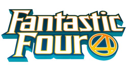
As part of Fresh Start, comic book publishing continued. The heroes were brought together again. The logo of the new series was a pointed Fantastic Four inscription and the number 4 in a circle. The white symbols speak of renewal. The dark blue and light blue shadows – are about the significant past of the franchise. Blue also indicates the color of superhero costumes.
The emblem is tilted away from the viewer and seems to fly upwards and away into infinity, predicting the eternal continuation of the story.
Animated series
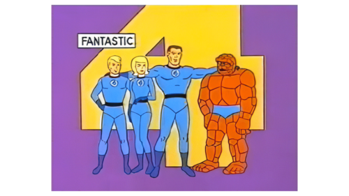
1967 – 1968
1978
1994 – 1996
2006 – 2007
Font and Colors
Several recurring colors are used in the comic book logos: yellow, red, blue, and white. These are associated both with the heroes’ outfits and the missions they undertook.
- Blue – symbolizes stretching and flexibility and is the overall color of the Fantastic Four. Initially, the members were scientists, and blue is a shade of science and knowledge.
- Red – represents the Human Torch’s fire. It’s a symbol of danger, speed, and intense battles.
- White – symbolizes the Invisible Woman’s transparent fields and invisibility. It’s a precursor of regular updates and new beginnings in the story.
- Yellow – a shade close to the Thing. It represents joy and success in the team’s collective work.
The uniquely tilted inscription has interesting serrations as if left by monster fangs. This technique points to the sharp storylines in the plot.
Fantastic Four color codes
| Peacock Blue | Hex color: | #003141 |
|---|---|---|
| RGB: | 0 49 65 | |
| CMYK: | 100 25 0 75 | |
| Pantone: | PMS 547 C |
| Pacific Blue | Hex color: | #02a1bd |
|---|---|---|
| RGB: | 2 161 189 | |
| CMYK: | 99 15 0 26 | |
| Pantone: | PMS 3125 C |
| Safety Orange | Hex color: | #ff8000 |
|---|---|---|
| RGB: | 255 128 0 | |
| CMYK: | 0 50 100 0 | |
| Pantone: | PMS 1505 C |
| Golden Yellow | Hex color: | #ffdd00 |
|---|---|---|
| RGB: | 255 221 0 | |
| CMYK: | 0 13 100 0 | |
| Pantone: | PMS 108 C |
