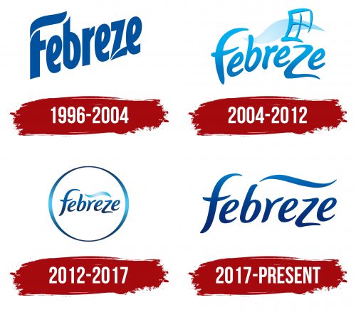
The Febreze logo embodies the brand’s lightness and confidence despite the simplicity and restraint in its design throughout each period of its transformation. Maintained in a unified color scheme, it exudes the “freshness” of the company’s odor-eliminating products. Notably, the name “Febreze” contains three identical vowels, which, in the logo’s visualization, became a unique feature that made the brand name even more recognizable and memorable.
Febreze: Brand overview
The discovery of a chemical that could capture and neutralize scents by accident by Procter & Gamble (P&G) chemist Fabrice Kélerhals in 1994 marked the beginning of the history of Febreze. This was discovered while working on a project to eliminate cigarette stink on clothes. Kélerhals discovered that cyclodextrin, a corn starch derivative, was an efficient way to collect odor molecules.
P&G started working on a product based on this discovery when they realized its potential. Researchers and marketers collaborated to develop a consumer-friendly, safe for use at home, and efficient recipe.
Following two years of extensive research and development, P&G released Febreze onto the American market in 1996. The product was first introduced as a fabric spray to eliminate offensive smells from carpets, furniture, and clothes. The terms “fabric” and “breeze,” which represent the main function of the product, were combined to create the name “Febreze.”
A significant marketing campaign was launched along with the first release to emphasize the product’s special capacity to remove smells rather than just cover them up. Even though the product was innovative, the first sales fell short of projections.
P&G studied the product’s lack of anticipated success in 1998. It was shown that individuals grow acclimated to the smells in their houses and frequently fail to detect them. As a result, the marketing approach was altered to place Febreze as the last stage in cleaning and add a new aroma.
A new, milder-smelling version was released in 1999. This modification allowed customers to remove smells from their houses and add a pleasing scent, greatly boosting the product’s appeal.
The product line saw significant growth in the 2000s. The fabric-freshening product Febreze Fabric Refresher was first released in 2000. P&G introduced its first air-refreshing product, Febreze Air Effects, in 2004.
With Car Vent Clips, the brand debuted in the automobile air freshener industry in 2006. Through this growth, the brand was able to reach a wider audience and transcend beyond domestic use.
Additional inventions and product line extensions marked the decade of the 2010s. The long-lasting Set & Refresh solution, introduced in 2011, provides continual air freshening. A product brand called Sleep Serenity was launched in 2012 for use in bedrooms.
The company debuted a new product line in 2020 under the “Febreze One.” This creative series was created in response to the increased customer desire for more natural and environmentally friendly products. Aerosols, synthetic perfumes, or artificial colorings were absent from “Febreze ONE.” Instead, light, pleasant smells were created using natural essential oils in the goods in this series. Introducing “Febreze ONE” marked a turning point in the strategy to increase its market share in the environmentally conscious sector.
In 2021, “Febreze Car Air Freshener with Gain Original Scent” was added to the collection of automobile air fresheners. In this joint venture between two P&G brands, the well-known Gain laundry detergent aroma was merged with odor-eliminating technology. The new item was created for drivers who wanted their automobiles to smell like clean laundry.
“Febreze Fade Defy PLUG,” a new line of electric air fresheners, was introduced in 2022. New technology was used to develop this product, which provides a consistent aroma strength for the duration of the device. Fade Defy PLUG tackled the widespread problem of many electric air fresheners’ slow loss of aroma.
The “Febreze Connect” smartphone app was introduced in the same year, bolstering its online presence. This software lets users schedule and change the level of the scent on their PLUG devices using a smartphone. The app also made ordering replacement cartridges simple and offered tailored advice on using the products.
Meaning and History
What is Febreze?
This well-known line of odor removers for the home is produced by Procter & Gamble. It has become a necessary component of many homes, recognized for its capacity to eradicate disagreeable smells instead of merely covering them up. The company sells various goods, such as cloth fresheners, car vent clips, plug-in air fresheners, air freshening sprays, and odor-eliminating candles. The business employs a unique method that effectively neutralizes odors by trapping their molecules and leaving behind a new scent. To accommodate a range of tastes, the firm creates a variety of scents, from light and airy to more complex.
1996 – 2004
The first Febreze logo was designed in a simple, strict style. At the same time, the designers managed to emphasize the letters “F” and “Z” with symmetrically placed serifs, making the font less monotonous and more distinctive. The upper part of the capital letter demonstrates a light breeze, directly reflecting the brand’s product line concept. The color scheme is chosen wisely, as the pleasant, unobtrusive blue is the shade that conveys freshness and lightness. Additionally, there is no texture, and the solid blue letters of the logo do not seem intrusive.
2004 – 2012
After eight years of successful business, consumers saw an updated Febreze logo style. A drastically different, bold, and striking redesign became even more noticeable and attractive. The emblem added two graphic elements. The first is the silhouette of a window with one part of the frame missing, which is quite original and unconventional. The second is a smooth stroke with a light blue gradient in the background of the “window.” In this case, this schematically represented figure symbolizes air, freshness, lightness, and aroma.
Regarding the font, the capital letter of the brand name is designed in a light style and appears more “cursive” than “capital,” which does not overload the design when paired with the added elements. Nevertheless, the same concept from the previous version of the logo was preserved – the letters “F” and “Z” stand out slightly enlarged but do not draw all the attention. The color scheme has “lightened,” and a moderate gradient has been added, giving confidence while making a light accent on the first letter of the logo.
2012 – 2017
In 2012, another version of the Febreze logo appeared. The inscription is made horizontally in cursive letters in a darker blue and placed in a new, bold emblem element – a perfect circle. The contours of the circle attract with their asymmetry – slightly thickened sides and thin lines of the upper and lower segments perfectly balance the overall perception. Unlike the smooth “wave” stroke, the window icon was removed, which was slightly reduced in thickness while retaining its subtle gradient. It, in turn, harmonizes perfectly with the gradient of the circle containing the brand name.
2017 – today
After several redesigns and variations since 2017, the Febreze logo remains in the initially chosen pleasant color scheme. The updated yet recognizable brand changed its emblem again, offering a minimalist, restrained, and “understandable” design. Unlike the previous version, the designers removed the circle where the brand name was placed. The blue color of the font with a barely noticeable gradient at the top of the capital letter is now perfect for visual perception. Also, the logo retained the figure of the light wave – the stroke is now more elongated and placed above the second half of the word. This element has a barely noticeable gradient, continuing the smooth color transition from the letter “F.”


